CSS :disabled Pseudo Class
Use the :disabled CSS pseudo-class for selecting and styling the disabled elements. Read about the pseudo-class & practice with examples.
The :disabled pseudo-class selects and styles every element that is currently disabled — that is, an element the user cannot interact with. A control becomes disabled when it carries the HTML disabled attribute, so :disabled lets you give those controls a distinct "you can't use this" look without adding an extra class.

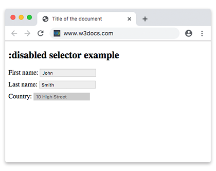
This page covers what counts as a disabled element, the syntax of the selector, how :disabled relates to its opposite :enabled, the difference between disabled and readonly, and a set of runnable styling examples.
Which elements can be disabled
Only elements that can be disabled in the first place are matched by :disabled. These are the interactive form controls:
<button><input>(all types)<select>and its<option>/<optgroup><textarea><fieldset>— disabling a<fieldset>disables every control inside it
A disabled control behaves differently from a normal one:
- It does not accept clicks, text input, or keyboard focus.
- Its value is not submitted with the form.
- It is not validated by the browser, so
:valid/:invaliddo not apply to it.
Plain text elements such as <p> or <div> cannot be disabled, so they never match :disabled.
:disabled vs. :enabled
:disabled and :enabled are mirror images. Any control that can be disabled is matched by exactly one of them at a time: :enabled when it is interactive, :disabled when the disabled attribute is present. Styling both gives the user a clear visual contrast between usable and unusable controls.
disabled vs. readonly
These two attributes look similar but are not the same:
disabled | readonly | |
|---|---|---|
| User can focus it | No | Yes |
| User can edit the value | No | No |
| Value submitted with the form | No | Yes |
| Matched by | :disabled | :read-only |
Use disabled to switch a control off entirely; use readonly (see :read-only) when the value must stay visible and be submitted but not edited.
Syntax
Used on its own, :disabled targets any disabled control. Combine it with a type or attribute selector to be more specific:
/* every disabled control */
:disabled {
  /* css declarations */
}

/* only disabled text inputs */
input[type="text"]:disabled {
  background: #ccc;
  cursor: not-allowed;
}Example of setting a background color for a disabled <input> element:
CSS :disabled code example
<!DOCTYPE html>
<html>
  <head>
    <title>Title of the document</title>
    <style>
      input {
        padding: 2px 5px;
        margin-bottom: 10px;
        border: 1px solid #ccc;
      }
      input[type=text]:enabled {
        background: #eee;
      }
      input[type=text]:disabled {
        background: #ccc;
      }
    </style>
  </head>
  <body>
    <h2>:disabled selector example for input</h2>
    <form action="">
      <label for="name">First name:</label>
      <input type="text" value="John" id="name" />
      <br />
      <label for="lastname">Last name:</label>
      <input type="text" value="Smith" id="lastname" />
      <br />
      <label for="country">Country:</label>
      <input type="text" disabled="disabled" value="10 High Street" id="country" />
    </form>
  </body>
</html>Example of setting a background color for disabled <option> elements:
CSS :disabled another code example
<!DOCTYPE html>
<html>
  <head>
    <title>Title of the document</title>
    <style>
      option:disabled {
        background: #8ebf42;
      }
    </style>
  </head>
  <body>
    <h2>:disabled selector example for option</h2>
    <select>
      <option value="paris">Paris</option>
      <option value="london" disabled>London</option>
      <option value="moscow">Moscow</option>
      <option value="rome" disabled>Rome</option>
      <option value="berlin">Berlin</option>
    </select>
  </body>
</html>Note: The
:disabledpseudo-class takes precedence over:validand:invalid. Disabled form elements are not validated by the browser.
Example of a disabled <input> element:
Example of disabled input element
<!DOCTYPE html>
<html>
  <head>
    <title>Title of the document</title>
    <style>
      input {
        width: 60%;
        margin: 0;
        border: none;
        outline: 1px solid lightgrey;
        outline-offset: 2px;
      }
      input:disabled {
        background: #cccccc;
        cursor: not-allowed;
      }
      form {
        background: #67a6ec;
        padding: 1.5em;
        max-width: 400px;
        width: 100%;
        outline: 10px solid rgba(17, 58, 103, 0.6);
      }
      hr {
        visibility: hidden;
      }
      label {
        margin-right: 3%;
        text-align: left;
        display: inline-block;
        width: 35%;
      }
    </style>
  </head>
  <body>
    <h2>:disabled selector example with styling</h2>
    <form action="#">
      <label for="name">Enabled Input:</label>
      <input type="text" autofocus />
      <hr />
      <label for="name">Disabled Input:</label>
      <input type="text" disabled />
    </form>
  </body>
</html>Accessibility note
Because a disabled control cannot receive focus, keyboard and screen-reader users skip right past it and get no explanation of why it is unavailable. Don't rely on graying-out alone — when the reason matters, add nearby helper text, or keep the control enabled and validate on submit instead. Also keep enough contrast on disabled text so it stays readable.
Related pseudo-classes
:enabled— the opposite state: controls the user can interact with.:read-onlyand:read-write— forreadonlyinputs.:required— controls that must be filled in.:validand:invalid— form-validation states.:checked— selected checkboxes, radios, and options.:focus— the element that currently has keyboard focus.