HTML <button> Tag
The HTML <button> tag creates clickable buttons. Learn the type attribute, styling, the disabled state, and accessibility, with examples.
The <button> tag creates a clickable button on the web page. Unlike a button built from the <input> tag, a <button> can contain rich content — text, images, or other inline HTML — between its opening and closing tags. This makes it the preferred element for most buttons today, because it is easier to style and lets you mix an icon with a label.
This page covers the <button> syntax, the all-important type attribute (and the bug that comes from forgetting it inside a form), styling, the disabled state, accessibility, and how <button> compares with <input>.
In the past, some developers used <input type="button"> instead of <button> because very old versions of Internet Explorer rendered <button> inconsistently. That quirk is long gone — in modern browsers <button> is the recommended choice.
Syntax
The <button> tag comes in pairs. The content is written between the opening (<button>) and closing (</button>) tags.
Example of the HTML <button> tag:
Example of HTML <button> Tag
<!DOCTYPE html>
<html>
  <head>
    <title>Title of the document</title>
  </head>
  <body>
    <h1>Here will be our button</h1>
    <button type="button">Click</button>
  </body>
</html>The type attribute
The type attribute decides what a button does. There are three values:
submit— submits the parent form.reset— resets all form controls to their initial values.button— does nothing on its own; you wire up behavior with JavaScript.
The most common gotcha: inside a <form>, a <button> with no type defaults to type="submit". So a button you meant as a plain action button will submit the form (often reloading the page) the moment it is clicked. Always set type="button" explicitly for non-submit buttons inside a form.
Example of submit, reset, and button:
Example of the three button types
<!DOCTYPE html>
<html>
  <head>
    <title>Title of the document</title>
  </head>
  <body>
    <form action="/submit">
      <label>Name: <input type="text" name="name"></label>
      <button type="submit">Submit</button>
      <button type="reset">Reset</button>
      <button type="button" onclick="alert('Just a button!')">Say hi</button>
    </form>
  </body>
</html>Submit sends the form, Reset clears the text field, and Say hi only runs its JavaScript without touching the form.
Using CSS styles
You can apply CSS styles to the <button> tag to change the appearance of the button, its size, color, text font, and so on.
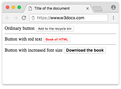
Example of the <button> tag with CSS styles:
Example of HTML <button> Tag with CSS color and font properties
<!DOCTYPE html>
<html>
  <head>
    <title>Title of the document</title>
    <style>
      .red-text {
        color: red;
      }
      .big-text {
        font: bold 14px Arial;
      }
    </style>
  </head>
  <body>
    Ordinary button
    <button type="button">Add to the recycle bin</button>
    <hr />
    Button with red text
    <button type="button" class="red-text"><b>HTML Book</b></button>
    <hr />
    Button with increased font size
    <button type="button" class="big-text">Download the book</button>
  </body>
</html>Result
The disabled state
A button with the disabled attribute can't be clicked or focused, and it won't fire its event handlers or submit a form. Browsers also grey it out so users can see it is inactive. This is useful while an action is unavailable — for example, until a form is filled in correctly.
Example of a disabled button
<!DOCTYPE html>
<html>
  <head>
    <title>Title of the document</title>
  </head>
  <body>
    <button type="button">Active button</button>
    <button type="button" disabled>Disabled button</button>
  </body>
</html>Attributes
The <button> tag doesn’t have required attributes; however, we recommend always setting type="button" when the tag is used as an ordinary (non-submit) button, because inside a form an unset type defaults to submit.
| Attributes | Value | Description |
|---|---|---|
autofocus | autofocus | Specifies that the button should receive focus after loading the page. |
disabled | disabled | Deactivates the button. (Used when the button should become active after performing some action.) |
form | form_id | Specifies one or more forms the button belongs to. If the button has multiple forms, then their identifiers (form_id) must be separated by spaces. |
formaction | URL | Defines the address, where the form data will be sent after clicking on the button. (Used only for the buttons with the type="submit" attribute). |
formenctype | application/x-www-form-urlencoded | Defines how the form-data should be encoded when a form is submitted. (Used only for type="submit"). All symbols are encoded before a form is submitted (default value). |
multipart/form-data | Encodes data as multipart MIME. | |
text/plain | Spaces are being replaced by the sign "+", but symbols aren’t encoded. | |
formmethod | get | Defines the method of the HTTP request, which will be used when a form is submitted (only for type="submit"). Passes the form data in the address bar ("name = value"), which are added to the URL of the page after the question mark and are separated by an ampersand (&). |
post | The browser communicates with the server and sends the data for processing. | |
formnovalidate | formnovalidate | Specifies that the form-data should not be validated on submission (only for type="submit"). |
formtarget | _blank | Specifies where the response will be shown after the form is submitted (only for type="submit"). Opens the response in a new window. |
_self | Opens the response in the current window. | |
_parent | Opens the response in the parent frame. | |
_top | Opens the response in the full width window. | |
name | name | Defines the button name. |
type | button | Defines an ordinary button. |
reset | Button that clears the form from the input data. | |
submit | Button for sending form data. | |
value | text | Defines the button value. |
The <button> tag also supports the Global Attributes and the Event Attributes.
Accessibility: giving a button an accessible name
Every button needs an accessible name — the text a screen reader announces. For a normal text button, the name is simply the text between the tags. The problem appears with icon-only buttons, where there is no visible text.
If the only thing inside the button is an image, give the <img> an alt attribute that describes the action, not the picture. The button then borrows that text as its name:
<button type="button">
  <img src="search.png" alt="Search">
</button>Here alt="Search" describes what the button does, so a screen reader announces "Search, button".
If the button has no text and no image with alt — for example an icon drawn with an icon font or an inline SVG — add an aria-label so the button still has a name:
<button type="button" aria-label="Close menu">
  <span class="icon-close" aria-hidden="true"></span>
</button>The aria-label is the button's accessible name; aria-hidden="true" keeps the decorative icon from being announced. Note that aria-label and an inner <img alt> are separate mechanisms — use whichever fits the markup, and never leave an icon-only button without one of them.
How to add a link to a button?
To create a clickable link that looks like a button, use an <a> element styled with CSS. Wrapping a <button> inside an <a> is invalid in HTML5. Here is the correct approach:
How to add a link to a button?
<a href="https://example.com" class="button-link">
  Button Label
</a>In this example, the <a> element is styled to resemble a button. When the user clicks on it, they will be taken to the linked URL.
<button> vs. <input type="button">
You can create a button with either <button> or the <input> tag (type="button", type="submit", or type="reset"). They behave similarly, but differ in what they can hold:
<button> | <input type="button"> / <input type="submit"> | |
|---|---|---|
| Label source | Content between the tags | The value attribute (plain text only) |
| Rich content | Yes — text, images, icons, other inline HTML | No — text only |
| Styling | Easier (pseudo-elements, nested elements) | More limited |
| Closing tag | Required (</button>) | None — it is a void element |
<!-- Rich content is possible -->
<button type="submit"><img src="check.png" alt=""> Save</button>

<!-- Text-only, set through value -->
<input type="submit" value="Save">Use <button> when you want an icon, formatted text, or finer styling control; reach for <input> when a simple text label is all you need.