HTML <meter> Tag
The <meter> tag shows a scalar measurement within a known range (disk usage, a score). Learn its attributes, color zones, and examples.
The <meter> tag is one of the HTML5 elements. It defines a scalar measurement within a known range — a single value that sits somewhere between a minimum and a maximum. Typical use cases include battery charge level, disk usage, a test score, a relevance rating, or how full a container is. Because the gauge needs a fixed scale to draw against, you should always know (and usually declare) the maximum value.
This page covers the <meter> syntax and attributes, how the low, high, and optimum attributes drive the gauge's color, how to label a meter for accessibility, and the limits of styling it with CSS.
<meter> vs <progress>: use <meter> for a static measurement (e.g. "6.7 GB of 8 GB used"). Use <progress> for the completion of a task that moves toward 100% (e.g. a file upload or page load). They look similar but mean different things.
Syntax
The <meter> tag comes in pairs. The content is written between the opening (<meter>) and closing (</meter>) tags.
Example of the HTML <meter> tag:
Example of the HTML <meter> Tag|W3Docs
<!DOCTYPE html>
<html>
  <head>
    <title>Title of the document</title>
  </head>
  <body>
    <meter value="4" min="0" max="10">4 out of 10</meter> 4 Out of 10<br />
    <meter value="0.75">75%</meter> 75%
  </body>
</html>Result
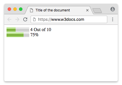
The <meter> tag isn’t used to indicate progress. For that purpose, use the <progress> tag.
Use CSS background-color, box-shadow, width and height properties to style the <meter> element.
Accessibility: Always Label a Meter
A <meter> element has no implicit accessible name. On its own, a screen reader announces only the value, with no indication of what is being measured. The text you place between the tags is a visual fallback for very old browsers — it is not reliably exposed as the accessible name.
Give every meter a real label. The clearest option is a <label> element associated by id; otherwise use aria-label or aria-labelledby.
Labeling a <meter> element:
<!DOCTYPE html>
<html>
  <head>
    <title>Title of the document</title>
  </head>
  <body>
    <!-- Associated <label> -->
    <label for="disk">Disk usage:</label>
    <meter id="disk" value="6" min="0" max="8">6 GB of 8 GB</meter>

    <!-- aria-label when no visible label is shown -->
    <meter value="0.6" aria-label="Password strength">60%</meter>
  </body>
</html>Color Zones: low, high, and optimum
The browser colors the meter automatically based on where value falls relative to the low, high, and optimum attributes. The thresholds split the range into three bands — below low, between low and high, and above high — and optimum tells the browser which band is the good one. From that, the browser picks one of three states:
- Green — the value is in (or adjacent to) the band that contains
optimum. This is the "good" zone. - Yellow — the value is one band away from the optimum band (acceptable, but not ideal).
- Red — the value is in the band on the opposite side of the range from
optimum(the worst zone).
The exact colors depend on the browser, but the green/yellow/red logic is consistent. Note that the meaning of high and low is not "big = good." If optimum is below low, then small values are green and large values turn red.
Three meters that map to the three color states:
<!DOCTYPE html>
<html>
  <head>
    <title>Title of the document</title>
  </head>
  <body>
    <!-- value above high, optimum is low -> red -->
    <label for="m1">Server load (high is bad):</label>
    <meter id="m1" value="90" min="0" max="100" low="33" high="66" optimum="10">90%</meter>
    <br />

    <!-- value in the middle band -> yellow -->
    <label for="m2">Server load (medium):</label>
    <meter id="m2" value="50" min="0" max="100" low="33" high="66" optimum="10">50%</meter>
    <br />

    <!-- value in the optimum band -> green -->
    <label for="m3">Server load (low is good):</label>
    <meter id="m3" value="15" min="0" max="100" low="33" high="66" optimum="10">15%</meter>
  </body>
</html>Because optimum (10) sits in the low band here, low values are healthy (green) and high values are dangerous (red) — exactly what you want for something like CPU load. Flip optimum to a high number and the colors invert, which suits a "battery level" or "password strength" meter where more is better.
Displaying a Number Range
The min and max attributes define the scale the gauge is drawn against. The value is interpreted on that scale: with min="0" and max="70", a value of 15 fills roughly 21% of the bar. Use the optimum attribute to mark the ideal point in the range — for example, a pass mark in a test — which (together with low and high) controls the gauge color described above.
A test score out of 70, where higher is better:
<!DOCTYPE html>
<html>
  <head>
    <title>Title of the document</title>
  </head>
  <body>
    <label for="score">Test score:</label>
    <meter id="score" value="15" min="0" max="70" low="35" high="55" optimum="65">15 out of 70</meter>
  </body>
</html>Displaying a Percentage
If you omit min and max, they default to 0 and 1. That makes <meter> convenient for fractions: a value of 0.8 renders as 80% of the bar. This is handy for things like a relevance score or a "profile completeness" indicator.
Always provide a visible label (or aria-label) and human-readable fallback text, so the meaning is clear without the styling.
<!DOCTYPE html>
<html>
  <head>
    <title>Title of the document</title>
  </head>
  <body>
    <label for="complete">Profile completeness:</label>
    <meter id="complete" value="0.8">80%</meter>
  </body>
</html>Styling the HTML <meter> tag
First of all, set the size with the width and height properties.
Example of the HTML <meter> tag:
meter {
  width: 300px;
  height: 20px;
}Modern browsers do not provide reliable, cross-browser styling hooks for the native meter control. The vendor-specific pseudo-elements shown below are deprecated or unsupported in current browsers, so they should not be relied on for production styling. If you need a fully styled, accessible indicator, consider using a custom ARIA-compliant component or the <progress> tag when the value represents progress.
The examples below are kept for reference, but treat them as fragile: each browser exposes its own non-standard pseudo-elements, they are not interoperable, and some have been removed entirely. If you need a fully styled, accessible indicator, build a custom component out of plain elements with role="meter", aria-valuenow, aria-valuemin, and aria-valuemax, and animate that instead. The Webkit/Blink engines expose the following pseudo-elements:
| Pseudo-class | Description |
|---|---|
| -webkit-meter-inner-element | Additional markup that is used for rendering the meter element as read-only. |
| -webkit-meter-bar | It contains meter gauge holding the value. |
| -webkit-meter-optimum-value | The current value of the meter element which is by default green when the value attribute falls within the low-high range. |
| -webkit-meter-suboptimum-value | The meter tag becomes yellow when the value is outside the low-high range. |
| -webkit-meter-even-less-good-value | The meter tag becomes red when the value and the optimum attributes are outside the low-high range but in opposite zones. For example, value high > low > optimum. |
Then, we'll need to set the default appearance of the meter gauge to "none".
Meter tag styled with appearance property
meter {
  -webkit-appearance: none;
}In our example, we will use the -webkit-meter-bar and -webkit-meter-optimum-value pseudo-classes.
Styling the HTML <meter> tag
meter::-webkit-meter-bar {
  background: none;
  background-color: lightgrey;
  box-shadow: 0 3px 3px -3px #333 inset;
}

meter::-webkit-meter-optimum-value {
  box-shadow: 0 3px 3px -3px #999 inset;
  background-image: linear-gradient( 90deg, #2286c9 5%, #FF00FF 5%, #FF00FF 15%, #04C319 15%, #04C319 55%, #F1F70D 55%, #F1F70D 95%, #00FFCC 95%, #00FFCC 100%);
  background-size: 100% 100%;
}Each color in the background linear gradient presents the space that is consumed by the sub-categories.
Styling the HTML <meter> tag
meter::-webkit-meter-optimum-value {
  -webkit-transition: width .5s;
}

meter::-webkit-meter-optimum-value:hover {
  background-image: linear-gradient( 90deg, #8bcf69 20%, #e6d450 20%, #e6d450 40%, #f28f68 40%, #f28f68 60%, #cf82bf 60%, #cf82bf 80%, #719fd1 80%, #719fd1 100%);
  transition: width .5s;
  width: 100%;
}Example of styling the HTML <meter> tag:
<!DOCTYPE html>
<html>
  <head>
    <title>Title of the document</title>
    <style>
      meter {
        width: 300px;
        height: 20px;
      }
      meter::-webkit-meter-bar {
        background: none;
        background-color: lightgrey;
        box-shadow: 0 3px 3px -3px #333 inset;
      }
      meter::-webkit-meter-optimum-value {
        box-shadow: 0 3px 3px -3px #999 inset;
        background-image: linear-gradient( 90deg, #2286c9 5%, #FF00FF 5%, #FF00FF 15%, #04C319 15%, #04C319 55%, #F1F70D 55%, #F1F70D 95%, #00FFCC 95%, #00FFCC 100%);
        background-size: 100% 100%;
      }
    </style>
  </head>
  <body>
    <meter value="30" min="0" max="70"></meter>
  </body>
</html>Both the transition and animation properties on the <meter> element are supported by Webkit browsers. Change the width of the value (on :hover) using transitions and animate the background-position of the container with keyframes.
Example of styling the HTML <meter> tag with the CSS transition property:
<!DOCTYPE html>
<html>
  <head>
    <title>Title of the document</title>
    <style>
      meter {
        width: 300px;
        height: 20px;
      }
      meter::-webkit-meter-bar {
        background: none;
        background-color: lightgrey;
        box-shadow: 0 3px 3px -3px #333 inset;
      }
      meter::-webkit-meter-optimum-value {
        -webkit-transition: width .5s;
        box-shadow: 0 5px 5px -5px #999 inset;
        background-image: linear-gradient( 90deg, #2286c9 5%, #FF00FF 5%, #FF00FF 15%, #04C319 15%, #04C319 55%, #F1F70D 55%, #F1F70D 95%, #00FFCC 95%, #00FFCC 100%);
        background-size: 100% 100%;
      }
      meter::-webkit-meter-optimum-value:hover {
        /* Reset each sub-category to 20% */
        background-image: linear-gradient( 90deg, #2286c9 20%, #FF00FF 20%, #FF00FF 40%, #04C319 40%, #04C319 60%, #F1F70D 60%, #F1F70D 80%, #00FFCC 80%, #00FFCC 100%);
        transition: width .5s;
        width: 100% !important;
      }
    </style>
  </head>
  <body>
    <meter value="25" min="0" max="70"></meter>
  </body>
</html>Pseudo-elements on meter gauge are supported only by Webkit browsers. The pseudo-elements can be used for displaying the meta information above the meter gauge.
Styling the HTML <meter> tag
meter {
  margin: 2em;
  position: relative;
}

meter::before {
  content: 'Used storage';
  position: absolute;
  top: -100%;
}

meter::after {
  content: 'Free storage';
  position: absolute;
  top: -100%;
  right: 0;
}Example of the HTML <meter> tag used with pseudo-elements:
<!DOCTYPE html>
<html>
  <head>
    <title>Title of the document</title>
    <style>
      meter {
        margin: 2em;
        width: 400px;
        height: 30px;
        position: relative;
      }
      meter::before {
        content: 'Used storage';
        position: absolute;
        top: -100%;
      }
      meter::after {
        content: 'Free storage';
        position: absolute;
        top: -100%;
        right: 0;
      }
      meter::-webkit-meter-bar {
        background: none;
        background-color: lightgray;
        box-shadow: 0 5px 5px -5px #333 inset;
      }
      meter::-webkit-meter-optimum-value {
        -webkit-transition: width .5s;
        box-shadow: 0 5px 5px -5px #999 inset;
        background-image: linear-gradient( 90deg, #8bcf69 5%, #e6d450 5%, #e6d450 15%, #f28f68 15%, #f28f68 55%, #cf82bf 55%, #cf82bf 95%, #719fd1 95%, #719fd1 100%);
        background-size: 100% 100%;
      }
      meter::-webkit-meter-optimum-value:hover {
        /* Reset each sub-category to 20% */
        background-image: linear-gradient( 90deg, #8bcf69 20%, #e6d450 20%, #e6d450 40%, #f28f68 40%, #f28f68 60%, #cf82bf 60%, #cf82bf 80%, #719fd1 80%, #719fd1 100%);
        transition: width .5s;
        width: 100% !important;
        /* !important required. to override the inline styles in WebKit. */
      }
    </style>
  </head>
  <body>
    <meter value="25" min="0" max="70"></meter>
  </body>
</html>Now, let’s use the Firefox fallback. Paint the meter gauge using the -moz-appearance: meterbar. If you don't need the default bevel and emboss set the -moz-appearance to "none".
Styling the HTML <meter> tag
meter {
  -moz-appearance: none;
  width: 400px;
  height: 30px;
}Firefox no longer supports styling the meter gauge via CSS pseudo-elements.
Here, we will style the background of the meter gauge value using the ::-moz-meter-bar pseudo-class.
Styling the HTML <meter> tag
meter::-moz-meter-bar {
  box-shadow: 0 5px 5px -5px #999 inset;
  background-image: linear-gradient( 90deg, #2286c9 5%, #FF00FF 5%, #FF00FF 15%, #04C319 15%, #04C319 55%, #F1F70D 55%, #F1F70D 95%, #00FFCC 95%, #00FFCC 100%);
  background-size: 100% 100%;
}In Firefox, you can use the meter selector itself to style the background of the container.
Styling the HTML <meter> tag
meter {
  background: none;
  background-color: lightgray;
  box-shadow: 0 5px 5px -5px #333 inset;
}Example of the HTML <meter> tag for Firefox:
<!DOCTYPE html>
<html>
  <head>
    <title>Title of the document</title>
    <style>
      meter {
        width: 400px;
        height: 30px;
        background: none;
        /* Required to get rid of the default background property */
        background-color: lightgray;
        box-shadow: 0 5px 5px -5px #333 inset;
      }
      meter::-moz-meter-bar {
        box-shadow: 0 5px 5px -5px #999 inset;
        background-image: linear-gradient( 90deg, #2286c9 5%, #FF00FF 5%, #FF00FF 15%, #04C319 15%, #04C319 55%, #F1F70D 55%, #F1F70D 95%, #00FFCC 95%, #00FFCC 100%);
        background-size: 100% 100%;
      }
    </style>
  </head>
  <body>
    <meter value="30" min="0" max="70"></meter>
  </body>
</html>The ::before and ::after pseudo elements on the meter gauge are not supported by Firefox. The support for CSS3 transitions and animation is weak, too.
Attributes
| Attribute | Value | Description |
|---|---|---|
| form | form_id | Indicates form (forms), which the <meter> tag belongs to. |
| high | number | Indicates high values (but not maximum ones). If the high value is less than the low, then the high = low. If high is set larger than max, then high = max. |
| low | number | Defines low values (but not minimal ones). This value must be less than high. If the low value is less than the min, then low = min. |
| max | number | Defines the maximum possible value. The default value is 1. |
| min | number | Defines the minimum possible value. The default value is 0. |
| optimum | number | Defines the optimal number, which must be within the range defined by the min and max attributes. It may be larger than the high value. |
| value | number | Sets the current value. If omitted, the default value is 0.5. |
The <meter> tag supports the Global Attributes and the Event Attributes.