HTML Images
Learn to embed images with the HTML img tag: src and alt, width/height to prevent layout shift, responsive srcset and picture, and lazy loading.
To embed an image to a web page use the <img> tag.
The <img> tag supports a number of required and optional attributes, which give additional information about it.
Syntax
The <img> tag is empty, which means that the closing tag isn’t required. It contains only attributes. But in XHTML, the (<img>) tag must be closed (<img/>).
Required Image Attributes - src and alt
The src (source) attribute specifies the name or the location of the image to be displayed. Its value can be a relative path (a file in your own project) or an absolute URL (an image hosted elsewhere).
Relative path — the image lives in your project, alongside the HTML file:
<img src="images/example.jpg" alt="A description of the image" />Absolute URL — the image is hosted on another server:
<img src="https://www.example.com/images/example.jpg" alt="A description of the image" />The alt attribute supplies alternate text that is shown if the image fails to load (slow connection, broken path) and read aloud by screen readers. There are two cases:
- Meaningful images — give
alta short, accurate description of what the image conveys (alt="Bar chart of 2024 sales"). - Decorative images that add nothing to the content — use an empty
alt="". Screen readers then skip the image instead of announcing a meaningless file name.
Always include the attribute. Omitting alt entirely is different from alt="" and is flagged as an accessibility error.
Note: the hover tooltip behavior is controlled by the title attribute, not alt.
Syntax of the <img> tag with required src and alt attributes will look like this:
HTML Image example
<img src="example.jpg" alt="HTML tutorial" />Use the alt attribute for all images to provide a clear, concise description of the image content, which improves accessibility and helps search engines understand your page.
Recommended Image Attributes - width and height
Always set the width and height attributes on an <img>. They tell the browser the image's aspect ratio before the file has downloaded, so it can reserve exactly the right amount of space in the layout from the start.
Without them, the page reflows the moment each image arrives — text and other elements jump down to make room. This visual jolt is called Cumulative Layout Shift (CLS), one of Google's Core Web Vitals and a common source of misclicks. Providing the dimensions prevents it.
HTML Image example
<img src="https://www.example.com/images/example.jpg" alt="HTML tutorial" width="200" height="120" />The attributes take unitless pixel numbers (width="200", not width="200px"). You can still resize the image with CSS — the browser uses the attribute values only to compute the aspect ratio and avoid the layout shift.
Example of the HTML <img> tag with the src, alt, width and height attributes:
<!DOCTYPE html>
<html>
  <head>
    <title>Title of the document</title>
  </head>
  <body>
    <h1>Place for your heading </h1>
    <p>This is Aleq's photo</p>
    <img src="https://api.w3docs.com/uploads/media/default/0001/01/25acddb3da54207bc6beb5838f65f022feaa81d7.jpeg" alt="Aleq" width="200" height="185"/>
  </body>
</html>Result
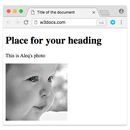
Keep the width and height attributes for the aspect ratio, then use the CSS max-width or max-height properties to add flexibility. This prevents large images from overflowing the layout on small screens.
Making images fluid (responsive)
To stop an image from overflowing its container on narrow screens, give it this CSS rule. It is the single most useful line of CSS for images:
img {
  max-width: 100%;
  height: auto;
}max-width: 100% caps the rendered image at the width of its container, so it shrinks on small screens but never scales up past its natural size and becomes blurry. height: auto lets the height follow along so the image keeps its proportions instead of stretching.
This works hand-in-hand with the width/height attributes: the attributes reserve the aspect-ratio space (no CLS), while the CSS makes the actual rendered size fluid.
Image Floating
By default, an <img> element is inline, so it sits in the line of text. You can wrap text around an image with the CSS float property — set float: left or float: right.
Float is a legacy technique for this kind of layout. For anything beyond simply wrapping a paragraph around one image — galleries, side-by-side media, cards — reach for Flexbox or CSS Grid instead. They give you alignment, gaps, and wrapping without the clearing quirks that float requires.
To show the picture on the left and text on the right, add float: left. Prefer a CSS class over an inline style attribute for maintainability.
Example of the <img> tag and the CSS float property for floating an image to the left:
Example of an Image with float|W3Docs
<!DOCTYPE html>
<html>
  <head>
    <title>Title of the document</title>
  </head>
  <body>
    <h1>Place for your heading </h1>
    <img src="https://api.w3docs.com/uploads/media/default/0001/01/25acddb3da54207bc6beb5838f65f022feaa81d7.jpeg" alt="Aleq" width="200" height="185" style="float:left"/>
    <p>Aleq's photo</p>
  </body>
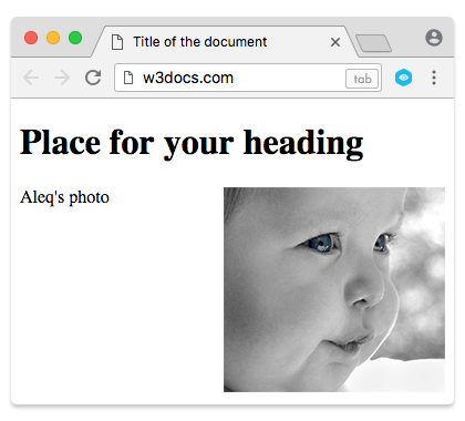
</html>Adding style="float:right" attribute to the <img> tag positions the text to the left, and the image to the right.
Example of the <img> tag and the CSS float property for floating an image to the right:
Example with a float:right attribute|W3Docs
<!DOCTYPE html>
<html>
  <head>
    <title>Title of the document</title>
  </head>
  <body>
    <h1>Place for your heading </h1>
    <img src="https://api.w3docs.com/uploads/media/default/0001/01/25acddb3da54207bc6beb5838f65f022feaa81d7.jpeg" alt="Aleq" width="200" height="185" style="float:right"/>
    <p>Aleq's photo</p>
  </body>
</html>Result
How to add hyperlink to an image
As the <a> tag is used for inserting hyperlinks, you just need to put the image in the <a> tag to make your image clickable.
Example of the <a> and <img> tags for adding a hyperlink to an image:
Example of an image with a hyperlink
<!DOCTYPE html>
<html>
  <head>
    <title>Title of the document</title>
  </head>
  <body>
    <a href="https://www.w3docs.com/" aria-label="w3docs homepage">
    <img src="https://api.w3docs.com/uploads/media/default/0001/01/0710cad7a1017902166203def268a0df2a5fd545.png" width="190" height="45" alt="logo"/>
    </a>
  </body>
</html>Responsive images: serving the right file
A single image rarely fits every screen. Sending a 2000px photo to a phone wastes bandwidth; sending a small one to a 4K display looks blurry. HTML gives you two tools to let the browser pick the best file for each device.
srcset and sizes (same image, different sizes)
Use the srcset and sizes attributes on <img> when you have the same picture at several widths and want the browser to download the most appropriate one.
<img
  src="photo-800.jpg"
  srcset="photo-400.jpg 400w, photo-800.jpg 800w, photo-1600.jpg 1600w"
  sizes="(max-width: 600px) 100vw, 50vw"
  width="800"
  height="600"
  alt="A scenic mountain lake"
/>srcsetlists candidate files with their intrinsic widths (400wmeans the file is 400px wide).sizestells the browser how wide the image will be displayed — here, full viewport width below 600px, otherwise half. The browser combines this with the device's pixel density to choose the smallest file that still looks sharp.srcremains as a fallback for very old browsers.
The picture element (different formats or art direction)
The <picture> element wraps several <source> elements and one <img>. The browser walks the sources top to bottom and uses the first one it supports, falling back to the <img> if none match.
The classic use is serving a modern, smaller format with a guaranteed fallback:
<picture>
  <source srcset="photo.avif" type="image/avif" />
  <source srcset="photo.webp" type="image/webp" />
  <img src="photo.jpg" alt="A scenic mountain lake" width="800" height="600" />
</picture>A browser that understands AVIF downloads the AVIF file; one that only understands WebP uses that; everything else falls back to the JPEG. The <img> is required — it provides the alt text and the fallback. You can also use <picture> for art direction: showing a cropped, portrait image on phones and a wide one on desktops via media attributes on each <source>.
Lazy loading and decoding
By default the browser eagerly downloads every image on the page. For images far below the fold, that is wasted effort up front. Add loading="lazy" so the browser only fetches the image as it approaches the viewport:
<img src="photo.jpg" alt="A scenic mountain lake" width="800" height="600" loading="lazy" />Use loading="lazy" for offscreen images, but not for your largest above-the-fold image (such as a hero or LCP element) — deferring that one slows down the perceived load.
You can also add decoding="async", which lets the browser decode the image off the main thread so it does not block rendering of surrounding content.
What image format to choose for web
There are three main types of image formats supported by browsers:
- GIF (Graphics Interchange Format)
- JPG / JPEG (Joint Photographic Experts Group)
- PNG (Portable Network Graphics)
GIF has 256 unique colors that make simple and fast-loading graphics. You can use GIF for small drawings, diagrams, charts, buttons, and other simple graphics, that won’t prevent your page from loading fast.
JPEG is typically a 24-bit format that blends red, blue, and green light to display millions of colors. Thus it is used mainly for photographs. This format gives you the flexibility to choose how much to compress your image – from 0% (heavy compression) to 100% (no compression). You can choose this format if you don’t mind giving up some quality for a reduction in size. Avoid using JPEG for images with text, shapes, or large color blocks, because when the file is compressed, the lines will blur and colors will shift.
PNG format combines the benefits of both JPEG and GIF: it supports millions of colors and allows lossless compression. You can use PNG for web graphics that require transparency, color heavy, and complex graphics or photographs.
Modern image formats
Two modern formats are now widely supported in browsers and produce smaller, faster-loading files than JPEG or PNG.
WebP, designed by Google, supports both lossless and lossy compression as well as transparency and animation. WebP files are typically 25–35% smaller than an equivalent JPEG or PNG and are supported in all current major browsers. (WebP - Wikipedia)
AVIF is a newer format based on the AV1 video codec. It usually compresses even better than WebP at the same visual quality and supports a wide color range, making it excellent for photographs. Browser support is now broad but slightly behind WebP.
Because not every visitor's browser supports the newest format, serve these with a <picture> element and a JPEG or PNG fallback, as shown in the Responsive images section above. The browser then picks the best format it understands.
You may still encounter older formats such as BPG and Apple's HEIC. Neither is supported by web browsers, so avoid them for images on the web — convert to WebP or AVIF instead.