CSS max-width Property
Use the max-width CSS property to set the maximum width of the content area of an element. Learn more about property values with examples.
The CSS max-width property sets the maximum width an element is allowed to reach. The element can be narrower than this value, but it will never grow wider, no matter how much content it holds or how large its container becomes.
This makes max-width the cornerstone of responsive layouts: instead of fixing an element to one width, you let it shrink freely on small screens while capping it on large ones.
How max-width interacts with width
It helps to think of three properties working together:
max-widthprevents the used value ofwidthfrom becoming larger than the specified value. Ifwidthresolves to more thanmax-width, the element is clamped down tomax-width.min-widthprevents the element from becoming smaller than its value, and it wins any conflict —min-widthoverridesmax-width. So ifmin-widthis greater thanmax-width, the element usesmin-width.
In short, the resolution order is: min-width beats max-width, and max-width beats width.
A common real-world pattern is a "centered content column" that fills narrow viewports but stops widening once it is comfortable to read:
.container {
  width: 100%;
  max-width: 1200px;
  margin: 0 auto;
}On a phone the container is full-width; past 1200px it stays at 1200px and the auto margins keep it centered.
| Initial Value | none |
|---|---|
| Applies to | All elements, but non-replaced inline elements, table rows, and row groups. |
| Inherited | No. |
| Animatable | Yes. Width is animatable. |
| Version | CSS2 |
| DOM Syntax | object.style.maxWidth = "500px"; |
Syntax
Syntax of CSS max-width Property
max-width: none | length | percentage | initial | inherit;A percentage is resolved against the width of the element's containing block. A length (like px, em, rem, ch) is an absolute or relative fixed cap. The default, none, means "no maximum."
Example of the max-width property:
Example of CSS max-width Property with % value
<!DOCTYPE html>
<html>
  <head>
    <title>Title of the document</title>
    <style>
      div {
        max-width: 50%;
        background-color: #1c87c9;
      }
    </style>
  </head>
  <body>
    <h2>Max-width property example</h2>
    <div>The max-width of this text is defined as 50%.</div>
  </body>
</html>Result
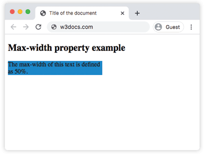
Example of the max-width property defined as "px" and "em":
Example of CSS max-width Property with px and em values
<!DOCTYPE html>
<html>
  <head>
    <title>Title of the document</title>
    <style>
      div {
        max-width: 250px;
        background-color: #8ebf42;
      }
      p {
        max-width: 20em;
        background-color: #ccc;
        color: #fff;
      }
    </style>
  </head>
  <body>
    <h2>Max-width property example</h2>
    <div>The max-width of this div element is defined as 250px.</div>
    <p>The max-width of this paragraph is defined as 20em.</p>
  </body>
</html>Responsive images with max-width
A classic use of max-width is making images scale down on small screens without ever exceeding their natural size:
img {
  max-width: 100%;
  height: auto;
}max-width: 100% lets the image shrink to fit a narrow container, while height: auto keeps its aspect ratio intact. Because there is no fixed width, the image never upscales beyond its intrinsic resolution.
max-width vs box-sizing
By default (box-sizing: content-box), max-width caps only the content area — padding and border are added on top, so the visible box can end up wider than max-width. If you want max-width to include padding and border, set box-sizing: border-box:
.card {
  max-width: 400px;
  padding: 20px;
  box-sizing: border-box; /* total rendered width never exceeds 400px */
}Values
| Value | Description |
|---|---|
none | No maximum width. This is the default value. |
length | A fixed maximum width in px, em, rem, ch, etc. Negative values are invalid. |
% | A maximum width as a percentage of the containing block's width. |
initial | Sets the property to its default value (none). |
inherit | Inherits the value from the parent element. |
Related properties
min-width— sets the lower bound; overridesmax-width.width— the preferred width, clamped bymax-width.max-height/min-height— the vertical equivalents.