CSS grid-template Property
Learn how to use the CSS grid-template shorthand to define rows, columns, and named areas in one declaration, with syntax, values, and examples.
The CSS grid-template property defines the rows, columns, and named areas of a CSS grid in one declaration. It is a shorthand for three longhand properties:
grid-template-rows— the height of each row track.grid-template-columns— the width of each column track.grid-template-areas— named regions you can place items into withgrid-area.
This page explains the syntax, how the forward slash separates rows from columns, how the named-area form works, when to use grid-template instead of the broader grid shorthand, and shows runnable examples you can edit live.
How the shorthand works
grid-template only applies to a grid container — an element with display: grid (or inline-grid). The property has two main forms.
Rows / columns form
Put the row sizes first, then a forward slash (/), then the column sizes:
.container {
  display: grid;
  grid-template: 100px 200px / 1fr 1fr 1fr; /* two rows / three columns */
}The / is required when you specify both rows and columns — it tells the browser where the column list begins. Sizes can use any track-sizing unit:
| Unit | Meaning |
|---|---|
px, %, em | Fixed or relative sizes |
fr | A fraction of the remaining free space |
auto | Sized by content, then distributes remaining space |
min-content | Smallest size that avoids overflow |
max-content | Largest size without wrapping |
minmax(min, max) | A range — e.g. minmax(100px, 1fr) |
repeat(n, size) | Repeat a track n times — e.g. repeat(3, 1fr) |
The fr unit is unique to grid layout. 1fr 2fr means "one part and two parts of free space" — so the second track is twice as wide as the first.
Named-areas form
Each quoted string represents one row. Words inside the string name the cells in that row. Cells that share the same name across rows merge into one rectangular area. A dot (.) leaves a cell unnamed:
.container {
  display: grid;
  grid-template:
    "header header" 60px
    "nav    main"   1fr
    / 120px 1fr;
}The row size (e.g. 60px, 1fr) is written after the quoted string, before the next string. The optional column sizes come after the final /.
You then place items into named areas with grid-area:
header { grid-area: header; }
nav    { grid-area: nav; }
main { grid-area: main; }This is the most readable way to describe a classic page layout in CSS.
grid-template does not set the gutter between tracks. Use gap (or the longhand column-gap) for spacing between tracks. Gutters are separate from track sizing.
grid-template vs. grid
The broader grid shorthand also resets the implicit-grid properties — grid-auto-rows, grid-auto-columns, and grid-auto-flow — to their initial values. grid-template leaves those untouched.
When to use each:
- Use
grid-templatewhen you only want to define the explicit tracks and areas without affecting auto-placement behavior. - Use
gridwhen you want a single reset of all grid properties at once.
Property reference
| Feature | Value |
|---|---|
| Initial value | none |
| Applies to | Grid containers |
| Inherited | No |
| Animatable | Yes — track sizes are animatable |
| Specification | CSS Grid Layout Module Level 1 |
Syntax
grid-template: none
             | <grid-template-rows> / <grid-template-columns>
             | [ <line-names>? <string> <track-size>? <line-names>? ]+ [ / <explicit-track-list> ]?
| initial | inherit | unset;Values
| Value | Description |
|---|---|
none | Resets all three longhands (grid-template-rows, grid-template-columns, grid-template-areas) to their initial values. Items are placed by the auto-placement algorithm. |
<rows> / <columns> | Sets explicit row and column tracks. Any sizing unit is valid: px, %, fr, auto, minmax(), repeat(), etc. |
"area-names" <size> | Sets named areas row by row. Each quoted string is one row; the optional size after it is that row's height. |
initial | Resets the property to none. |
inherit | Inherits the computed value from the parent element. |
unset | Acts as inherit if the property is inheritable, otherwise as initial. |
Examples
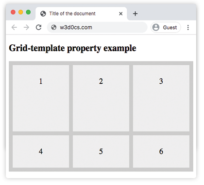
Defining rows and columns
This grid has one explicit row of 170px and three auto-sized columns. Items beyond the first row flow into implicitly created rows.
<!DOCTYPE html>
<html>
  <head>
    <title>Title of the document</title>
    <style>
      .grid-container {
        display: grid;
        grid-template: 170px / auto auto auto;
        grid-gap: 10px;
        background-color: #ccc;
        padding: 10px;
      }
      .grid-container > div {
        background-color: #eee;
        text-align: center;
        padding: 30px 0;
        font-size: 20px;
      }
    </style>
  </head>
  <body>
    <h2>Grid-template property example</h2>
    <div class="grid-container">
      <div>1</div>
      <div>2</div>
      <div>3</div>
      <div>4</div>
      <div>5</div>
      <div>6</div>
    </div>
  </body>
</html>Result:
Using named areas
Here the first item is assigned the name item1 via grid-area. The two quoted strings place item1 in a 2×2 block in the top-left. Dots (.) mark empty cells that the remaining items flow into.
<!DOCTYPE html>
<html>
  <head>
    <title>Title of the document</title>
    <style>
      .box {
        grid-area: item1;
      }
      .grid-container {
        display: grid;
        grid-template: 'item1 item1 . .' 'item1 item1 . .';
        grid-gap: 10px;
        background-color: #ccc;
        padding: 10px;
      }
      .grid-container > div {
        background-color: #eee;
        text-align: center;
        padding: 30px 0;
        font-size: 20px;
      }
    </style>
  </head>
  <body>
    <h2>Grid-template property example</h2>
    <div class="grid-container">
      <div class="box">1</div>
      <div>2</div>
      <div>3</div>
      <div>4</div>
      <div>5</div>
      <div>6</div>
    </div>
  </body>
</html>Page layout with named areas
A classic three-section layout — header, sidebar, and content — defined in a single grid-template declaration:
<!DOCTYPE html>
<html>
  <head>
    <title>Named area layout</title>
    <style>
      .page {
        display: grid;
        grid-template:
          "header  header"  60px
          "sidebar content" 1fr
          "footer  footer"  40px
          / 160px 1fr;
        gap: 8px;
        height: 300px;
      }
      .page > * {
        background: #dde;
        padding: 8px;
        font-family: sans-serif;
      }
      .hdr  { grid-area: header; }
      .side { grid-area: sidebar; }
      .main { grid-area: content; }
      .ftr  { grid-area: footer; }
    </style>
  </head>
  <body>
    <div class="page">
      <div class="hdr">Header</div>
      <div class="side">Sidebar</div>
      <div class="main">Content</div>
      <div class="ftr">Footer</div>
    </div>
  </body>
</html>The layout is fully defined in one property: three rows (60 px / flexible / 40 px) and two columns (160 px sidebar / flexible content). No grid-column or grid-row spans are needed — the names do the work.
Common gotchas
Areas must form a rectangle. You cannot create an L-shaped or T-shaped named area. If you try, the declaration is invalid and the browser ignores it.
Row count must match. The number of cells in each quoted string must be equal. "a b" followed by "a b c" is invalid.
grid-template resets the three longhands. Setting grid-template: 1fr / 1fr implicitly sets grid-template-areas: none — any previously set named areas are cleared.
Implicit tracks are not affected. grid-template only controls the explicit grid. Extra items that overflow the defined rows and columns are placed in implicit tracks, sized by grid-auto-rows and grid-auto-columns.
Browser support
grid-template is part of CSS Grid Layout Module Level 1 and is supported in all modern browsers (Chrome 57+, Edge 16+, Firefox 52+, Safari 10.1+, Opera 44+). It has no effect on elements that are not grid containers — always pair it with display: grid.