CSS Border
How to use CSS border width and color properties, border style values like dotted,dashed, solid, double, groove, ridge, inset, outset. See examples.
CSS Border
A border is a line drawn around the edges of an element's box, between its padding and its margin. Borders are one of the most common ways to visually separate content, highlight a box, or build UI elements like cards, buttons, and input fields.
Every border has three ingredients, and you almost always set all three:
- width — how thick the line is (e.g.
2px,thin,thick). - style — what the line looks like (e.g.
solid,dashed,dotted). This is the one property that must be present — without aborder-style, the browser shows no border at all, even if you set a width and color. - color — the color of the line (e.g.
red,#1c87c9,rgb(0,0,0)).
You can set these individually with border-width, border-style, and border-color, or all at once with the border shorthand. The rest of this chapter walks through each option.
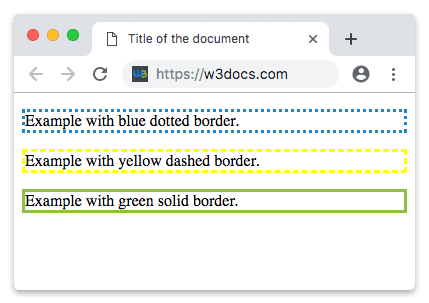
Example of the border property:
<!DOCTYPE html>
<html>
  <head>
    <title>Title of the document</title>
  </head>
  <body>
    <p style="border:3px dotted #1c87c9"> Example with a blue dotted border.</p>
    <p style="border:3px dashed #ffff00"> Example with a yellow dashed border.</p>
    <p style="border:3px solid #8ebf42"> Example with a green solid border.</p>
  </body>
</html>Result
Border Width
The border-width property sets the width of a border.
The width can be specified in a length unit such as pixels (px), em, or rem. It can also be set with one of three pre-defined keywords: thin, medium, or thick. The exact size of these keywords is left to the browser, but thin < medium < thick.
You cannot use border-width on its own — it has no visible effect without a border-style, because the default style is none. Always set the style (or use the border shorthand) first.
You can also give border-width up to four values to size each side independently, exactly like border-style: one value sets all sides, two set top/bottom and left/right, four set top, right, bottom, and left in clockwise order.
Example of the border-width property:
<!DOCTYPE html>
<html>
  <head>
    <style>
      p.border-width-1 {
        border-style: solid;
        border-width: 6px;
      }
      p.border-width-2 {
        border-style: dotted;
        border-width: 1px;
      }
        p.border-width-3 {
        border-style: dotted;
        border-width: medium;
      }
      p.border-width-4 {
        border-style: double;
        border-width: 8px;
      }
      p.border-width-5 {
        border-style: double;
        border-width: thick;
      }
      p.border-width-6 {
        border-style: solid;
        border-width: 3px 12px 6px 18px;
      }
    </style>
  </head>
  <body>
    <h2>The border-width Property</h2>
    <p class="border-width-1">Example with border-width.</p>
    <p class="border-width-2">Example with border-width.</p>
    <p class="border-width-3">Example with border-width.</p>
    <p class="border-width-4">Example with border-width.</p>
    <p class="border-width-5">Example with border-width.</p>
    <p class="border-width-6">Example with border-width.</p>
  </body>
</html>Border Color
The border-color property is used to set the color of a border. The color can be set by:
- name - specifies a color name, like "red"
- RGB - specifies a RGB value, like "rgb(255,0,0)"
- Hex - specifies a hex value, like "#ff0000"
You cannot use the "border-color" property alone. It will not work. Use "border-style" for setting the borders first.
Usually, we write these three properties together in one row.
Example of the border-color property:
<!DOCTYPE html>
<html>
  <head>
    <style>
      p.color-one {
        border-style: solid;
        border-color: blue;
      }
      p.color-two {
        border-style: dotted;
        border-color: yellow;
      }
      p.color-three {
        border-style: solid;
        border-color: DarkBlue orange green red;
      }
    </style>
  </head>
  <body>
    <h2>The border-color Property</h2>
    <p class="color-one">Example with blue solid border-color.</p>
    <p class="color-two">Example with yellow dotted border-color.</p>
    <p class="color-three">Example with multicolor border-color.</p>
  </body>
</html>Notice the last paragraph: when border-color is given four values, they apply to the top, right, bottom, and left sides in that clockwise order.
Border Style
The CSS border-style property sets the style of all four sides of an element’s borders. Borders are placed on the top of an element’s background. It can have from one to four values. So, each side can have its value. The default value of border-style is none.
Border-style has the following values:
- dotted
- dashed
- solid
- double
- groove
- ridge
- inset
- outset
Here is what each value means:
- dotted — a series of round dots.
- dashed — a series of short dashes.
- solid — a single straight line. This is by far the most common style.
- double — two parallel solid lines. The combined width equals the
border-widthvalue. - groove — looks as though the border is carved into the page (a 3D effect).
- ridge — the opposite of
groove; the border appears to stick out. - inset — makes the whole box look pressed into the page.
- outset — makes the box look like it is raised off the page.
The groove, ridge, inset, and outset effects depend on the border color, so they look subtle (or invisible) on a thin border or against a similar background. Use a border-width of at least 3px to see them clearly.
CSS Border for individual sides
CSS provides properties that specify each border (right, left, bottom and top).
The border-style property can have 4 values, for example, border-style: dotted solid double dashed; where the top border is dotted, the bottom border is double, the right border is solid, and the left border is dashed.
The border-style property can have 3 values, for example, border-style: dotted solid double; where the top border is dotted, the bottom border is double, and the right and left borders are solid.
The border-style property can have 2 values, for example, border-style: dotted solid; where the right and left borders are solid, and the top and bottom borders are dotted. And, of course, this property can have only 1 value, for example, border-style: solid; where all the sides are solid.
Example of the border properties for individual sides:
<!DOCTYPE html>
<html>
  <head>
    <style>
      p {
        border-top-style: double;
        border-right-style: solid;
        border-bottom-style: dotted;
        border-left-style: groove;
      }
    </style>
  </head>
  <body>
    <p>Example with border individual sides.</p>
  </body>
</html>CSS border as a shorthand property
The CSS border property is a shorthand property for the following individual border properties:
- The CSS border-width property, which sets the width of all four sides of an element's border.
- The CSS border-style property, which sets the style of all four sides of an element’s borders.
- The CSS border-color property, which sets the color of all four sides of an element's border.
Example of the border shorthand property:
<!DOCTYPE html>
<html>
  <head>
    <style>
      p.border-all {
        border: 3px solid red;
      }
      p.border-left {
        border-left: 4px solid blue;
        background-color: #dcdcdc;
      }
      p.border-top {
        border-top: 6px solid green;
        background-color: #dcdcdc;
      }
    </style>
  </head>
  <body>
    <h2>The border Shorthand Property</h2>
    <p class="border-all">Example with a shorthand property for border-width, border-style, and border-color.</p>
    <p class="border-left">Example with a shorthand property for border-left-width, border-left-style, and border-left-color.</p>
    <p class="border-top">Example with a shorthand property for border-top-width, border-top-style, and border-top-color.</p>
  </body>
</html>Rounded borders
Using the CSS border-radius property, you can add rounded borders to an element.
Example of the border-radius property:
<!DOCTYPE html>
<html>
  <head>
    <style>
      p.normal {
        border: 3px solid blue;
      }
      p.round-one {
        border: 3px solid blue;
        border-radius: 6px;
      }
      p.round-two {
        border: 3px solid blue;
        border-radius: 9px;
      }
      p.round-three {
        border: 3px solid blue;
        border-radius: 15px;
      }
    </style>
  </head>
  <body>
    <h2>The border-radius Property</h2>
    <p class="normal">Example with normal border</p>
    <p class="round-one">Example with round border</p>
    <p class="round-two">Example with rounder border</p>
    <p class="round-three">Example with roundest border</p>
  </body>
</html>The difference between borders and outlines
A border and an outline both draw a line around an element, so they are easy to confuse. The key differences are:
- A border is part of the box model. It sits between the padding and the margin and takes up space, so adding a border can shift the layout of surrounding elements.
- An outline is drawn outside the border and does not take up space, so it never changes the size or position of the element or its neighbours.
- A border can have a different style, width, and color on each side. An outline is the same on all four sides.
- An outline can be offset from the element with
outline-offset; borders cannot be offset.
Because outlines don't affect layout, they are commonly used for the :focus state of buttons and links — the focus ring can appear without nudging the rest of the page.
Related chapters
- CSS border-width — control the thickness of each side.
- CSS border-style — all the line styles in detail.
- CSS border-color — set per-side colors.
- CSS border-radius — round the corners.
- CSS outline — the no-layout-impact alternative to a border.
- CSS padding — the space just inside the border.