CSS column-gap Property
The column-gap property sets the length of gap between columns. Learn about values and try examples.
The CSS column-gap property sets the size of the gap (the gutter) between adjacent columns. It works in three different layout contexts: multi-column layouts created with column-count, flex containers, and grid containers. In flexbox and grid it is the modern shorthand-half of gap, and it replaces the older grid-column-gap property.
This page covers the property's syntax, its accepted values, how it behaves in each layout context, and the gotchas around percentages and the column-rule.
column-gap is one of the CSS3 properties.
What it does
In a multi-column layout the browser packs your content into a number of columns. By default the columns are separated by a normal gap (1em for multi-column elements). column-gap lets you replace that default with any length value, so you can tighten or widen the gutter to suit your design.
It accepts a normal keyword or a <length> value:
normal— the default. For multi-column layouts this resolves to1em. For flex and grid containers it resolves to0.<length>— a fixed gutter such as30px,2em, or1rem. Negative values are not allowed.<percentage>— a gap relative to the element's width.
The property also supports the standard initial and inherit keywords.
Vendor prefixes (-moz-column-gap, -webkit-column-gap) are no longer required for modern browsers. Native support is available in all major browsers.
Where the column-rule sits
When a column-rule is drawn between columns, it sits in the middle of the gap and does not take up any space of its own. If you widen column-gap, the rule stays centered with more breathing room on each side; if the gap is too small, a thick rule can visually crowd the text.
column-gap vs. gap and grid-column-gap
In flex and grid containers, column-gap is the horizontal half of the gap shorthand: gap: <row-gap> <column-gap>. The older grid-column-gap property does the same job in grid but is deprecated — prefer column-gap.
| Initial Value | normal |
|---|---|
| Applies to | Multi-column elements, flex containers, grid containers. |
| Inherited | No. |
| Animatable | Yes. The length of the column gap is animatable. |
| Version | CSS3 |
| DOM Syntax | object.style.columnGap = "100px"; |
Syntax
Syntax of CSS column-gap Property
column-gap: length | normal | initial | inherit;Example of the column-gap property:
Example of CSS column-gap Property with normal value
<!DOCTYPE html>
<html>
  <head>
    <title>Title of the document</title>
    <style>
      div {
        column-count: 4;
        column-gap: normal;
      }
    </style>
  </head>
  <body>
    <h2>The column-gap property example</h2>
    <div>
      Lorem Ipsum is dummy text of the printing and typesetting industry. Lorem Ipsum has been the industry's standard dummy text ever since the 1500s when an unknown printer took a galley of type and scrambled it to make a type specimen book. It has survived not only five centuries, but also the leap into electronic typesetting, remaining essentially unchanged. It was popularised in the 1960s with the release of Letraset sheets containing Lorem Ipsum passages, and more recently with desktop publishing software like Aldus PageMaker including versions of Lorem Ipsum.
    </div>
  </body>
</html>Result
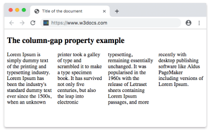
With column-gap: normal, the four columns are separated by the default 1em gutter.
Example of the column-gap property with the "length" value:
Here we set an explicit 30px gutter, giving the columns more separation than the normal default.
Example of CSS column-gap Property with length value
<!DOCTYPE html>
<html>
  <head>
    <title>Title of the document</title>
    <style>
      div {
        column-count: 4;
        column-gap: 30px;
      }
    </style>
  </head>
  <body>
    <h2>Column-gap property example</h2>
    <div>
      Lorem Ipsum is dummy text of the printing and typesetting industry. Lorem Ipsum has been the industry's standard dummy text ever since the 1500s when an unknown printer took a galley of type and scrambled it to make a type specimen book. It has survived not only five centuries, but also the leap into electronic typesetting, remaining essentially unchanged. It was popularised in the 1960s with the release of Letraset sheets containing Lorem Ipsum passages, and more recently with desktop publishing software like Aldus PageMaker including versions of Lorem Ipsum.
    </div>
  </body>
</html>Using column-gap in flex and grid
The same property controls the horizontal gutter between flex items and between grid columns. In these contexts it is usually written through the gap shorthand, but column-gap on its own is fully supported:
/* Flex container: 24px between items in a row */
.flex {
  display: flex;
  column-gap: 24px;
}

/* Grid: 16px between columns, 8px between rows */
.grid {
  display: grid;
  grid-template-columns: repeat(3, 1fr);
  column-gap: 16px;
  row-gap: 8px;
}Note that in flex and grid the default column-gap is 0, whereas in a multi-column layout the normal default is 1em.
Percentage values
A percentage gap is resolved against the width of the element, not the column width:
div {
  column-count: 3;
  column-gap: 5%; /* 5% of the element's width */
}Because percentages depend on the container width, the gutter grows and shrinks as the layout is resized — handy for fluid designs, but harder to predict than a fixed px value.
Values
| Value | Description |
|---|---|
| normal | The default gap size between columns. |
| length | Specifies the length that sets the gap between columns. Can be specified in em, px, or percentages. |
| initial | Sets the property to its default value. |
| inherit | Inherits the property from its parent element. |
Related properties
- column-count — sets how many columns the content is split into.
- column-width — suggests an ideal width for each column.
- columns — shorthand for
column-widthandcolumn-count. - column-rule — draws a line inside the gap between columns.
- grid-gap — the
gapshorthand for setting row and column gaps together in grid.