CSS image-rendering Property
Learn how the CSS image-rendering property controls pixel scaling. Covers auto, pixelated, and crisp-edges with working examples and browser support tips.
The image-rendering CSS property tells the browser which scaling algorithm to use when an image is displayed at a size other than its natural (intrinsic) resolution. It controls how pixels are interpolated — not whether the image is scaled.
This page explains what each value does, when to use pixelated versus crisp-edges, how to handle browser differences, and includes runnable examples.
When would I use it?
By default the browser applies smooth interpolation (bilinear or bicubic) when it scales an image up or down. That looks great for photographs but blurs images that are meant to stay sharp pixel-by-pixel. Reach for image-rendering when:
- You are upscaling pixel art, retro game sprites, or 8-bit icons and want blocky pixels preserved instead of blurred.
- You are zooming into a QR code, barcode, or technical diagram where every pixel carries meaning.
- You deliberately scale up a low-resolution image and prefer crisp hard edges over a soft, muddy result.
- You are building a canvas-based game and want the browser to keep scaled canvas pixels sharp.
For photographs and gradients, leave it at auto — smoothing is exactly what you want there.
crisp-edges and pixelated are similar but not identical. pixelated guarantees nearest-neighbor scaling; crisp-edges lets each browser pick a sharp algorithm. Authors often list both so that one acts as a fallback for the other across engines.
| Initial Value | auto |
|---|---|
| Applies to | All elements |
| Inherited | Yes |
| Animatable | Discrete |
| Version | CSS3 |
| DOM Syntax | object.style.imageRendering = "pixelated" |
Syntax
image-rendering: auto | crisp-edges | pixelated | initial | inherit;The property accepts a single keyword. There is no shorthand.
Values
| Value | Description |
|---|---|
auto | The browser chooses an algorithm that maximizes visual quality. For most browsers this means bilinear or bicubic interpolation — smooth but can look blurry on pixel art. This is the default. |
crisp-edges | The image is scaled without any smoothing or anti-aliasing. The browser picks its own high-contrast algorithm (could be nearest-neighbor or another sharp method). Results may vary slightly between engines. |
pixelated | Strict nearest-neighbor scaling. Each source pixel maps to one or more destination pixels of the same color with no blending. Guarantees the blocky pixel look across all supporting browsers. |
initial | Resets the property to its default value (auto). |
inherit | Inherits the value from the parent element. |
pixelated vs crisp-edges — what is the difference?
Both values prevent smoothing, but their contracts differ:
pixelatedis a precise spec: the browser must use nearest-neighbor scaling. Every pixel in the output maps to exactly one source pixel — you get hard, jaggy, intentionally blocky results. This is what pixel-art games rely on.crisp-edgessays "avoid smoothing and preserve contrast" but leaves the algorithm up to the browser. Firefox uses its own sharp algorithm; older Safari used-webkit-optimize-contrast. The visual result is usually very similar topixelated, but is not guaranteed to be identical.
For pixel art, prefer pixelated. Use crisp-edges as a safety net for older browsers that did not implement pixelated.
Examples
Basic comparison: auto vs pixelated
The example below shows the same small image rendered at three times its natural width. The auto version is blurry; pixelated keeps hard edges.
<!DOCTYPE html>
<html>
  <head>
    <title>Title of the document</title>
    <style>
      .pixelated {
        image-rendering: pixelated;
      }
      .wrapper {
        display: flex;
        flex-wrap: wrap;
        gap: 20px;
      }
      .resize {
        flex: 1 1 45%;
      }
      .resize img, .original img {
        width: 100%;
        display: block;
      }
      body {
        background-color: #ccc;
        padding: 20px;
      }
    </style>
  </head>
  <body>
    <h2>Image-rendering property example</h2>
    <div class="wrapper">
      <div class="original">
        <p>Original image size:</p>
        <img src="https://api.w3docs.com/uploads/media/default/0001/02/2895884641188df105fa653fee0b33c785dd7b3d.png" alt="W3docs logo" />
      </div>
      <div class="resize">
        <p><code>image-rendering: auto</code></p>
        <img src="https://api.w3docs.com/uploads/media/default/0001/02/2895884641188df105fa653fee0b33c785dd7b3d.png" alt="W3docs logo" />
      </div>
      <div class="resize">
        <p><code>image-rendering: pixelated</code></p>
        <img class="pixelated" src="https://api.w3docs.com/uploads/media/default/0001/02/2895884641188df105fa653fee0b33c785dd7b3d.png" alt="W3docs logo" />
      </div>
    </div>
  </body>
</html>Result
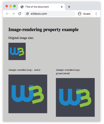
Using crisp-edges with a fallback
Because crisp-edges has a patchy history (older Safari required -webkit-optimize-contrast), it is safest to stack all three declarations. The browser keeps the last value it recognises:
.sharp-upscale {
  image-rendering: -webkit-optimize-contrast; /* Safari < 13 */
  image-rendering: crisp-edges;               /* Firefox, most modern browsers */
  image-rendering: pixelated;                 /* Chrome, Edge, Safari 13+ */
}Applying image-rendering to a CSS background
The property works on background-image as well as <img> elements. This is useful for tiled pixel-art backgrounds:
.pixel-bg {
  background-image: url('sprite-sheet.png');
  background-size: 300%;        /* zoom in */
  image-rendering: pixelated;   /* keep pixels sharp */
}Applying image-rendering to a canvas element
When you draw at a low logical resolution on a <canvas> and then scale the element up via CSS, pixelated keeps the canvas pixels sharp — a common technique for pixel-art games:
<canvas
  id="game"
  width="64"
  height="64"
  style="width: 320px; height: 320px; image-rendering: pixelated;"
></canvas>The width/height attributes set the drawing surface (64 × 64 pixels). The CSS width/height scale the element up 5× on screen. Without pixelated, the browser would blur the scaled canvas.
Things to keep in mind
- It only affects scaled images. If an image is shown at its natural size there is nothing to interpolate, so
image-renderinghas no visible effect. - Inheritance can surprise you. The property is inherited, so setting
image-rendering: pixelatedon a<div>applies to all descendant<img>and background images unless you override it. pixelatedscales down too. Nearest-neighbor also applies when the image is smaller than its source, which can look aliased. For general downscaling,autousually looks better.- It applies to
<img>,background-image,<canvas>, and SVG<image>elements — not to vector content (inline SVG paths) that the browser rasterizes on the fly. - HiDPI / Retina screens. On a 2× screen, pixel art displayed at
image-rendering: pixelatedwill appear at 2 CSS pixels per source pixel. Consider providing a@media (min-resolution: 2dppx)rule with a larger natural image if you want more physical-pixel detail. object-fitruns beforeimage-rendering. Theobject-fitproperty decides how the image fills its box;image-renderingthen decides how the scaled result looks.
Browser support
pixelated is well-supported in Chrome, Edge, Safari 13+, and Firefox 93+. crisp-edges is supported in all modern browsers (Firefox, Chrome, Safari, Edge) and is the safer choice for code that must run on older browsers. The legacy -webkit-optimize-contrast value is only needed for Safari 12 and below.
Related properties
background-image— set images thatimage-renderingcan then sharpen.background-size— scale background images, makingimage-renderingrelevant.object-fit— control how a replaced element fills its box before rendering kicks in.object-position— reposition the image inside the box alongsideobject-fit.width— resize elements, which is what triggersimage-renderingto matter.filter— apply visual effects (blur, contrast, etc.) after rendering.- CSS3 properties — browse other modern CSS properties.