CSS grid-column-gap Property
Learn how the CSS grid-column-gap property sets column gutters in a grid layout, see its values, examples, and the modern column-gap replacement.
The grid-column-gap property sets the size of the gutter (the empty space) between the columns of a CSS Grid layout. It controls only the horizontal spacing between column tracks — it never adds space on the outer edges of the grid container.
The value can be a fixed length (such as px, rem, or em) or a percentage. When a percentage is used, it is resolved against the inline size (the width) of the grid container.
grid-column-gap is deprecated. It was an early, grid-specific name that browsers have since renamed. In new code, use the modern column-gap property, or the gap shorthand to set the row and column gaps at once. All current browsers still accept grid-column-gap as an alias of column-gap, so existing layouts keep working — but there is no reason to write it in new stylesheets.
Why a gap instead of margins?
Before gap properties existed, authors created spacing between grid items with margin, then had to cancel the extra margin that leaked onto the first and last items. grid-column-gap solves this cleanly: the gap appears only between column tracks, so the grid stays flush with its container on both sides. The browser also keeps the gap consistent as tracks grow or shrink, which margins cannot guarantee.
Property reference
| Property | Value |
|---|---|
| Initial Value | normal (equivalent to 0 in grid) |
| Applies to | Grid containers |
| Inherited | No |
| Animatable | Yes |
| Version | CSS Grid Layout Module Level 1 |
| DOM Syntax | object.style.gridColumnGap = "30px" |
Syntax
grid-column-gap: <length-percentage> | normal | initial | inherit;<length-percentage>— a non-negativepx,em,rem,ch,vw, or%value. Negative values are invalid.normal— the browser's default, which resolves to0in a grid context.initial— resets the property to its initial value (normal).inherit— inherits the computed value from the parent element (rarely useful sincegrid-column-gapis not inherited).
Examples
Fixed-length gap (px)
The most common case: a fixed pixel gap that stays the same size regardless of the container width.
<!DOCTYPE html>
<html>
  <head>
    <title>Title of the document</title>
    <style>
      .grid-container {
        display: grid;
        grid-template-columns: auto auto auto auto;
        grid-column-gap: 30px;
        grid-row-gap: 10px;
        background-color: #666;
        padding: 10px;
      }
      .grid-container > div {
        background-color: #ccc;
        text-align: center;
        padding: 20px 0;
        font-size: 30px;
      }
    </style>
  </head>
  <body>
    <h2>Grid-column-gap property example</h2>
    <div class="grid-container">
      <div>1</div>
      <div>2</div>
      <div>3</div>
      <div>4</div>
      <div>5</div>
      <div>6</div>
      <div>7</div>
      <div>8</div>
      <div>9</div>
      <div>10</div>
      <div>11</div>
      <div>12</div>
    </div>
  </body>
</html>Result
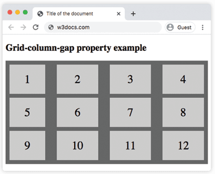
The twelve items flow into four columns; each column is separated from the next by 30px, while grid-row-gap: 10px keeps the rows apart.
Percentage gap (%)
A percentage value is resolved against the grid container's inline size (width). The gutters grow and shrink as the container is resized.
<!DOCTYPE html>
<html>
  <head>
    <title>Title of the document</title>
    <style>
      .grid-container {
        display: grid;
        grid-template-columns: auto auto auto auto;
        grid-column-gap: 20%;
        grid-row-gap: 10px;
        background-color: #666;
        padding: 10px;
      }
      .grid-container > div {
        background-color: #ccc;
        text-align: center;
        padding: 20px 0;
        font-size: 30px;
      }
    </style>
  </head>
  <body>
    <h2>Grid-column-gap property example</h2>
    <div class="grid-container">
      <div>1</div>
      <div>2</div>
      <div>3</div>
      <div>4</div>
      <div>5</div>
      <div>6</div>
      <div>7</div>
      <div>8</div>
    </div>
  </body>
</html>Percentage gaps are rarely what you want: with three gaps each at 20%, the gaps alone consume 60% of the container — leaving only 40% for four auto column tracks. Fixed lengths (px, rem, em) give far more predictable gutters.
Migrating to the modern syntax
The replacement is a direct rename — the value is identical, only the property name changes:
.grid-container {
  display: grid;
  grid-template-columns: repeat(4, 1fr);

  /* Deprecated — avoid in new code */
  grid-column-gap: 30px;

  /* Modern equivalent */
  column-gap: 30px;

  /* Or set both axes at once with the gap shorthand */
  /* gap: <row-gap> <column-gap>; */
  gap: 10px 30px;
}gap: 10px 30px is equivalent to row-gap: 10px; column-gap: 30px;. Passing a single value — gap: 30px — applies it to both rows and columns. The gap shorthand also works inside Flexbox containers, making it the most versatile choice.
How gaps interact with fr units
When you mix a gap with fr columns, the browser subtracts all gap space from the available width before distributing fr shares. This means the gaps never affect the ratio between tracks:
.grid {
  display: grid;
  /* Three equal columns; gaps come out of available space first */
  grid-template-columns: repeat(3, 1fr);
  column-gap: 24px; /* modern equivalent of grid-column-gap: 24px */
}If the container is 300px wide and there are two gaps of 24px each, the remaining 252px is split evenly: each column is 84px. This is one reason fr tracks paired with a fixed column-gap (or grid-column-gap) produce more predictable layouts than percentage-based gaps.
Values
| Value | Description |
|---|---|
<length> | A fixed gap in px, em, rem, etc. Negative values are not allowed. |
<percentage> | A percentage of the grid container's inline size (width). |
normal | The browser default, which equals 0 inside a grid. |
initial | Resets to the initial value (normal). |
inherit | Uses the parent element's computed value. |
Practice
Related properties
column-gap— the modern replacement for this property.gap— shorthand for setting the row and column gaps together.grid-row-gap— the matching property for vertical gaps between rows.grid-template-columns— defines the column tracks the gaps sit between.grid-template-rows— defines the row tracks thatgrid-row-gapacts on.grid— the shorthand that turns an element into a grid container.