CSS background-clip Property
CSS background-clip property specifies how far the background color and image is from the element. See an example and try it yourself.
The CSS background-clip property defines how far the background-color and background-image extend within an element — that is, the painting area of the background. By default a background is painted all the way out to the outer edge of the border, but background-clip lets you stop it at the padding edge, the content edge, or even clip it to the shape of the text.
This page covers what each value does, when to reach for it, the difference between background-clip and the related background-origin property, and a working example for every value.
If the element has no background-color or background-image, this property has no visual effect.
The background-clip property is one of the CSS3 properties.
When to use it
- Inset backgrounds — use
padding-boxorcontent-boxso a translucent border (for example adashedordottedborder) shows the page behind it instead of the element's background color. - Gradient or image text — combine
background-clip: textwith a colorfulbackground-imageandcolor: transparentto fill letterforms with a gradient. - Layered cards — pair with
background-originto control where a background image starts (origin) versus where it is cut off (clip).
For clipping a background to text, a vendor-prefixed version (-webkit-background-clip) is also required for support in most browsers (see the note on the text value below).
| Initial Value | border-box |
|---|---|
| Applies to | All elements. It also applies to ::first-letter and ::first-line. |
| Inherited | No. |
| Animatable | No. |
| Version | CSS3 |
| DOM Syntax | object.style.backgroundClip = "content-box"; |
Syntax
Syntax of CSS background-clip Property
background-clip: border-box | padding-box | content-box | text | initial | inherit;Example of the background-clip property:
Example of CSS background-clip Property with content-box value
<!DOCTYPE html>
<html>
  <head>
    <title>The title of the document</title>
    <style>
      #example {
        border: 3px solid #666;
        padding: 15px;
        background: #ccc;
        background-clip: content-box;
      }
    </style>
  </head>
  <body>
    <h2>Background-clip property example</h2>
    <p>Here the "content-box" value is used.</p>
    <div id="example">
      <p>The background extends to the edge of the content box.</p>
    </div>
  </body>
</html>In the following example find the difference between the "padding-box" and the "border-box" values.
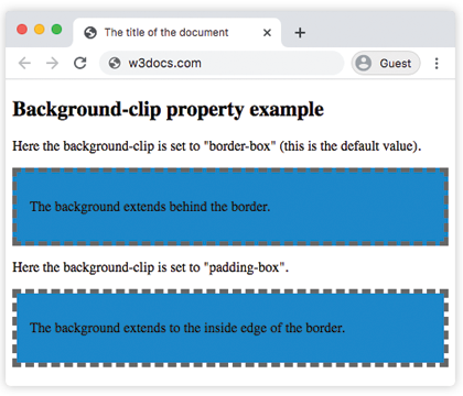
Example of the background-clip property with the "padding-box" and "border-box" values:
Example of CSS background-clip Property with border-box value
<!DOCTYPE html>
<html>
  <head>
    <title>The title of the document</title>
    <style>
      #example1 {
        border: 5px dashed #666;
        padding: 15px;
        background: #1c87c9;
        background-clip: border-box;
      }
      #example2 {
        border: 5px dashed #666;
        padding: 15px;
        background: #1c87c9;
        background-clip: padding-box;
      }
    </style>
  </head>
  <body>
    <h2>Background-clip property example</h2>
    <p>Here the background-clip is set to "border-box" (this is the default value).</p>
    <div id="example1">
      <p>The background extends behind the border.</p>
    </div>
    <p>Here the background-clip is set to "padding-box".</p>
    <div id="example2">
      <p>The background extends to the inside edge of the border.</p>
    </div>
  </body>
</html>The text value clips the background so it is only visible through the shape of the foreground text. To see the background instead of solid letters, set color: transparent (or a semi-transparent color) so the text itself does not cover the background. This is the standard technique for gradient-filled headings.
Browser support: the
textvalue still needs the-webkit-background-clip: textprefix in most browsers. Always declare both-webkit-background-clip: text;andbackground-clip: text;together, as the example below does.
Example of the background-clip property with the "text" value:
Example of CSS background-clip Property with text value
<!DOCTYPE html>
<html>
  <head>
    <title>The title of the document</title>
    <style>
      #example {
        border: 3px dashed #1ebf42;
        padding: 15px;
        background: #1c87c9;
        background-clip: text;
        -webkit-background-clip: text;
        color: transparent;
      }
    </style>
  </head>
  <body>
    <h2>Background-clip property example</h2>
    <p>Here the background-clip is set to "text"</p>
    <div id="example">
      <p>The background is painted within the foreground text.</p>
    </div>
  </body>
</html>background-clip vs background-origin
These two properties are easy to confuse because they share the same box keywords (border-box, padding-box, content-box):
- background-origin sets where the background image's positioning area begins — the reference box for
background-positionand a non-coverbackground-size. background-clipsets where the painted background is cut off — anything outside this box is not shown.
A background can therefore start at the border edge (background-origin: border-box) but be clipped to the content edge (background-clip: content-box), so the part over the padding and border is hidden.
Values
| Value | Description | Play it |
|---|---|---|
| border-box | The background appears behind the border. This is the default value. | Play it » |
| padding-box | The background appears inside of the border. | Play it » |
| content-box | The background extends to the edge of the content box. | Play it » |
| text | The background is painted within the foreground text. | Play it » |
| initial | Sets the property to its default value. | Play it » |
| inherit | Inherits the property from its parent element. |