CSS min-width Property
Use the min-width CSS property to set the minimum width of the content area of an element.See property values with examples.
The min-width property sets the minimum width of an element. It prevents the width property's value from ever shrinking below the value you give to min-width, no matter how narrow the available space becomes.
This page covers what min-width does, how it interacts with width and max-width, the values it accepts (including the keyword min-content/max-content/fit-content), and the common flexbox gotcha that min-width solves.
How min-width interacts with width and max-width
When you use min-width together with the width and max-width properties, min-width acts as a lower bound. The browser computes the width, then clamps it into the range min-width … max-width:
- If
widthis smaller thanmin-width, the element is widened tomin-width. - If
widthis larger thanmax-width, the element is narrowed tomax-width.
In other words, min-width wins over a smaller width, and max-width wins over a larger min-width — min-width always takes precedence when the two conflict. This is what makes elements stay readable while still being responsive: the element can grow on wide screens but never collapse below a usable size.
A common real-world use is keeping a column, card, or button from becoming too narrow inside a flexbox or grid layout, where children would otherwise shrink to fit.
Negative length values are illegal — min-width accepts 0 or a positive length/percentage only.
| Initial Value | 0 |
|---|---|
| Applies to | All elements, but non-replaced inline elements, table rows, and row groups. |
| Inherited | No. |
| Animatable | Yes. Width is animatable. |
| Version | CSS2 |
| DOM Syntax | object.style.minWidth = "200px"; |
Syntax
min-width: <length> | <percentage> | min-content | max-content | fit-content | auto | initial | inherit;The property takes a CSS length (px, pt, em, rem, and so on), a percentage of the containing block, or one of the intrinsic-size keywords described in the Values table below.
Examples
Percentage value
When min-width is a percentage, it is resolved against the width of the containing block. Here width: 10px is overridden because the min-width of 70% is larger, so the element is widened to 70% of its parent:
<!DOCTYPE html>
<html>
  <head>
    <meta name="viewport" content="width=device-width, initial-scale=1.0">
    <title>Title of the document</title>
    <style>
      div {
        width: 10px;
        min-width: 70%;
        background-color: #1c87c9;
        color: #ffffff
      }
    </style>
  </head>
  <body>
    <div>The min-width of this text is defined as 70%.</div>
  </body>
</html>Result
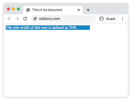
Fixed length value
In this example a min-width of 10cm is given to an inline-block element. It is compared with a plain span that has min-width: 0, so you can see how the floor forces the second box to stay at least 10cm wide even though its text is short:
<!DOCTYPE html>
<html>
  <head>
    <meta name="viewport" content="width=device-width, initial-scale=1.0">
    <title>Title of the document</title>
    <style>
      span {
        background-color: #ccc;
        min-width: 0;
      }
      .example {
        min-width: 10cm;
        display: inline-block;
      }
    </style>
  </head>
  <body>
    <h2>Min-width property example</h2>
    <h3>Min-width: 0:</h3>
    <span>Minimum width is set to 0.</span>
    <h3>min-width: 10cm:</h3>
    <span class="example">Minimum width is set to 10cm.</span>
  </body>
</html>The min-width: 0 flexbox gotcha
By default, a flex item cannot shrink below the size of its content — its implied min-width is auto, not 0. This is why long words, code blocks, or <pre> elements inside a flex container can overflow and stretch the whole layout instead of wrapping or scrolling.
The fix is to set min-width: 0 explicitly on the flex item so it is allowed to shrink past its content size:
.flex-item {
  min-width: 0; /* allow this item to shrink below its content width */
  overflow: hidden; /* or use overflow-x: auto for scrollable content */
}See overflow and flex for more on controlling how shrunken content behaves.
Values
| Value | Description | Play it |
|---|---|---|
length | Defines a minimum width in px, pt, cm, em, etc. Default value is 0. | Play it » |
% | Sets the minimum width as a percentage of the containing element's width. | Play it » |
min-content | The smallest width the content can take without overflowing (e.g. the longest word). | |
max-content | The width the content would take if it never wrapped. | |
fit-content | Uses the available space, but never more than max-content. | |
auto | The default — resolves to 0 for most elements, but to the content size for flex items. | |
initial | Makes the property use its default value (0). | Play it » |
inherit | Inherits the property from its parent element. |
Related properties
width— set the preferred width thatmin-widthclamps.max-width— set the upper bound of the width range.min-height— the vertical counterpart ofmin-width.box-sizing— controls whether padding and borders count toward the width.