CSS border-image-slice Property
The CSS border-image-slice property specifies how to slice the image specified by border-image-source into nine regions.
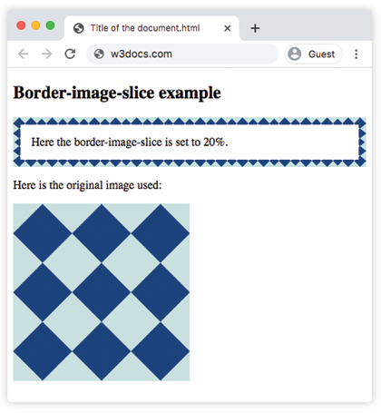
The CSS border-image-slice property defines how to cut up the image set by border-image-source so the browser can use the pieces as a border. The image is sliced into nine regions: four corners, four edges, and a middle part. It is one of the CSS3 properties.
Think of two horizontal lines and two vertical lines drawn across the source image. Where they cross, they carve the picture into a 3×3 grid. The four corner tiles are placed at the corners of the element's border, the four edge tiles are stretched or repeated along each side (controlled by border-image-repeat), and the center tile is discarded by default — it stays fully transparent unless you add the fill keyword, in which case it is drawn behind the content like a background image.
border-image-slice is the property that decides where those four lines fall. On its own it does nothing visible; it always works together with border-image-source and a non-zero border-width (or the border-image-width of the shorthand). That is why every example below also sets a transparent border and uses the border-image shorthand to supply the source.
How the values work
The property accepts a number, a percentage, and an optional fill keyword:
- number — an edge offset measured in pixels for raster images (PNG, JPEG) and in coordinates for vector images (SVG). Note: the number is unitless here — write
30, not30px. - percentage — an edge offset as a percentage of the source image's size (its width for the left/right slices, its height for the top/bottom slices).
- fill — keeps and displays the middle region instead of dropping it.
You can give one to four offset values. Negative values are not allowed, and offsets larger than the image are clamped. The values follow the standard CSS edge order:
| Values given | Meaning |
|---|---|
20% | All four sides sliced the same distance. |
30 50 | Top & bottom = 30; left & right = 50. |
30 50 10 | Top = 30; left & right = 50; bottom = 10. |
30 50 10 5 | Top = 30; right = 50; bottom = 10; left = 5 (clockwise from top). |
When would I use it?
Use border-image-slice whenever you build a decorative frame from a single image — ornate borders, ribbon edges, comic-style panels, or rounded "bubble" graphics that must scale to any element size without distorting the corners. By slicing the corners away from the stretchable middle of the edges, the corners stay crisp at any element width while the sides repeat or stretch to fit.
| Initial Value | 100%. |
|---|---|
| Applies to | All elements. It also applies to ::first-letter. |
| Inherited | No. |
| Animatable | No. |
| Version | CSS3 |
| DOM Syntax | object.style.borderImageSlice = "10%"; |
Syntax
Syntax of CSS border-image-slice Property
border-image-slice: number | % | fill | initial | inherit;Example of the border-image-slice property:
Example of CSS border-image-slice Property with %(percentage) value
<!DOCTYPE html>
<html>
  <head>
    <style>
      .border {
        border: 10px solid transparent;
        padding: 15px;
        border-image: url("/uploads/media/default/0001/01/812bf6a749522b8185c1beee20dd99dd6c6c87da.jpeg") round;
        border-image-slice: 20%;
      }
    </style>
  </head>
  <body>
    <h2>Border-image-slice example</h2>
    <p class="border">Here the border-image-slice is set to 20%.</p>
    <p>Here is the original image used:</p>
    <img src="/uploads/media/default/0001/01/812bf6a749522b8185c1beee20dd99dd6c6c87da.jpeg" style="width:50%" />
  </body>
</html>Result
In the next example two values are used. The first value (30) creates slices measured from the top and bottom, and the second value (50) creates slices measured from the left and right.
Example of the border-image-slice property with two values:
Example of CSS border-image-slice Property with two values
<!DOCTYPE html>
<html>
  <head>
    <style>
      .border {
        border: 10px solid transparent;
        padding: 15px;
        border-image: url("/uploads/media/default/0001/01/812bf6a749522b8185c1beee20dd99dd6c6c87da.jpeg") round;
        border-image-slice: 30 50;
      }
    </style>
  </head>
  <body>
    <h2>Border-image-slice example</h2>
    <p class="border">Here the border-image-slice is set to 30 and 50.</p>
    <p>Here is the original image used:</p>
    <img src="/uploads/media/default/0001/01/812bf6a749522b8185c1beee20dd99dd6c6c87da.jpeg" style="width:50%" />
  </body>
</html>In the following example the % value is combined with the fill keyword, so the discarded middle region of the image is also drawn behind the paragraph's content.
Example of the border-image-slice property with the "%" and "fill" values:
Example of CSS border-image-slice Property with percentage and fill values
<!DOCTYPE html>
<html>
  <head>
    <style>
      .border {
        border: 10px solid transparent;
        padding: 15px;
        border-image: url("/uploads/media/default/0001/01/812bf6a749522b8185c1beee20dd99dd6c6c87da.jpeg") round;
        border-image-slice: 15% fill;
      }
    </style>
  </head>
  <body>
    <h2>Border-image-slice example</h2>
    <p class="border"><strong>Here the border-image-slice is set to 15 fill.</strong></p>
    <p>Here is the original image used:</p>
    <img src="/uploads/media/default/0001/01/812bf6a749522b8185c1beee20dd99dd6c6c87da.jpeg" style="width:50%" />
  </body>
</html>Values
| Value | Description | Play it |
|---|---|---|
| number | Represents an edge offset in pixels for raster images and coordinates for vector images. | Play it » |
| % | Represents an edge offset as a percentage of the source image's size. | Play it » |
| fill | Makes the middle part of the image to be displayed as a background image. | Play it » |
| initial | Sets the property to its default value. | |
| inherit | Inherits the property from its parent element. |
Related properties
border-image-slice is one of several longhands that make up the border-image shorthand. To get a complete picture of how border images are built, see also:
- border-image-source — sets the image to slice.
- border-image-width — sets how wide the border-image area is.
- border-image-repeat — controls how edge slices stretch, repeat, or round.
- border-image-outset — pushes the border image beyond the border box.