CSS border-style Property
This CSS property will help you to set the style of all four side elements of the border. Learn more about its values and see examples.
The CSS border-style property sets the line style of all four sides of an element's border at once — for example solid, dashed, or dotted. This page explains every value, how the one-to-four-value shorthand maps to each side, and the gotchas worth knowing before you ship a border.
border-style is a shorthand for the four individual side properties: border-top-style, border-bottom-style, border-left-style, and border-right-style.
Why it matters
A border only becomes visible once it has a style. This is the most common beginner trap: if you set border-width and border-color but leave border-style at its default of none, nothing renders — the browser reserves no space and paints no line. So border-style is effectively the switch that turns a border on. In most real code you set all three at once with the border shorthand (e.g. border: 1px solid #1c87c9;), but reaching for border-style directly is useful when you want a different line style per side, or when you change only the style on hover/focus while keeping the width fixed (which avoids layout shift).
The border is painted on top of the element's background and the value is not inherited and not animatable.
How the one-to-four-value shorthand works
border-style accepts one to four values, so each side can have its own style:
- One value — applied to all four sides.
- Two values — first is top and bottom; second is left and right.
- Three values — first is top; second is left and right; third is bottom.
- Four values — top, right, bottom, left, in clockwise order (a handy mnemonic: TRouBLe).
A quick note on browser support: every modern browser supports all the values below. The 3D styles (groove, ridge, inset, outset) render their effect from the border-color, so they look subtle on light colors and disappear entirely when the color is black or very dark.
| Initial Value | none |
|---|---|
| Applies to | All elements. It also applies to ::first-letter. |
| Inherited | No. |
| Animatable | No. |
| Version | CSS1 |
| DOM Syntax | object.style.borderStyle = "dotted double"; |
Syntax
Syntax of CSS border-style Property
border-style: none |hidden | dotted | dashed | solid | double | groove | ridge | inset | outset | initial |inherit;Example of the border-style property:
Example of CSS border-style Property with dotted value
<!DOCTYPE html>
<html>
  <head>
    <title>Title of the document</title>
    <style>
      p {
        border-style: dotted;
        padding: 5px;
      }
    </style>
  </head>
  <body>
    <p> Example of dotted border-style.</p>
  </body>
</html>Example of the border-style property where each side has its own value:
Example of CSS border-style Property with double, solid, dashed and dotted values
<!DOCTYPE html>
<html>
  <head>
    <title>Title of the document</title>
    <style>
      p {
        border-width: 4px;
        border-style: double solid dashed dotted;
        border-color: #1c87c9;
        color: #8ebf42;
        padding: 5px;
      }
    </style>
  </head>
  <body>
    <p>Example, where each side has own value.</p>
  </body>
</html>Result
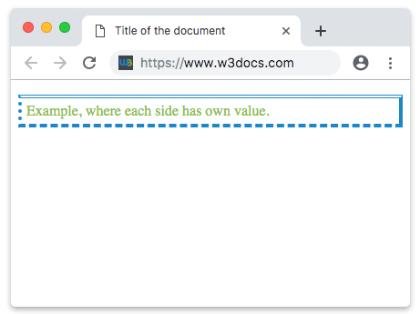
Example of the border-style property with all the values:
Example of CSS border-style Property with hidden, double, solid, dashed ,dotted, groove,ridge, inset and outset values
<!DOCTYPE html>
<html>
  <head>
    <title>Title of the document</title>
    <style>
      body {
        background: #eee;
        font-size: 20px;
        text-align: center;
      }
      main div {
        display: flex;
        align-items: center;
        justify-content: center;
        color: black;
        padding-top: 30px;
        padding-bottom: 30px;
        width: 200px;
        height: 100px;
        margin: 15px;
        font-weight: bold;
        background-color: #c9c5c5;
        border: 8px solid #1c87c9;
      }
      .flex-center {
        display: flex;
        justify-content: center;
      }
      /* border-style example classes */
      .b1 {
        border-style: hidden;
      }
      .b2 {
        border-style: dotted;
      }
      .b3 {
        border-style: dashed;
      }
      .b4 {
        border-style: solid;
      }
      .b5 {
        border-style: double;
      }
      .b6 {
        border-style: groove;
      }
      .b7 {
        border-style: ridge;
      }
      .b8 {
        border-style: inset;
      }
      .b9 {
        border-style: outset;
      }
    </style>
  </head>
  <body>
    <h1>Border-style value examples</h1>
    <main class="flex-center">
      <div class="b1">
        hidden
      </div>
      <div class="b2">
        dotted
      </div>
      <div class="b3">
        dashed
      </div>
    </main>
    <main class="flex-center">
      <div class="b4">
        solid
      </div>
      <div class="b5">
        double
      </div>
      <div class="b6">
        groove
      </div>
    </main>
    <main class="flex-center">
      <div class="b7">
        ridge
      </div>
      <div class="b8">
        inset
      </div>
      <div class="b9">
        outset
      </div>
    </main>
  </body>
</html>Values
| Value | Description | Play it |
|---|---|---|
| none | Will show no border. Default value. | Play it » |
| hidden | The same as "none", except in border conflict resolution for table elements. | Play it » |
| dotted | The border is specified as a series of dots. | Play it » |
| dashed | The border is specified as a series of dashes. | Play it » |
| solid | The border is specified as a solid lines. | Play it » |
| double | The border is specified as a double solid lines. | Play it » |
| groove | It’s a 3D grooved border and gives the impression that the border is carved. Opposite of ridge. | Play it » |
| ridge | Specifies a 3D ridged border and gives the impression of extruded appearance. Opposite of groove. | Play it » |
| inset | It’s a 3D effect that make impression that the element appear embedded. Opposite of outset. | Play it » |
| outset | It’s a 3D effect that make impression that the element appear embossed. Opposite of inset. | Play it » |
| initial | Sets the property to its default value. | Play it » |
| inherit | Inherits the property from its parent element. |
Common gotchas
- No style means no border. With
border-style: none(the default),border-widthandborder-colorhave no visible effect. Always set a style. hiddenvsnone. They look identical on a normal box. The difference only appears in tables: in border-conflict resolution,hiddenwins and suppresses the neighboring cell's border, whilenonehas the lowest priority.groove,ridge,inset, andoutsetneed a colored, multi-pixel border. Their 3D illusion is built from lighter/darker shades ofborder-color, so use a width of at least2px–4pxand avoid pure black or white.- Changing only
border-stylekeeps the box size stable because the width is unchanged — useful for hover/focus states that swapdashedforsolidwithout nudging the layout.
Related properties
- border — set width, style, and color in one declaration.
- border-width and border-color — the other two pieces of a border.
- border-radius — round the corners of a styled border.
- outline-style — the same line styles for outlines (which sit outside the border and don't affect layout).