CSS border-top-style Property
CSS border-top-style property is used to specify the style of an element's top border. See all property values shown with examples.
The CSS border-top-style property sets the line style of an element's top border — whether it is drawn as a solid line, a dashed line, a 3D groove, and so on.
It accepts a single keyword chosen from the same set of values available to the border-style shorthand. The difference is scope: border-style sets the style of all four sides at once, while border-top-style targets only the top edge. The matching per-side properties for the other edges are border-right-style, border-bottom-style, and border-left-style.
When to use it
Reach for border-top-style when you want one edge to look different from the rest — for example, a dotted divider above a footer, a dashed line over a "read more" block, or a single solid rule across the top of a card while the other sides stay borderless. If you need the same style on all sides, the border-style shorthand is shorter.
A border is only painted when its style is set. By default border-top-style is none, so even if you set a top color or width, nothing shows until you give the top edge a style. The default width of a visible top border is medium; change it with border-top-width or the border-width shorthand, and set its color with border-color.
Rendering is not pixel-identical across browsers. For instance, Chrome draws dotted borders as small squares rather than round dots, and the spacing of dots and dashes is left to each engine.
The specification does not specify the amount of spacing between the dots and the dashes.
The specification does not define how borders of different styles connect in the corners.
| Default Value | none |
|---|---|
| Applies to | All elements. It also applies to ::first-letter. |
| Inherited | No |
| Animatable | No |
| Version | CSS1 |
| DOM Syntax | object.style.borderTopStyle = "dashed"; |
Syntax
Syntax of CSS border-top-style Property
border-top-style: none | hidden | dotted | dashed | solid | double | groove | ridge | inset | outset | initial | inherit;Example of the border-top-style property:
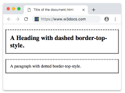
Example of CSS border-top-style Property with dashed and dotted values
<!DOCTYPE html>
<html>
  <head>
    <style>
      h2,
      p {
        padding: 15px;
        border: solid #666;
      }
      h2 {
        border-top-style: dashed;
      }
      p {
        border-top-style: dotted;
      }
    </style>
  </head>
  <body>
    <h2>A Heading with dashed border-top-style.</h2>
    <p>A paragraph with dotted border-top-style.</p>
  </body>
</html>Depending on the value of the border-color, the effects of groove, ridge, inset and outset values can be changed.
Result
Example of the border-top-style property with all style values:
Example of CSS border-top-style Property with hidden, dotted, dashed, solid, double, groove, ridge, inset and outset values
<!DOCTYPE html>
<html>
  <head>
    <title>Title of the document</title>
    <style>
      body {
        background: #1c87c9;
        font-size: 20px;
        text-align: center;
      }
      main div {
        display: flex;
        align-items: center;
        justify-content: center;
        color: black;
        padding-top: 30px;
        padding-bottom: 30px;
        width: 200px;
        height: 100px;
        margin: 15px;
        font-weight: bold;
        background-color: #c9c5c5;
        border: 10px solid;
      }
      .flex-center {
        display: flex;
        justify-content: center;
      }
      /* border-top-style example classes */
      .b1 {
        border-top-style: hidden;
      }
      .b2 {
        border-top-style: dotted;
      }
      .b3 {
        border-top-style: dashed;
      }
      .b4 {
        border-top-style: solid;
      }
      .b5 {
        border-top-style: double;
      }
      .b6 {
        border-top-style: groove;
      }
      .b7 {
        border-top-style: ridge;
      }
      .b8 {
        border-top-style: inset;
      }
      .b9 {
        border-top-style: outset;
      }
    </style>
  </head>
  <body>
    <h1>Border-top-style value examples</h1>
    <main class="flex-center">
      <div class="b1">
        hidden
      </div>
      <div class="b2">
        dotted
      </div>
      <div class="b3">
        dashed
      </div>
    </main>
    <main class="flex-center">
      <div class="b4">
        solid
      </div>
      <div class="b5">
        double
      </div>
      <div class="b6">
        groove
      </div>
    </main>
    <main class="flex-center">
      <div class="b7">
        ridge
      </div>
      <div class="b8">
        inset
      </div>
      <div class="b9">
        outset
      </div>
    </main>
  </body>
</html>The groove, ridge, inset, and outset values create a fake 3D effect by lightening and darkening the border-color. On a solid or single-color background they can look almost flat — the effect is most visible with a mid-tone color and a border at least a few pixels thick.
Values
| Value | Description | Play it |
|---|---|---|
| none | Defines that there won't be any border. Default value. | Play it » |
| hidden | Is the same with "none" except in border conflict resolution for table elements. | Play it » |
| dotted | Defines a dotted border. | Play it » |
| dashed | Defines a dashed border. | Play it » |
| double | Defines a double border. | Play it » |
| solid | Defines a solid border. | Play it » |
| groove | Defines a 3D grooved border. Its effect can be changed with the value of border-color. | Play it » |
| ridge | Defines a 3D ridged border. Its effect can be changed with the value of border-color. | Play it » |
| inset | Defines a 3D inset border. Its effect can be changed with the value of border-color. | Play it » |
| outset | Defines a 3D outset border. Its effect can be changed with the value of border-color. | Play it » |
| initial | Sets the property to its default value. | Play it » |
| inherit | Inherits the property from its parent element. |
Related properties
- border-style — set the style of all four sides at once.
- border-top — shorthand for the top border's width, style, and color.
- border-top-width — control the thickness of the top border.
- border-color — set the color the style is drawn in.
- border-right-style, border-bottom-style, border-left-style — the matching per-side properties.