CSS width Property
The width CSS property sets the width of the element. Try examples with each of this property’s value.
The CSS width property sets the width of an element's content area — the inner box that holds text and child elements. By default this width does not include the border, padding or margin: those are added on top, so the element's total rendered width is width + padding + border.
This page covers what width measures, every value it accepts (including the modern intrinsic keywords min-content, max-content and fit-content), how percentages are resolved, and the box-model gotcha that trips up most beginners.
How width interacts with the box model
How width is measured depends on the box-sizing property:
content-box(the default) —widthsizes only the content. Padding and border are added outside it. A box withwidth: 200px; padding: 20px; border: 5px solidrenders 250px wide.border-box—widthsizes the content, padding and border together. The same declarations render exactly 200px wide, and the content area shrinks to make room.
Because border-box makes element sizes predictable, many stylesheets set it globally:
*,
*::before,
*::after {
  box-sizing: border-box;
}Which elements width applies to
The width property applies to all elements except non-replaced inline elements (such as a plain <span>), table rows, and row groups (i.e. <thead>, <tfoot> and <tbody>). To give an inline element a width, set display: inline-block or display: block first.
The property takes a CSS length (px, pt, em, and so on), a percentage, or a keyword such as auto or max-content.
A percentage is resolved against the width of the parent element (the containing block). For absolutely positioned elements, the percentage is calculated relative to the width of the containing block's padding box.
The width property can be overridden by min-width and max-width: a max-width smaller than width wins, and a min-width larger than width wins. The companion property is height.
Negative length values are illegal.
| Initial Value | auto |
|---|---|
| Applies to | All elements except non-replaced inline elements, table rows, and row groups. |
| Inherited | No. |
| Animatable | Yes. The width of an element is animatable. |
| Version | CSS1 |
| DOM Syntax | Object.style.width = "300px"; |
Syntax
Syntax of CSS width Property
width: auto | length | percentage | initial | inherit | fit-content | min-content | max-content | stretch;Example of the width property specified in “%”:
Example of CSS width Property with % value
<!DOCTYPE html>
<html>
  <head>
    <title>Title of the document</title>
    <style>
      div {
        width: 50%;
        background-color: #1c87c9;
      }
    </style>
  </head>
  <body>
    <h2>Width property example</h2>
    <div>
      Lorem Ipsum is simply dummy text of the printing and typesetting industry. Lorem Ipsum has been the industry's standard dummy text ever since the 1500s, when an unknown printer took a galley of type and scrambled it to make a type specimen book.
    </div>
  </body>
</html>Result
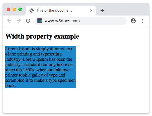
In the given example, the width of the div container is 50% — half the width of its parent (here, the <body>).
In the following example, the width of the first element is 250px and the one of the second element is 25em:
Example of the width property specified in “px” and “em”:
Example of CSS width Property with px and em values
<!DOCTYPE html>
<html>
  <head>
    <title>Title of the document</title>
    <style>
      div.t1 {
        width: 250px;
        border: 1px solid black;
        background-color: #1c87c9;
      }
      div.t2 {
        width: 25em;
        border: 1px solid black;
        background-color: #8ebf42;
      }
    </style>
  </head>
  <body>
    <h2>Width property example</h2>
    <h3>width: 250px</h3>
    <div class="t1">
      Lorem Ipsum is dummy text of the printing and typesetting industry. Lorem Ipsum has been the industry's standard dummy text ever since the 1500s when an unknown printer took a galley of type and scrambled it to make a type specimen book. It has survived not only five centuries, but also the leap into electronic typesetting, remaining essentially unchanged. It was popularised in the 1960s with the release of Letraset sheets containing Lorem Ipsum passages, and more recently with desktop publishing software like Aldus PageMaker including versions of Lorem Ipsum.
    </div>
    <h3>width: 25em</h3>
    <div class="t2">
      Lorem Ipsum is simply dummy text of the printing and typesetting industry. Lorem Ipsum has been the industry's standard dummy text ever since the 1500s when an unknown printer took a galley of type and scrambled it to make a type specimen book. It has survived not only five centuries, but also the leap into electronic typesetting, remaining essentially unchanged. It was popularised in the 1960s with the release of Letraset sheets containing Lorem Ipsum passages, and more recently with desktop publishing software like Aldus PageMaker including versions of Lorem Ipsum.
    </div>
  </body>
</html>Intrinsic sizing keywords
Besides fixed lengths and percentages, width accepts keywords that size an element to its content rather than to its container:
max-content— the width the content wants if it never wrapped. For a paragraph, that is the full text on one line.min-content— the smallest width without overflowing, i.e. the width of the longest unbreakable word.fit-content— grows with the content likemax-contentbut never exceeds the available space, so it wraps once it hits the container edge. Ideal for "shrink-to-fit" boxes such as buttons or badges.
<!DOCTYPE html>
<html>
  <head>
    <title>Title of the document</title>
    <style>
      div {
        border: 2px solid #1c87c9;
        margin-bottom: 10px;
        padding: 5px;
      }
      .min { width: min-content; }
      .max { width: max-content; }
      .fit { width: fit-content; }
    </style>
  </head>
  <body>
    <div class="min">width: min-content</div>
    <div class="max">width: max-content</div>
    <div class="fit">width: fit-content</div>
  </body>
</html>The min-content box is as narrow as the longest word, the max-content box stretches to fit the whole line, and the fit-content box sits between the two depending on the available space.
Values
| Value | Description | Play it |
|---|---|---|
| auto | The browser will calculate a width for the specified element. This is the default value. | Play it » |
| length | Defines width in px, pt, cm, etc. | Play it » |
| percentage | Defines width in percent of the containing element. | Play it » |
| initial | Makes the property use its default value. | Play it » |
| inherit | Inherits the property from its parent element. | |
| fit-content | Calculates width based on the intrinsic size of the content. | Play it » |
| min-content | Calculates width based on the minimum content size. | Play it » |
| max-content | Calculates width based on the maximum content size. | Play it » |
| stretch | Stretches the element to fill the container. | Play it » |
Common pitfalls
- A percentage width with no defined parent width. If the parent's width is
auto, a percentage may not resolve as you expect. Give the containing block an explicit width (or rely on a block element's natural full width). - Padding and border blow out the layout. Under the default
content-box, adding padding to a 100%-wide element makes it overflow its parent. Switch tobox-sizing: border-boxto keep the total at 100%. widthon inline elements is ignored. Setdisplay: inline-blockorblockfirst.- Responsiveness. Prefer
max-widthover a fixedwidthfor fluid layouts:max-width: 600pxlets a box shrink on small screens while capping it on large ones.