CSS outline-offset Property
The outline-offset CSS property is used to define the width of space between outline and border of an element. See property values and examples.
The outline-offset property specifies the amount of space between an element's outline and its border edge. The space added by outline-offset is always transparent, so the page background (or whatever is behind the element) shows through the gap.
This page covers what outline-offset does, how positive and negative values behave, when you'd reach for it, and the gotchas to watch out for.
How outlines differ from borders
outline-offset only makes sense once you understand how outlines behave, because they work very differently from borders:
- An outline is drawn outside the element's border edge — by default it sits flush against the border.
- An outline does not take up space in the layout, so adding or offsetting one never shifts surrounding elements.
- An outline can be non-rectangular (for example, it wraps each line of a multi-line inline element).
Because an outline doesn't affect layout, outline-offset is a safe way to push the outline away from (or into) the element without reflowing the page. This property is one of the CSS3 properties.
It is not part of the outline shorthand property. Unlike outline-style, outline-color, and outline-width, outline-offset must always be set as its own declaration.
| Initial Value | 0 |
|---|---|
| Applies to | All elements. |
| Inherited | No. |
| Animatable | Yes. Width of space is animatable. |
| Version | CSS3 |
| DOM Syntax | object.style.outlineOffset = "20px"; |
Syntax
CSS outline-offset syntax
outline-offset: length | initial | inherit;Example of the outline-offset property:
CSS outline-offset code example
<!DOCTYPE html>
<html>
  <head>
    <title>Title of the document</title>
    <style>
      div.ex1 {
        margin: 20px;
        border: 2px dotted #000;
        background-color: #8ebf42;
        outline: 4px solid #666;
        outline-offset: 10px;
      }
    </style>
  </head>
  <body>
    <h2>Outline-offset property example</h2>
    <div class="ex1">The outline-offset is 10px</div>
  </body>
</html>Result
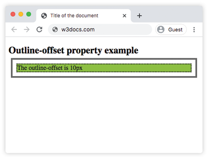
In the example above the space between the outline and the border is 10px, and the page background shows through that transparent gap.
Negative values
outline-offset also accepts negative lengths. A negative offset pulls the outline inward, so it is drawn over the element's padding/content instead of around it:
outline-offset: -5px; /* outline moves 5px inside the border edge */This is handy when you want a focus ring that sits inside a tightly packed element (for example, a button flush against a container edge) without the outline being clipped by an ancestor with overflow: hidden. A negative offset larger than the element makes the outline collapse and disappear.
When to use it
- Spaced focus rings. Pair
:focus-visiblewith a small positive offset so the keyboard-focus ring doesn't crowd the element. Never remove the outline entirely without providing a replacement — it's the primary affordance for keyboard users. - Decorative "double border" effects without adding a second element, since the offset gap reveals the background.
- Avoiding clipped rings inside scroll containers, by using a small negative offset.
Values
| Value | Description |
|---|---|
| length | Space between the outline and the border edge of an element. Can be negative to draw the outline inside the border edge. The default value is 0. |
| initial | Sets the property to its default value. |
| inherit | Inherits the property from its parent element. |
Things to keep in mind
outline-offsetis not inherited — children don't pick it up automatically.- Percentages are not allowed; only
lengthunits (px,em,rem, etc.) work. - The offset only renders when an outline is actually visible, i.e. when outline-style is not
noneand the width is greater than zero. - The gap is transparent —
outline-offsetcannot be given its own color.