CSS clip-path Property
The clip-path CSS property creates a clipping region which shows the specified part of the element. Learn about the values and see examples.
The clip-path property defines a clipping region: the part of an element that stays visible. Everything outside that region is hidden — but the hidden area still occupies layout space, it is just not painted. This lets you cut elements into non-rectangular shapes (circles, hexagons, arrows, stars) without editing the underlying images or markup.
Unlike cropping a raster image in an editor, a clip-path is purely visual and reversible: the full element is still in the DOM, remains clickable only inside the clip, and can be animated between shapes.
This property accepts four kinds of values:
<clip-source>— aurl()pointing at an SVG<clipPath>element, for fully custom paths.<basic-shape>— a CSS shape function:circle(),ellipse(),inset(), orpolygon().<geometry-box>— the reference box the shape is measured against (border-box,padding-box,content-box, ormargin-box).none— no clipping; the whole element is shown (the default).
clip-path supersedes the deprecated, rectangle-only clip property. Prefer clip-path in all new code: clip only worked on absolutely positioned elements and could not produce non-rectangular shapes.
When to use clip-path
- Display avatars or thumbnails as circles or hexagons while keeping a square source image.
- Create angled or diagonal section dividers without extra background images.
- Reveal or hide content with an animated shape (since
<basic-shape>values are animatable). - Build decorative cut-outs, badges, and arrows from a single element.
For text flowing around a shape rather than clipping the element, use shape-outside instead.
| Initial Value | none |
|---|---|
| Applies to | All elements. |
| Inherited | No |
| Animatable | Yes, if specified for <basic-shape>. |
| Version | CSS Masking Module Level 1 |
| DOM Syntax | object.style.clipPath = "none"; |
Syntax
clip-path: <clip-source> | <basic-shape> | <geometry-box> | none | initial | inherit | unset;The basic-shape functions
These four functions cover almost every clipping need. Coordinates can use any CSS length or percentage; percentages are relative to the reference box.
circle(radius at cx cy)— a circle. Example:circle(50% at 50% 50%)inscribes the largest circle centered on the element.ellipse(rx ry at cx cy)— an ellipse with separate horizontal and vertical radii.inset(top right bottom left round <radius>)— a rectangle inset from each edge, with an optionalroundkeyword for rounded corners.polygon(x1 y1, x2 y2, …)— an arbitrary polygon defined by a list of vertex points, going clockwise.polygon(50% 0%, 100% 50%, 50% 100%, 0% 50%)produces a diamond.
For shapes you cannot express with these functions, reference an SVG <clipPath>: clip-path: url(#myClip).
Example of the clip-path property:
Example of CSS clip-path Property with basic-shape value
<!DOCTYPE html>
<html>
  <head>
    <title>The title of the document</title>
    <style>
      body {
        margin: 0;
        padding: 0;
        background-color: #eee;
      }
      .container {
        display: grid;
        grid-template-columns: 200px 200px 200px;
        grid-template-rows: 200px 200px 200px;
        grid-gap: 20px;
        justify-content: center;
      }
      .container div {
        background-image: url("/uploads/media/default/0001/01/b408569013c0bb32b2afb0f0d45e93e982347951.jpeg");
        background-position: center;
        background-size: cover;
        color: #000;
        font-size: 18px;
        font-family: sans-serif;
        display: flex;
        justify-content: center;
        align-items: center;
      }
      .example {
        clip-path: polygon(50% 0%, 100% 50%, 50% 100%, 0% 50%);
      }
    </style>
  </head>
  <body>
    <h1>Clip-path property example</h1>
    <div class="container">
      <div class="example">polygon</div>
    </div>
  </body>
</html>Result
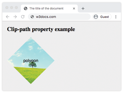
The square image is clipped to a diamond — its corners are hidden while the layout box stays 200×200.
Example of the clip-path property with all the values:
Example of CSS clip-path Property with global and basic-shape values
<!DOCTYPE html>
<html>
  <head>
    <title>Title of the document</title>
    <style>
      body {
        margin: 0;
        padding: 0;
        background-color: #eee;
      }
      .container {
        display: grid;
        grid-template-columns: 200px 200px 200px;
        grid-template-rows: 200px 200px 200px;
        grid-gap: 20px;
        justify-content: center;
      }
      .container > div {
        background-image: url(/uploads/media/default/0001/01/b408569013c0bb32b2afb0f0d45e93e982347951.jpeg);
        background-position: center;
        background-size: cover;
        color: #000;
        font-size: 18px;
        font-family: sans-serif;
        display: flex;
        justify-content: center;
        align-items: center;
      }
      .box1 {
        clip-path: none;
      }
      .box2 {
        clip-path: inset(25% 0 25% 0 round 0 25% 0 25%);
        /* values are from-top, from-right, from-bottom, from-left, and optional round keyword for border-radius */
      }
      .box3 {
        clip-path: circle(50% at 50% 50%);
      }
      .box4 {
        clip-path: polygon(50% 0%, 100% 50%, 50% 100%, 0% 50%);
      }
      .box5 {
        clip-path: ellipse(90px 50px at 100px 100px);
      }
      .box6 {
        clip-path: inherit;
      }
      .box7 {
        clip-path: initial;
      }
      .box8 {
        clip-path: unset;
      }
    </style>
  </head>
  <body>
    <h2>Clip-path property example</h2>
    <div class="container">
      <div class="box1">none</div>
      <div class="box2">inset</div>
      <div class="box3">circle</div>
      <div class="box4">polygon</div>
      <div class="box5">ellipse</div>
      <div class="box6">inherit</div>
      <div class="box7">initial</div>
      <div class="box8">unset</div>
    </div>
  </body>
</html>Animating clip-path
When both the start and end states use the same <basic-shape> function with the same number of points, browsers can smoothly interpolate between them. This makes shape reveals and morphs possible with a transition or an animation:
.reveal {
  clip-path: circle(0% at 50% 50%);
  transition: clip-path 0.4s ease;
}
.reveal:hover {
  clip-path: circle(75% at 50% 50%);
}A polygon() only animates to another polygon() with the same vertex count, so keep the point counts equal on both ends.
Browser support and tips
clip-pathwith<basic-shape>values is supported in all modern browsers. Older builds needed the-webkit-prefix; today an unprefixed declaration is enough for evergreen browsers.- The hidden area is removed only visually — it still affects layout and is not clickable, so the rest of the page is unaffected.
- A clip can hide outlines, box-shadows, and focus rings that fall outside the shape; verify keyboard focus remains visible.
Values
| Value | Description |
|---|---|
<clip-source> | The <url> referencing an SVG <clipPath> element. |
<basic-shape> | A basic shape function such as circle(), ellipse(), inset(), or polygon(). Can be combined with a <geometry-box> using a slash (/). |
<geometry-box> | Defines the reference box for the basic shape (e.g., border-box, padding-box, content-box, margin-box). |
| none | Clipping path is not created. |
Note: initial, inherit, and unset are global CSS values and can be used with any property.