CSS flex-flow Property
The flex-flow CSS property is a shorthand property for flex-wrap and flex-direction. Read about this property and try some examples.
The CSS flex-flow property is a shorthand that sets two flex-container properties at once: flex-direction (the axis along which items are laid out) and flex-wrap (whether items stay on one line or wrap onto several). Instead of writing both declarations, you combine them in a single line, which keeps your CSS shorter and the intent clearer.
This property belongs to the CSS3 properties and is part of the Flexible Box Layout module. It only affects an element whose display is set to flex or inline-flex; on a non-flex element it has no effect, and if a flex container has no flexible items there is nothing for it to lay out.
This page covers the syntax of flex-flow, what each value does, and runnable examples for every common direction-and-wrap combination.
What each value controls
flex-flow accepts one flex-direction value and one flex-wrap value, in any order:
flex-direction— the main axis and the order items follow along it:row(default) — left to right.row-reverse— right to left.column— top to bottom.column-reverse— bottom to top.
flex-wrap— what happens when items don't fit on one line:nowrap(default) — all items squeeze onto a single line and may shrink.wrap— items overflow onto new lines in the same direction.wrap-reverse— items wrap onto new lines in the opposite cross-axis direction.
Because the initial value is row nowrap, a flex container with no flex-flow set lays its items out in a single horizontal line.
Modern browsers support the flex-flow property natively without vendor prefixes.
| Initial Value | row nowrap |
|---|---|
| Applies to | Flex containers |
| Inherited | No. |
| Animatable | No. |
| Version | CSS3 |
| DOM Syntax | object.style.flexFlow = "column nowrap"; |
Syntax
Syntax of CSS flex-flow Property
flex-flow: <flex-direction> || <flex-wrap>;
/* or */ initial | inherit;When we set flex-flow: row wrap;, the first value defines the flex-direction and the second defines the flex-wrap property. The two values are order-independent because they accept different keywords, so flex-flow: wrap row; is equally valid. You may also supply just one of them — for example flex-flow: column; leaves flex-wrap at its default nowrap.
Example of CSS flex-flow Property
flex-flow: row wrap;The following code is the same as the code above.
Example of flex-direction and flex-wrap properties
flex-direction: row;
flex-wrap: wrap;Example of the flex-flow property with the "row" and "wrap" values:
<!DOCTYPE html>
<html>
  <head>
    <title>Title of the document</title>
    <style>
      .example {
        width: 200px;
        height: 200px;
        border: 1px solid #c3c3c3;
        display: flex;
        flex-flow: row wrap;
      }
      .example div {
        width: 50px;
        height: 50px;
      }
    </style>
  </head>
  <body>
    <h2>Flex-flow property example</h2>
    <div class="example">
      <div style="background-color: #8ebf42;">A</div>
      <div style="background-color: #1c87c9;">B</div>
      <div style="background-color: #cccccc;">C</div>
      <div style="background-color: #666666;">D</div>
      <div style="background-color: #4c4a4a;">E</div>
      <div style="background-color: #c6c4c4;">F</div>
    </div>
  </body>
</html>Example of the flex-flow property with the "wrap-reverse" and "column" values:
<!DOCTYPE html>
<html>
  <head>
    <title>Title of the document</title>
    <style>
      .example {
        width: 200px;
        height: 200px;
        border: 1px solid #c3c3c3;
        display: flex;
        flex-flow: column wrap-reverse;
      }
      .example div {
        width: 50px;
        height: 50px;
      }
    </style>
  </head>
  <body>
    <h2>Flex-flow property example</h2>
    <div class="example">
      <div style="background-color: #8ebf42;">A</div>
      <div style="background-color: #1c87c9;">B</div>
      <div style="background-color: #cccccc;">C</div>
      <div style="background-color: #666666;">D</div>
      <div style="background-color: #4c4a4a;">E</div>
      <div style="background-color: #c6c4c4;">F</div>
    </div>
  </body>
</html>Example of the flex-flow property with the "row" and "nowrap" values:
<!DOCTYPE html>
<html>
  <head>
    <title>Title of the document</title>
    <style>
      .example {
        width: 200px;
        height: 200px;
        border: 1px solid #c3c3c3;
        display: flex;
        flex-flow: row nowrap;
      }
      .example div {
        width: 50px;
        height: 50px;
      }
    </style>
  </head>
  <body>
    <h2>Flex-flow property example</h2>
    <div class="example">
      <div style="background-color: #8ebf42;">A</div>
      <div style="background-color: #1c87c9;">B</div>
      <div style="background-color: #cccccc;">C</div>
      <div style="background-color: #666666;">D</div>
      <div style="background-color: #4c4a4a;">E</div>
      <div style="background-color: #c6c4c4;">F</div>
    </div>
  </body>
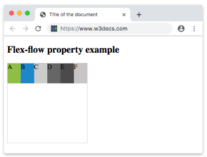
</html>Result
With flex-flow: row nowrap, all six items stay on a single horizontal line and shrink to fit the container instead of wrapping:
Example of the flex-flow property with the "row-reverse" and "nowrap" values:
<!DOCTYPE html>
<html>
  <head>
    <title>Title of the document</title>
    <style>
      .example {
        width: 200px;
        height: 200px;
        border: 1px solid #c3c3c3;
        display: flex;
        flex-flow: row-reverse nowrap;
      }
      .example div {
        width: 50px;
        height: 50px;
      }
    </style>
  </head>
  <body>
    <h2>Flex-flow property example</h2>
    <div class="example">
      <div style="background-color: #8ebf42;">A</div>
      <div style="background-color: #1c87c9;">B</div>
      <div style="background-color: #cccccc;">C</div>
      <div style="background-color: #666666;">D</div>
      <div style="background-color: #4c4a4a;">E</div>
      <div style="background-color: #c6c4c4;">F</div>
    </div>
  </body>
</html>Example of the flex-flow property with the "column" and "nowrap" values:
<!DOCTYPE html>
<html>
  <head>
    <title>Title of the document</title>
    <style>
      .example {
        width: 200px;
        height: 200px;
        border: 1px solid #c3c3c3;
        display: flex;
        flex-flow: column nowrap;
      }
      .example div {
        width: 50px;
        height: 50px;
      }
    </style>
  </head>
  <body>
    <h2>Flex-flow property example</h2>
    <div class="example">
      <div style="background-color: #8ebf42;">A</div>
      <div style="background-color: #1c87c9;">B</div>
      <div style="background-color: #cccccc;">C</div>
      <div style="background-color: #666666;">D</div>
      <div style="background-color: #4c4a4a;">E</div>
      <div style="background-color: #c6c4c4;">F</div>
    </div>
  </body>
</html>Example of the flex-flow property with the "column-reverse" and "nowrap" values:
<!DOCTYPE html>
<html>
  <head>
    <title>Title of the document</title>
    <style>
      .example {
        width: 200px;
        height: 200px;
        border: 1px solid #c3c3c3;
        display: flex;
        flex-flow: column-reverse nowrap;
      }
      .example div {
        width: 50px;
        height: 50px;
      }
    </style>
  </head>
  <body>
    <h2>Flex-flow property example</h2>
    <div class="example">
      <div style="background-color: #8ebf42;">A</div>
      <div style="background-color: #1c87c9;">B</div>
      <div style="background-color: #cccccc;">C</div>
      <div style="background-color: #666666;">D</div>
      <div style="background-color: #4c4a4a;">E</div>
      <div style="background-color: #c6c4c4;">F</div>
    </div>
  </body>
</html>Values
| Value | Description | Play it |
|---|---|---|
| flex-direction | Defines flexible items' direction. Possible values are: row row-reverse column column-reverse initial inherit | Play it » |
| flex-wrap | Defines whether flexible items should wrap or not. Possible values are: nowrap wrap wrap-reverse initial inherit | Play it » |
| initial | Makes the property use its default value. | Play it » |
| inherit | Inherits the property from its parents element. |
When to use flex-flow
Reach for flex-flow whenever you need to set both the direction and the wrapping behavior of a flex container. A common pattern is a responsive bar of items that should sit in a row on wide screens but wrap onto multiple lines on narrow ones — flex-flow: row wrap; handles that in one declaration. If you only ever change one of the two sub-properties, using the longhand flex-direction or flex-wrap directly can make the intent more obvious. For the full picture of how these fit together, see the ultimate guide to flexbox.