CSS text-overflow Property
Use the text-overflow CSS property to specify how the inline text that overflows should be signaled. See property values and try examples.
The CSS text-overflow property specifies how content that overflows its container is signaled to the user — typically by clipping it or replacing the hidden part with an ellipsis (…). It is one of the CSS3 properties.
This page covers the syntax and values, the three conditions a box must meet for text-overflow to take effect, how to truncate multiple lines, a common Flexbox gotcha, and a complete list of values.
Why three properties are needed together
On its own, text-overflow does nothing. It only describes how already-overflowing text should be rendered, so you first have to make the text overflow and hide the excess. For single-line truncation you need all three of the following on the same element:
white-space: nowrap— stops the text from wrapping, forcing it onto one line that runs past the box.overflow: hidden— clips the part that escapes the box (without this, the text would just be visible outside).text-overflow: ellipsis— tells the browser to mark the clipped text with an ellipsis instead of a hard cut.
If any one of these is missing the ellipsis will not appear. The box also needs a constrained width (or max-width) so there is actually something to overflow.
In CSS3 you can also supply a custom string in place of the ellipsis. A string value can contain whitespace, or you can use any other custom string. In older drafts of the specification a URL to an image could be used, but that was dropped.
| Initial Value | clip |
|---|---|
| Applies to | Block container elements. |
| Inherited | No. |
| Animatable | No. |
| Version | CSS3 |
| DOM Syntax | object.style.textOverflow = "ellipsis"; |
Syntax
CSS text-overflow values
text-overflow: clip | ellipsis | string | initial | inherit;Example of the text-overflow property:
CSS text-overflow code example
<!DOCTYPE html>
<html>
  <head>
    <title>Title of the document</title>
    <style>
      div {
        white-space: nowrap;
        background-color: #eee;
        width: 50px;
        overflow: hidden;
        text-overflow: ellipsis;
        border: 1px solid #666;
      }
    </style>
  </head>
  <body>
    <h2>Text-overflow property example</h2>
    <h3>text-overflow: ellipsis</h3>
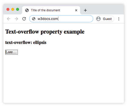
    <div>Lorem Ipsum</div>
  </body>
</html>Result
Example of the text-overflow property with the "clip", "ellipsis" and "initial" values:
CSS text-overflow clip, ellipsis values example
<!DOCTYPE html>
<html>
  <head>
    <title>Title of the document</title>
    <style>
      div.element1 {
        white-space: nowrap;
        background-color: #eee;
        width: 50px;
        overflow: hidden;
        text-overflow: clip;
        border: 1px solid #666;
      }
      div.element2 {
        white-space: nowrap;
        background-color: #eee;
        width: 50px;
        overflow: hidden;
        text-overflow: ellipsis;
        border: 1px solid #666;
      }
      div.element3 {
        white-space: nowrap;
        background-color: #eee;
        width: 50px;
        overflow: hidden;
        text-overflow: initial;
        border: 1px solid #666;
      }
    </style>
  </head>
  <body>
    <h2>Text-overflow property example</h2>
    <h3>text-overflow: clip</h3>
    <div class="element1">Lorem Ipsum</div>
    <h3>text-overflow: ellipsis</h3>
    <div class="element2">Lorem Ipsum</div>
    <h3>text-overflow: initial</h3>
    <div class="element3">Lorem Ipsum</div>
  </body>
</html>Truncating multiple lines
text-overflow: ellipsis only works on a single line. To clamp text to a fixed number of lines and add an ellipsis after the last one, use the -webkit-line-clamp approach. It is widely supported across modern browsers despite the vendor prefix:
<!DOCTYPE html>
<html>
  <head>
    <title>Title of the document</title>
    <style>
      div {
        width: 200px;
        background-color: #eee;
        border: 1px solid #666;
        display: -webkit-box;
        -webkit-box-orient: vertical;
        -webkit-line-clamp: 2;
        overflow: hidden;
      }
    </style>
  </head>
  <body>
    <h2>Clamp to two lines</h2>
    <div>
      Lorem ipsum dolor sit amet, consectetur adipiscing elit, sed do
      eiusmod tempor incididunt ut labore et dolore magna aliqua.
    </div>
  </body>
</html>Here you do not set white-space: nowrap, because the text needs to wrap before it is clamped.
Gotcha: Flexbox and Grid children
A flex or grid item has a default min-width of auto, which refuses to shrink below the content's intrinsic size. That stops overflow: hidden from kicking in, so the ellipsis never appears even though all three properties are set. The fix is to add min-width: 0 (or overflow: hidden) to the truncating item:
.flex-child {
  min-width: 0;        /* allow the item to shrink */
  white-space: nowrap;
  overflow: hidden;
  text-overflow: ellipsis;
}Values
| Value | Description | Play it |
|---|---|---|
clip | Cuts the text at the limit of the content area; truncation can happen in the middle of a character. This is the default value. | Play it » |
ellipsis | Renders an ellipsis ("...") to show the clipped text. Note: This only works on a single line of text. | Play it » |
<string> | Renders the given string to represent the clipped text. The string is displayed inside the content area. Note: Limited support in older browsers. | Play it » |
initial | Makes the property use its default value. | Play it » |
inherit | Inherits the property from its parent element. |