CSS transform-origin Property
How to use the transform-origin CSS property to change the transformed element’s position. See transform functions and try examples.
The CSS transform-origin property sets the point an element is transformed around — the pivot for rotations, the anchor for scaling, and the reference point for skewing.
By default, every transform happens around the element's center (50% 50%). Rotate a box and it spins on its own middle; scale it and it grows outward in all directions. transform-origin lets you move that pivot anywhere — to a corner, an edge, or even a point outside the box — so the same transform produces a completely different motion.
This page covers the syntax, how keyword / percentage / length values behave, the optional z-axis value for 3D, and worked examples you can run.
Why transform-origin matters
A rotation looks very different depending on where its pivot sits. Picture a clock hand: rotating it around its center sweeps a small circle, but rotating it around its base swings the tip across the whole face — same rotate(), different origin.
This is why transform-origin is essential for:
- Hinged or door-like motion — rotate around an edge instead of the center.
- Scaling from a corner — grow a menu out of its top-left instead of its middle.
- 3D card flips — pair it with the z-offset and perspective.
The transform-origin property only takes effect when a transform function is applied via the transform property — on its own it does nothing. It is one of the CSS3 properties.
Syntax recap
The value can be specified with:
- Offset keywords —
left,center,right,top,bottom(e.g.top left). - Lengths — measured from the element's top-left corner (e.g.
0 0,80px 40px). - Percentages — relative to the element's own size (e.g.
0% 0%is the top-left,100% 100%is the bottom-right).
When you give only one value, the second defaults to center. A third value sets the z-axis position and only matters for 3D transforms.
Historically, the -webkit- prefix was used for Safari, Chrome, and older Opera versions. Modern browsers no longer require vendor prefixes for this property.
| Initial Value | 50% 50% 0 |
|---|---|
| Applies to | Transformable elements. |
| Inherited | No. |
| Animatable | Yes. Degree is animatable. |
| Version | CSS3 |
| DOM Syntax | Object.style.transform-origin = "10% 30%"; |
Syntax
CSS transform-origin values
transform-origin: x-offset y-offset z-offset | initial | inherit;Example of the transform-origin property:
CSS transform-origin code example
<!DOCTYPE html>
<html>
  <head>
    <title>Title of the document</title>
    <style>
      .big {
        position: relative;
        height: 300px;
        width: 300px;
        margin: 80px;
        padding: 5px;
        border: 2px solid #666666;
        background-color: #eeeeee;
      }
      .little {
        padding: 60px;
        position: absolute;
        border: 2px solid #666666;
        background-color: #8ebf42;
        -webkit-transform: rotate(35deg);
        -webkit-transform-origin: 70% 90%;
        transform: rotate(35deg);
        transform-origin: 70% 90%;
      }
    </style>
  </head>
  <body>
    <h2>Transform-origin property example</h2>
    <div class="big">
      <div class="little">Box</div>
    </div>
  </body>
</html>Result
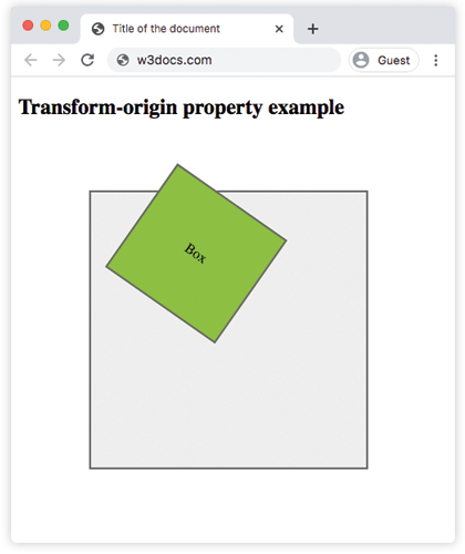
The little box is rotated 35°, but because transform-origin is 70% 90% (lower-right area), it pivots around that point rather than its center.
The next example rotates four identical boxes by the same 25deg and only changes transform-origin, so you can see side by side how each value moves the pivot.
Example of transform-origin with four values:
CSS transform-origin another code example
<!DOCTYPE html>
<html>
  <head>
    <title>Title of the document</title>
    <style>
      body {
        background-color: #eeeeee;
        font-size: 1.1em;
        font-family: 'Roboto', Helvetica, sans-serif;
      }
      .container {
        margin: 10px auto;
        max-width: 700px;
      }
      .wrap {
        width: 150px;
        height: 150px;
        border: 2px solid #666666;
        display: inline-block;
        margin: 100px;
      }
      .box {
        width: 150px;
        height: 150px;
        position: relative;
        color: #eeeeee;
        text-align: center;
        line-height: 150px;
        -webkit-transform: rotate(25deg);
        transform: rotate(25deg);
      }
      .a {
        background-color: #0747af;
      }
      .b {
        background-color: #40b530;
        -webkit-transform-origin: top left;
        transform-origin: top left;
      }
      .c {
        background-color: #666666;
        -webkit-transform-origin: 90% 120%;
        transform-origin: 90% 120%;
      }
      .d {
        background-color: #ffdb11;
        -webkit-transform-origin: 80px 40px;
        transform-origin: 80px 40px;
      }
    </style>
  </head>
  <body>
    <h2>Transform-origin property example</h2>
    <div class="container">
      <div class="wrap">
        <div class="box a">
          50% 50%
        </div>
      </div>
      <div class="wrap">
        <div class="box b">
          top left
        </div>
      </div>
      <div class="wrap">
        <div class="box c">
          90% 120%
        </div>
      </div>
      <div class="wrap">
        <div class="box d">
          80px 40px
        </div>
      </div>
    </div>
  </body>
</html>Reading the four boxes: 50% 50% spins on the center, top left pivots on the upper-left corner, 90% 120% uses a point below and right of the box, and 80px 40px measures the pivot in pixels from the top-left corner.
The z-offset for 3D transforms
The third value moves the pivot along the z-axis (toward or away from the viewer). It only has a visible effect with 3D transform functions such as rotateX() or rotateY(), and it must be a length — percentages are not allowed for the z value.
.card {
  /* pivot at the center, pushed 50px toward the viewer */
  transform: rotateY(45deg);
  transform-origin: center center 50px;
}For the 3D effect to be visible, the parent usually needs a perspective value (and you can shift the vanishing point with perspective-origin).
Values
| Value | Description |
|---|---|
x-offset | Specifies the horizontal position. Accepts keywords (left, center, right), lengths, or percentages. |
y-offset | Specifies the vertical position. Accepts keywords (top, center, bottom), lengths, or percentages. |
z-offset | Specifies the depth position along the z-axis for 3D transformations. Accepts length values. |
initial | Sets this property to its default value. |
inherit | Inherits this property from its parent element. |
Tips and gotchas
- It does nothing alone. If
transform-originseems to have no effect, check that the element also has atransformvalue — without one there is nothing to pivot around. - Percentages are relative to the element, not its parent:
100% 0%is the element's own top-right corner. - Order is x then y, so
top leftandleft topare equivalent (keywords are order-independent), but0% 100%(bottom-left) and100% 0%(top-right) are not. - Animate transforms, not the origin, for smooth motion. Changing
transform-originmid-animation makes the element jump, so set the origin once and animate the transition or animation ontransform.
Related properties
- transform — applies the rotation, scale, skew, or translate that the origin pivots around.
- perspective and perspective-origin — needed to see the z-axis origin in 3D.
- transition and animation — animate transforms over time.