CSS text-shadow Property
Use the text-shadow CSS property to specify the shadow of the text. See property values and try examples.
The CSS text-shadow property adds one or more shadows to the text of an element. It is one of the CSS3 properties and is widely used for subtle depth, glowing effects, and improving the legibility of text placed over busy backgrounds.
This page covers the syntax, every value, how to stack multiple shadows, common visual effects (drop shadow, glow, embossed text), accessibility notes, and how text-shadow differs from box-shadow.
How it works
A single shadow is described by 2 to 3 length values followed by an optional <color>:
- x-offset (first value, required) — the horizontal distance. A positive value moves the shadow to the right, a negative value to the left.
- y-offset (second value, required) — the vertical distance. A positive value moves the shadow down, a negative value up.
- blur-radius (third value, optional) — how soft the shadow is. Larger values mean a softer, more spread-out shadow. It cannot be negative; the default is
0(a sharp shadow). - color (optional) — the shadow color. If omitted, browsers fall back to the element's
colorvalue. You can pick from HTML colors and use names, hex,rgb(),rgba(),hsl()orhsla().
The x-offset and the y-offset are required; the blur-radius and color are optional. The color and the two offsets may be written in any order, but the offset values must stay in the order x, y, blur.
| Initial Value | none |
|---|---|
| Applies to | All elements. It also applies to ::first-letter and ::first-line. |
| Inherited | Yes. |
| Animatable | Yes. |
| Version | CSS3 |
| DOM Syntax | object.style.textShadow = "1px 3px 3px #8ebf42"; |
Syntax
Syntax of CSS text-shadow Property
text-shadow: h-shadow v-shadow [blur-radius] [color] | none | initial | inherit;Example of the text-shadow property:
Example of CSS text-shadow Property
<!DOCTYPE html>
<html>
  <head>
    <title>Title of the document</title>
    <style>
      .shadow {
        text-shadow: 2px 2px #1c87c9;
      }
    </style>
  </head>
  <body>
    <h2>Text-shadow property example</h2>
    <p>Some paragraph for example.</p>
    <p class="shadow">Some paragraph with the text-shadow property.</p>
  </body>
</html>Result
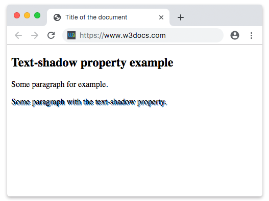
Example of the text-shadow property with the “x-offset”, “y-offset”, “blur-radius” and “color” values:
Example of CSS text-shadow Property where the x-offset, y-offset, blur-radius and color are specified
<!DOCTYPE html>
<html>
  <head>
    <style>
      p {
        text-shadow: 5px 3px 2px #8ebf42;
        font: 1em Roboto, Helvetica, sans-serif;
      }
    </style>
  </head>
  <body>
    <h2>Text-shadow property example</h2>
    <p>Lorem Ipsum is simply dummy text of the printing and typesetting industry. Lorem Ipsum has been the industry's standard dummy text ever since the 1500s, when an unknown printer took a galley of type and scrambled it to make a type specimen book.</p>
  </body>
</html>Stacking multiple shadows
You can apply several shadows to the same text by separating them with commas. Shadows are painted front to back: the first shadow in the list sits on top, and each later shadow is drawn behind the previous one. This is the basis for glow, outline, and 3D effects.
/* a soft glow built from two stacked shadows */
.glow {
  color: #fff;
  text-shadow:
    0 0 5px #8ebf42,
    0 0 15px #8ebf42;
}

/* a simple two-tone outline */
.outline {
  text-shadow:
    1px 1px 0 #1c87c9,
    -1px -1px 0 #1c87c9;
}Common effects
| Effect | Example value | What it does |
|---|---|---|
| Subtle drop shadow | text-shadow: 1px 1px 2px rgba(0,0,0,0.4); | Lifts text slightly off the page. |
| Neon glow | text-shadow: 0 0 8px #0ff, 0 0 16px #0ff; | Two stacked blurred shadows in the same color. |
| Embossed (engraved) | text-shadow: 0 1px 1px rgba(255,255,255,0.6); | A light shadow below dark text looks etched. |
| Readability on photos | text-shadow: 0 1px 3px rgba(0,0,0,0.8); | A dark blur behind light text keeps it legible. |
Use text-shadow for legibility and decoration, not as a substitute for real contrast. Heavy or low-contrast shadows can make text harder to read for some users, so keep the underlying text/background contrast strong on its own.
text-shadow vs box-shadow
text-shadow draws a shadow around the glyphs (the letter shapes) of text, while box-shadow draws a shadow around the rectangular box of an element. Reach for text-shadow when you want the shadow to follow the outline of the characters, and box-shadow for cards, buttons, and other boxed UI.
Values
| Value | Description |
|---|---|
h-shadow | The horizontal offset (x-axis). Positive draws the shadow on the right, negative on the left. |
v-shadow | The vertical offset (y-axis). Positive draws the shadow below the text, negative above. |
blur-radius | Defines how big and blurred the shadow is. Negative values are not allowed. Default is 0. |
color | The shadow color. Color names, hex codes, rgb(), rgba(), hsl(), and hsla() can be used. |
none | No shadow is applied. This is the default value of the property. |
initial | Sets the property to its default value (none). |
inherit | Inherits the property from the parent element. |
Browser support and related properties
text-shadow is supported in all modern browsers. The shadow does not affect layout — it is painted outside the box and never changes the element's size or the position of surrounding content.
Related reading: box-shadow, color, opacity, text-decoration, and the ::first-letter and ::first-line pseudo-elements that text-shadow also applies to.