CSS opacity Property
The CSS Opacity Property sets the level of transparency of an element. Try CSS Opacity Property example yourself and see the results.
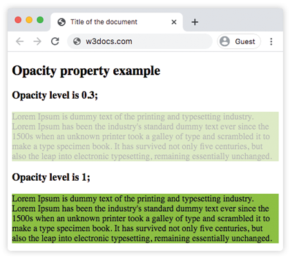
The CSS opacity property sets how transparent an element is. It controls the whole element — text, background, borders, and any child elements all fade together. It is one of the CSS3 properties.
Use opacity when you want an element (and everything inside it) to look faded: dimming an inactive button, building a hover effect, or layering a watermark over content.
How the opacity value works
The value is a number between 0 and 1:
0— the element is fully transparent (invisible, but it still takes up space and stays interactive).1— the default value, the element is fully opaque.- Any value in between, such as
0.5, makes the element partially transparent. Lower numbers mean more transparency.
You can also write the value as a percentage in modern browsers, where 50% is equivalent to 0.5.
Negative values are invalid and are clamped — the browser treats anything below 0 as 0 and anything above 1 as 1.
Opacity affects child elements too. When you fade a parent, every child fades with it, and you cannot make a child fully opaque again by giving it opacity: 1. If you only want a see-through background while keeping text and children solid, use an RGBA color on background-color instead — for example background-color: rgba(142, 191, 66, 0.3).
An element with an opacity value less than 1 creates a new stacking context. This can change how it overlaps neighboring elements, so a faded element may appear above or below siblings differently than you expect.
| Initial Value | 1.0 |
|---|---|
| Applies to | All elements. |
| Inherited | No. |
| Animatable | Yes. |
| Version | CSS3 |
| DOM Syntax | object.style.opacity = "0.3"; |
Syntax
CSS opacity syntax
opacity: number | initial | inherit;Example of the opacity property:
CSS opacity code example
<!DOCTYPE html>
<html>
  <head>
    <title>Title of the document</title>
    <style>
      .example1 {
        background-color: #8ebf42;
        opacity: 0.3;
      }
      .example2 {
        background-color: #8ebf42;
        opacity: 1;
      }
    </style>
  </head>
  <body>
    <h2>Opacity property example</h2>
    <h3>Opacity level is 0.3;</h3>
    <div class="example1"> Lorem Ipsum is dummy text of the printing and typesetting industry. Lorem Ipsum has been the industry's standard dummy text ever since the 1500s when an unknown printer took a galley of type and scrambled it to make a type specimen book. It has survived not only five centuries, but also the leap into electronic typesetting, remaining essentially unchanged. </div>
    <h3>Opacity level is 1;</h3>
    <div class="example2">Lorem Ipsum is dummy text of the printing and typesetting industry. Lorem Ipsum has been the industry's standard dummy text ever since the 1500s when an unknown printer took a galley of type and scrambled it to make a type specimen book. It has survived not only five centuries, but also the leap into electronic typesetting, remaining essentially unchanged.</div>
  </body>
</html>Result
In the example below, the opacity level of the first image is 1.0, the second image is 0.6, and the third image is 0.2.
Example of the opacity property with three opacity levels:
CSS opacity another code example
<!DOCTYPE html>
<html>
  <head>
    <title>Title of the document</title>
    <style>
      img.a {
        opacity: 1;
      }
      img.b {
        opacity: 0.6;
      }
      img.c {
        opacity: 0.2;
      }
    </style>
  </head>
  <body>
    <h2>Opacity property example</h2>
    <h3>Opacity: 1.0;</h3>
    <img src="/uploads/media/default/0001/01/4982c4f43023330a662b9baed5a407e391ae6161.jpeg" alt="house" width="300" height="300" class="a" />
    <h3>Opacity: 0.6;</h3>
    <img src="/uploads/media/default/0001/01/4982c4f43023330a662b9baed5a407e391ae6161.jpeg" alt="house" width="300" height="300" class="b" />
    <h3>Opacity: 0.2;</h3>
    <img src="/uploads/media/default/0001/01/4982c4f43023330a662b9baed5a407e391ae6161.jpeg" alt="house" width="300" height="300" class="c" />
  </body>
</html>Opacity vs. RGBA backgrounds
A common mistake is reaching for opacity when you only want a semi-transparent background. Because opacity fades children too, the text inside a box also becomes faint and harder to read. An RGBA background color applies transparency to the background color only, leaving the text fully opaque:
/* Fades the whole box, including the text */
.with-opacity {
  background-color: #8ebf42;
  opacity: 0.3;
}

/* Only the background is transparent; text stays crisp */
.with-rgba {
  background-color: rgba(142, 191, 66, 0.3);
}For controlling the color of the box itself, see background-color.
Fading on hover
Because opacity is animatable, it pairs naturally with transition to create smooth fade effects, such as dimming an image until the user hovers over it:
.thumb {
  opacity: 0.6;
  transition: opacity 0.3s ease;
}

.thumb:hover {
  opacity: 1;
}Opacity vs. visibility and display
opacity: 0, visibility: hidden, and display: none all hide an element, but they behave differently:
| Declaration | Visible | Takes up space | Clickable |
|---|---|---|---|
opacity: 0 | No | Yes | Yes |
visibility: hidden | No | Yes | No |
display: none | No | No | No |
An element with opacity: 0 is invisible yet still responds to clicks, so add pointer-events: none if you need it to be non-interactive as well.
Values
| Value | Description | Play it |
|---|---|---|
| number | Defines the opacity level. The default value is 1.0. | Play it » |
| initial | Makes the property use its default value. | Play it » |
| inherit | Inherits the property from its parent element. |