CSS grid-column-end Property
Use the CSS grid-column-end property to set where a grid item ends across columns, by line number or span. Syntax, values, and examples.
The CSS grid-column-end property sets where a grid item ends along the inline (column) axis. You give it either a column line to stop at, or a span that says how many columns the item should cover. Together with grid-column-start, it defines the inline-start and inline-end edges of the item's grid area.
How grid lines are numbered
A grid is bounded by numbered lines, not by the tracks (columns) themselves. A grid with three columns has four vertical lines: line 1 runs along the left edge, line 4 along the right edge.
 line:  1     2     3     4
| col | col | col |grid-column-end refers to one of these lines:
grid-column-end: 3makes the item end at line 3 — it stops before the third column.grid-column-end: span 2makes the item end 2 columns after wherever it starts, regardless of the absolute line number.
You can also count from the end with negative numbers: -1 is the last line, -2 the one before it. So grid-column-end: -1 always reaches the right edge of the grid no matter how many columns there are — handy for "full-width" items.
Tip: the value only describes where the item stops. Where it begins comes from
grid-column-start(or is auto-placed). The shorthandgrid-columnsets both at once, e.g.grid-column: 1 / 3.
| Initial Value | auto |
|---|---|
| Applies to | Grid items. |
| Inherited | No. |
| Animatable | Yes. The number of columns is animatable. |
| Version | CSS Grid Layout Module Level 1 |
| DOM Syntax | object.style.gridColumnEnd = "3"; |
Syntax
Syntax of CSS grid-column-end Property
grid-column-end: auto | span n | column-line | initial | inherit;Example of the grid-column-end property:
Example of CSS grid-column-end Property with auto value
<!DOCTYPE html>
<html>
<head>
<title>Title of the document</title>
<style>
.grid-container {
display: grid;
grid-template-columns: auto auto auto auto;
grid-gap: 5px;
background-color: #8ebf42;
padding: 10px;
}
.grid-container > div {
background-color: #eee;
text-align: center;
padding: 30px 0;
font-size: 30px;
}
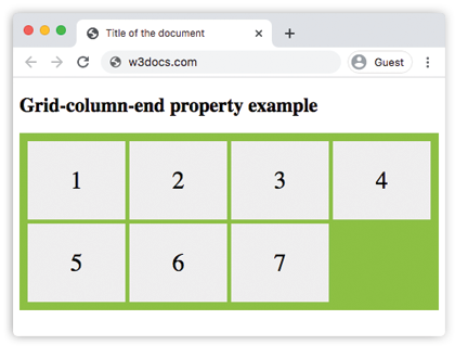
.box1 {
grid-column-end: auto;
}
</style>
</head>
<body>
<h2>Grid-column-end property example</h2>
<div class="grid-container">
<div class="box1">1</div>
<div>2</div>
<div>3</div>
<div>4</div>
<div>5</div>
<div>6</div>
<div>7</div>
</div>
</body>
</html>Result
Example of the grid-column-end property with line numbers and span values:
Example of CSS grid-column-end Property with span n value
<!DOCTYPE html>
<html>
  <head>
    <title>Title of the document</title>
    <style>
      .grid-container {
        display: grid;
        grid-template-columns: auto auto auto auto;
        grid-gap: 10px;
        background-color: #ccc;
        padding: 10px;
      }
      .grid-container > div {
        background-color: #888;
        text-align: center;
        padding: 20px 0;
        font-size: 30px;
      }
      .box1 {
        grid-column-end: 3;
      }
      .span-container {
        display: grid;
        grid-template-columns: auto auto auto auto;
        grid-gap: 10px;
        background-color: #888;
        padding: 10px;
        margin-top: 20px;
      }
      .span-container > div {
        background-color: #ccc;
        text-align: center;
        padding: 20px 0;
        font-size: 30px;
      }
      .span-box1 {
        grid-column-end: span 3;
      }
    </style>
  </head>
  <body>
    <h2>Grid-column-end property example</h2>
    <div class="grid-container">
      <div class="box1">1</div>
      <div>2</div>
      <div>3</div>
      <div>4</div>
      <div>5</div>
      <div>6</div>
    </div>
    <div class="span-container">
      <div class="span-box1">1</div>
      <div>2</div>
      <div>3</div>
      <div>4</div>
      <div>5</div>
      <div>6</div>
    </div>
  </body>
</html>The top grid uses grid-column-end: 3 (a line number), so the first item ends at line 3 and covers two columns. The bottom grid uses grid-column-end: span 3, so the item spans three columns starting from its own position.
In the following example, we again use span to control how many columns the item covers.
Example of the grid-column-end property with the "span n" value:
Example of the CSS grid-column-end property with the 'span n' value
<!DOCTYPE html>
<html>
  <head>
    <title>Title of the document</title>
    <style>
      article {
        display: grid;
        grid-template-columns: auto auto auto;
        grid-gap: 25px;
        padding: 20px;
        background-color: #7cbf7c;
      }
      article div {
        text-align: center;
        font-size: 35px;
        background-color: #ffffff;
        padding: 30px 0;
      }
      article div:first-child {
        grid-column-end: span 3;
      }
    </style>
  </head>
  <body>
    <article>
      <div>1</div>
      <div>2</div>
      <div>3</div>
      <div>4</div>
      <div>5</div>
    </article>
  </body>
</html>In the next example, the applied value specifies on which column the display of the item should be ended.
Example of the grid-column-end property with a line number value:
Example of the CSS grid-column-end property with the 'column-line' value:
<!DOCTYPE html>
<html>
  <head>
    <title>Title of the document</title>
    <style>
      .grid-container {
        display: grid;
        grid-gap: 5px;
        background-color: #8ebf42;
        grid-template-columns: auto auto auto;
        grid-gap: 20px;
        padding: 30px;
      }
      .grid-container > div {
        text-align: center;
        font-size: 35px;
        background-color: white;
        padding: 20px 0;
      }
      .box1 {
        grid-column-end: 3;
      }
    </style>
  </head>
  <body>
    <h2>Grid-column-end property example</h2>
    <div class="grid-container">
      <div class="box1">1</div>
      <div>2</div>
      <div>3</div>
      <div>4</div>
      <div>5</div>
      <div>6</div>
      <div>7</div>
      <div>8</div>
    </div>
  </body>
</html>Example of the grid-column-end property with the "auto" value:
Example of using the CSS grid-column-end auto property.
<!DOCTYPE html>
<html>
  <head>
    <title>Title of the document</title>
    <style>
      .grid-container {
        display: grid;
        grid-template-columns: auto auto auto;
        grid-gap: 5px;
        background-color: #8ebf42;
        padding: 10px;
      }
      .grid-container > div {
        background-color: #eee;
        text-align: center;
        padding: 30px 0;
        font-size: 30px;
      }
      .box1 {
        grid-column-end: auto;
      }
    </style>
  </head>
  <body>
    <h2>Grid-column-end property example</h2>
    <div class="grid-container">
      <div class="box1">1</div>
      <div class="box2">2</div>
      <div class="box3">3</div>
      <div class="box4">4</div>
      <div class="box5">5</div>
      <div class="box6">6</div>
      <div class="box7">7</div>
    </div>
  </body>
</html>Values
| Value | Description | Play it |
|---|---|---|
| auto | Auto-places the item; it spans a single column by default. This is the initial value. | Play it » |
| span n | The item ends n columns after its start line. | Play it » |
| column-line | A line number (positive or negative) or a named line where the item should end. | Play it » |
| initial | Sets the property to its default value (auto). | |
| inherit | Inherits the value from the parent element. |
Common pitfalls
spanis relative, lines are absolute.grid-column-end: 3always stops at line 3;grid-column-end: span 3stops three columns past the start line. Mixing them up is the most common grid bug.- End before start is fine — the browser swaps them. If
grid-column-endresolves to a line beforegrid-column-start, the two values are swapped so the area is still valid. grid-column-endalone doesn't move the start. Setting only the end leaves the start auto-placed. To pin both, use thegrid-columnshorthand.
Related properties
grid-column-start— the inline-start edge of the item.grid-column— shorthand for start and end together.grid-row-end— the same idea on the block (row) axis.grid-template-columns— defines the columns these lines run between.