CSS font-weight Property
Learn how CSS font-weight controls text thickness with keywords (normal, bold) and numeric values (100–900), plus bolder/lighter resolution rules.
The CSS font-weight property sets how bold or thick the characters of a font appear. You can specify the weight with a keyword (normal, bold), a relative keyword (bolder, lighter), or a numeric value from 100 to 900.
A typeface usually ships several distinct weights as separate font files. The browser can only render the weights the font actually provides. Many fonts include just two — normal (400) and bold (700) — so requesting font-weight: 300 may snap to the nearest available weight rather than draw a true light variant. Variable fonts are the exception: they embed a continuous weight axis and can render any value without separate files.
This page covers keyword and numeric values, how bolder / lighter are resolved, animating weight, and what to expect when a requested weight is not available.
| Initial Value | normal |
|---|---|
| Applies to | All elements. It also applies to ::first-letter and ::first-line. |
| Inherited | Yes. |
| Animatable | Yes. |
| Version | CSS1 |
| DOM Syntax | object.style.fontWeight = "bolder"; |
Syntax
font-weight: normal | bold | bolder | lighter | <number> | initial | inherit;Values
| Value | Description |
|---|---|
normal | Default weight. Equivalent to 400. |
bold | Bold weight. Equivalent to 700. |
bolder | One step heavier than the parent element's computed weight (see table below). |
lighter | One step lighter than the parent element's computed weight (see table below). |
100–900 | Numeric weight in steps of 100 — from thin (100) to heaviest (900). |
initial | Resets to the property's initial value (normal). |
inherit | Inherits the computed weight from the parent element. |
Basic example
The example below applies bolder to a paragraph so it appears heavier than the surrounding body text.
<!DOCTYPE html>
<html>
  <head>
    <title>Title of the document</title>
    <style>
      p.bolder {
        font-weight: bolder;
      }
    </style>
  </head>
  <body>
    <h2>Font-weight property example</h2>
    <p class="bolder">We used a bolder text here.</p>
  </body>
</html>Result
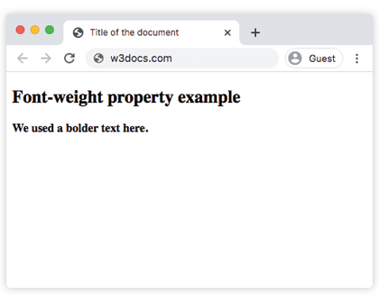
All keyword and numeric values
The example below puts every major value side by side so you can compare them visually.
<!DOCTYPE html>
<html>
  <head>
    <title>Title of the document</title>
    <style>
      p.normal {
        font-weight: normal;
      }
      p.lighter {
        font-weight: lighter;
      }
      p.bold {
        font-weight: bold;
      }
      p.bolder {
        font-weight: bolder;
      }
      p.fweight {
        font-weight: 600;
      }
    </style>
  </head>
  <body>
    <h2>Font-weight property example</h2>
    <p class="normal">We used normal weight here.</p>
    <p class="lighter">This is a lighter weight.</p>
    <p class="bold">We used bold weight here.</p>
    <p class="bolder">We used a bolder text here.</p>
    <p class="fweight">We set font-weight 600 here.</p>
  </body>
</html>The numeric weight scale
Numeric values run from 100 (thinnest) to 900 (thickest) in steps of 100. Each step has a conventional name used by type designers:
| Value | Common name |
|---|---|
| 100 | Thin (Hairline) |
| 200 | Extra Light (Ultra Light) |
| 300 | Light |
| 400 | Normal (Regular) |
| 500 | Medium |
| 600 | Semi Bold (Demi Bold) |
| 700 | Bold |
| 800 | Extra Bold (Ultra Bold) |
| 900 | Black (Heavy) |
normal maps to 400 and bold maps to 700, so those keyword/number pairs are always interchangeable. Use a numeric value when you need finer control — for example font-weight: 500 gives a "medium" heading that is heavier than body text but lighter than a fully bold heading.
When the font does not have the requested weight
If the font does not provide the exact weight you request, the browser falls back to the closest weight it has. That is why font-weight: 100 and font-weight: 300 can look identical when the font ships only 400 (Regular) and 700 (Bold). Always load or declare the specific weights your design uses — see @font-face and font-display for how to do this efficiently.
How bolder and lighter are resolved
bolder and lighter are relative to the inherited weight of the parent element. They do not simply add or subtract 100. Instead, the browser maps the parent's computed weight to a coarser three-level scale before applying the step:
| Inherited weight | bolder becomes | lighter becomes |
|---|---|---|
| 100 | 400 | 100 |
| 200 | 400 | 100 |
| 300 | 400 | 100 |
| 400 | 700 | 100 |
| 500 | 700 | 100 |
| 600 | 900 | 400 |
| 700 | 900 | 400 |
| 800 | 900 | 700 |
| 900 | 900 | 700 |
This means nesting two bolder elements does not keep getting heavier indefinitely — once you reach 900 it stays there.
<!DOCTYPE html>
<html>
  <head>
    <title>bolder resolution example</title>
    <style>
      .parent {
        font-weight: 400; /* normal */
      }
      .child {
        font-weight: bolder; /* resolves to 700 */
      }
      .grandchild {
        font-weight: bolder; /* resolves to 900, then stops */
      }
    </style>
  </head>
  <body>
    <p class="parent">
      Parent at normal (400).
      <span class="child">
        Child becomes bold (700).
        <span class="grandchild">Grandchild becomes black (900).</span>
      </span>
    </p>
  </body>
</html>Animating font-weight
font-weight is animatable, so you can transition between weights smoothly with CSS transitions or animations. Smooth interpolation only works with variable fonts, because static fonts only have discrete weight files. On a static font the browser snaps to the nearest available weight at the midpoint of the transition.
.heading {
  font-weight: 400;
  transition: font-weight 0.3s ease;
}

.heading:hover {
  font-weight: 700;
}For continuous, smooth weight changes — for example a hover effect that slides from thin to bold — use a variable font with the font-variation-settings property:
.heading {
  /* "wght" is the weight axis on variable fonts */
  font-variation-settings: "wght" 400;
  transition: font-variation-settings 0.3s ease;
}

.heading:hover {
  font-variation-settings: "wght" 700;
}Tips and accessibility
- Load the weights you use. When pulling fonts from Google Fonts or another service, request each weight explicitly in the URL or
@font-facedescriptor. If a weight is not loaded, the browser synthesizes a fake bold that is often lower quality than the real variant. - Do not use weight alone to convey meaning. Bold text is a visual cue only. For text that must carry semantic importance, use
<strong>(which carriesfont-weight: boldby default) so assistive technologies can communicate the emphasis. - Watch contrast on light weights. Weights
100–300reduce stroke thickness and can fall below WCAG contrast thresholds, especially at small sizes and on colored backgrounds. Check contrast ratios with the color picker tool and keep body text at400or heavier. - Prefer numeric values in design systems. Keywords like
boldare coarse. Using700makes the intent explicit and easier to audit.
Related properties
- font — shorthand that sets
font-weighttogether with style, size, and family in one declaration. - font-style — controls italic and oblique variants.
- font-size — sets the size of the text.
- font-family — chooses which typeface is used.
- @font-face — declares custom fonts and their available weight ranges.
- font-display — controls how the browser renders text while a custom font is loading.