CSS flex-direction Property
The flex-direction CSS property defines how the flex items are placed in the flex container. Read about the values and see some examples.
The flex-direction property sets the main axis of a flex container, which is the direction along which its flex items are laid out. By switching the main axis between horizontal and vertical (and optionally reversing it), a single property controls whether items flow in a row or a column. It is one of the CSS3 properties and is part of the Flexible Box Layout module.
The property has no effect on its own — the element must first be a flex container, which you create with display: flex (or inline-flex). Once that's set, every direct child becomes a flex item that follows the chosen direction.
Flex items can be displayed:
- horizontally from left to right (
flex-direction: row) or right to left (flex-direction: row-reverse) - vertically from top to bottom (
flex-direction: column) or from bottom to top (flex-direction: column-reverse)
Main axis and cross axis
Flexbox always works with two axes. The main axis is the one flex-direction chooses; items are placed one after another along it. The cross axis runs perpendicular to it. This matters because the alignment properties depend on which axis is which:
justify-contentaligns items along the main axis.align-itemsaligns items along the cross axis.
So when you set flex-direction: column, the main axis becomes vertical — and justify-content now controls vertical positioning while align-items controls horizontal positioning. Reaching for the wrong one is the most common flexbox mistake, and it almost always traces back to which value of flex-direction is in effect.
The *-reverse values flip the order in which items are painted, but they do not change the source order of your HTML — important for accessibility, because screen readers and keyboard focus still follow the DOM order, not the visual one.
If there are no flex items (the container has no direct children), the flex-direction property has no visible effect.
| Initial Value | row |
|---|---|
| Applies to | Flex containers. |
| Inherited | No. |
| Animatable | No. |
| Version | CSS3 |
| DOM Syntax | object.style.flexDirection = "row-reverse"; |
Syntax
Syntax of CSS flex-direction Property
flex-direction: row | row-reverse | column | column-reverse | initial | inherit;Example of the flex-direction property:
Example of CSS flex-direction property with column-reverse value
<!DOCTYPE html>
<html>
  <head>
    <title>Title of the document</title>
    <style>
      .example {
        width: 350px;
        height: 350px;
        border: 1px solid #c3c3c3;
        display: flex;
        flex-direction: column-reverse;
      }
      .example div {
        width: 70px;
        height: 70px;
      }
    </style>
  </head>
  <body>
    <h2>Flex-direction property example</h2>
    <div class="example">
      <div style="background-color: #8ebf42;">A</div>
      <div style="background-color: #1c87c9;">B</div>
      <div style="background-color: #eeeeee;">C</div>
      <div style="background-color: #666666;">F</div>
    </div>
  </body>
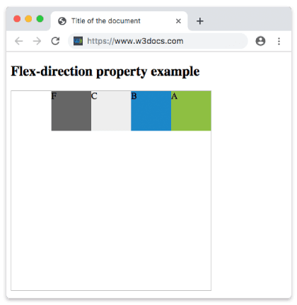
</html>In the following example, the items are displayed horizontally as a row from right to left.
Example of the flex-direction property with the "row-reverse" value:
Example of CSS flex-direction property with row-reverse value
<!DOCTYPE html>
<html>
  <head>
    <title>Title of the document</title>
    <style>
      .example {
        width: 350px;
        height: 350px;
        border: 1px solid #c3c3c3;
        display: flex;
        flex-direction: row-reverse;
      }
      .example div {
        width: 70px;
        height: 70px;
      }
    </style>
  </head>
  <body>
    <h2>Flex-direction property example</h2>
    <div class="example">
      <div style="background-color: #8ebf42;">A</div>
      <div style="background-color: #1c87c9;">B</div>
      <div style="background-color: #eeeeee;">C</div>
      <div style="background-color: #666666;">F</div>
    </div>
  </body>
</html>Result
The following image shows the items displayed in reverse order from right to left.
Example of the flex-direction property with the "row" value:
Example of the flex-direction property with the “row” value
<!DOCTYPE html>
<html>
  <head>
    <title>Title of the document</title>
    <style>
      .example {
        width: 350px;
        height: 350px;
        border: 1px solid #c3c3c3;
        display: flex;
        flex-direction: row;
      }
      .example div {
        width: 70px;
        height: 70px;
      }
    </style>
  </head>
  <body>
    <h2>Flex-direction property example</h2>
    <div class="example">
      <div style="background-color: #8ebf42;">A</div>
      <div style="background-color: #1c87c9;">B</div>
      <div style="background-color: #eeeeee;">C</div>
      <div style="background-color: #666666;">F</div>
    </div>
  </body>
</html>Example of the flex-direction property with the "column" value:
<!DOCTYPE html>
<html>
  <head>
    <title>Title of the document</title>
    <style>
      .example {
        width: 350px;
        height: 350px;
        border: 1px solid #c3c3c3;
        display: flex;
        flex-direction: column;
      }
      .example div {
        width: 70px;
        height: 70px;
      }
    </style>
  </head>
  <body>
    <h2>Flex-direction property example</h2>
    <div class="example">
      <div style="background-color: #DC143C;">A</div>
      <div style="background-color: #0000CD;">B</div>
      <div style="background-color: #9ACD32;">C</div>
      <div style="background-color: #666666;">F</div>
    </div>
  </body>
</html>Example of the flex-direction property with the "column-reverse" value:
<!DOCTYPE html>
<html>
  <head>
    <title>Title of the document</title>
    <style>
      .example {
        width: 350px;
        height: 340px;
        border: 1px solid #c3c3c3;
        display: flex;
        flex-direction: column-reverse;
      }
      .example div {
        width: 60px;
        height: 60px;
      }
    </style>
  </head>
  <body>
    <h2>Flex-direction property example</h2>
    <div class="example">
      <div style="background-color: #DC143C;">A</div>
      <div style="background-color: #0000CD;">B</div>
      <div style="background-color: #9ACD32;">C</div>
      <div style="background-color: #666666;">F</div>
    </div>
  </body>
</html>When to use each value
row(default) — horizontal navigation bars, button groups, and any "left-to-right list of things." You rarely write it explicitly since it is already the default.column— stacking cards, form fields, or sidebar items vertically while still getting flexbox alignment andgapcontrol. A common pattern is a full-height page layout:display: flex; flex-direction: column; min-height: 100vhwith a header, aflex: 1main area, and a footer.row-reverse/column-reverse— flip visual order without touching the HTML, for example mirroring a layout for right-to-left languages or showing the newest chat message at the bottom while keeping the DOM in chronological order.
A related shorthand, flex-flow, sets flex-direction and flex-wrap in one declaration — handy when you also need items to wrap onto multiple lines.
Browser support
flex-direction is supported in all modern browsers without a vendor prefix. It is part of the broader Flexbox model covered in the Ultimate Guide to Flexbox.
Values
| Value | Description | Play it |
|---|---|---|
| row | Items are displayed horizontally as a row. This is the default value of this property. | Play it » |
| row-reverse | Items are displayed in a row in a reverse order (from right to left). | Play it » |
| column | Items are displayed vertically from top to bottom. | Play it » |
| column-reverse | Items are displayed vertically from bottom to top. | Play it » |
| initial | The property uses its default value. | Play it » |
| inherit | The property inherits the value from its parent element. | Play it » |