CSS flex-grow Property
The flex-grow property defines how much the item will grow. See the values of this property and try some examples.
The flex-grow property controls how much a flex item grows to fill the free space left over inside its flex container. The value is a unitless growth factor, not a length: it answers the question "when there is extra room, what share of it should this item take?"
When every item has a flex-grow factor, the leftover space is divided proportionally to those factors. A flex item's main size is either its width or its height, depending on the flex-direction: in a row the items grow horizontally, in a column they grow vertically.
This property is one of the CSS3 properties. It is normally used together with flex-shrink (how items shrink when space is short) and flex-basis (their starting size), and all three are usually set at once through the flex shorthand.
How free space is distributed
The flex algorithm runs in two steps:
- Lay every item out at its
flex-basis(or its content size ifflex-basis: auto). - Measure the free space — the container's main size minus the sum of those basis sizes — and hand it out in proportion to each item's
flex-growfactor.
If the items above start near zero width and the container has, say, 600px of free space with factors 1, 2, 1, 1, 1 (total 6), each unit is worth 600 / 6 = 100px. So the item with factor 2 receives 200px of growth, while every factor-1 item receives 100px. Double the factor, double the share of the extra space — it does not make an item twice as wide overall.
flex-grow only does something when there is free space and the items are actual flex items (the parent has display: flex or display: inline-flex). With no free space, or no flex items, it has no effect.
| Initial Value | 0 |
|---|---|
| Applies to | Flex items, including in-flow pseudo-elements. |
| Inherited | No. |
| Animatable | Yes. Items are animatable. |
| Version | CSS3 |
| DOM Syntax | object.style.flexGrow = 3; |
Syntax
Syntax of CSS flex-grow Property
flex-grow: number | initial | inherit;Example of the flex-grow property:
Example of CSS flex-grow Property with number value
<!DOCTYPE html>
<html>
  <head>
    <title>Title of the document</title>
    <style>
      .box {
        width: 320px;
        height: 120px;
        border: 2px solid #cccccc;
        display: flex;
      }
      .box div:nth-of-type(1) {
        flex-grow: 1;
      }
      .box div:nth-of-type(2) {
        flex-grow: 2;
      }
      .box div:nth-of-type(3) {
        flex-grow: 1;
      }
      .box div:nth-of-type(4) {
        flex-grow: 1;
      }
      .box div:nth-of-type(5) {
        flex-grow: 1;
      }
    </style>
  </head>
  <body>
    <h2>Flex-grow property example</h2>
    <div class="box">
      <div style="background-color: #eeeeee;"></div>
      <div style="background-color: #1c87c9;"></div>
      <div style="background-color: #8ebf42;"></div>
      <div style="background-color: #cccccc;"></div>
      <div style="background-color: #666666;"></div>
    </div>
  </body>
</html>Result
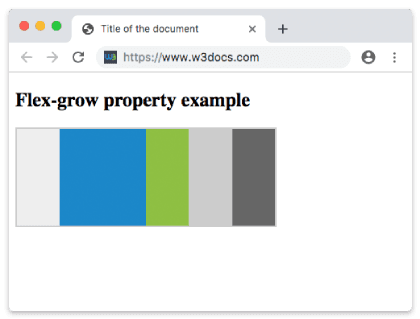
Example of the flex-grow property with a higher growth factor:
CSS flex-grow property with a number as a value
<!DOCTYPE html>
<html>
  <head>
    <title>The title of the document</title>
    <style>
      .box {
        width: 320px;
        height: 120px;
        border: 2px solid #cccccc;
        display: flex;
      }
      .box div:nth-of-type(1) {
        flex-grow: 1;
      }
      .box div:nth-of-type(2) {
        flex-grow: 6;
      }
      .box div:nth-of-type(3) {
        flex-grow: 1;
      }
      .box div:nth-of-type(4) {
        flex-grow: 1;
      }
      .box div:nth-of-type(5) {
        flex-grow: 1;
      }
    </style>
  </head>
  <body>
    <h2>Flex-grow property example</h2>
    <div class="box">
      <div style="background-color: #eeeeee;"></div>
      <div style="background-color: #1c87c9;"></div>
      <div style="background-color: #8ebf42;"></div>
      <div style="background-color: #cccccc;"></div>
      <div style="background-color: #666666;"></div>
    </div>
  </body>
</html>Using flex-grow inside the flex shorthand
You rarely write flex-grow on its own. The most common pattern is flex: 1, which is shorthand for flex-grow: 1; flex-shrink: 1; flex-basis: 0. Setting the basis to 0 tells the browser to ignore content size and split the whole container proportionally, so several items with flex: 1 end up exactly equal in width:
.item {
  flex: 1; /* grow:1  shrink:1  basis:0  → equal columns */
}To let one item take twice the share of the others, bump its grow factor:
.sidebar { flex: 1; }
.main { flex: 2; } /* gets 2/3 of the space, sidebar gets 1/3 */Common gotchas
- Factor, not width.
flex-grow: 2doesn't mean "twice as wide" — it means "twice the share of the leftover space." When items have different content sizes, the final widths won't be a clean 2:1 ratio unlessflex-basisis0. - Negative values are invalid. They are ignored and the property keeps its previous value.
- No free space, no effect. If the items already fill (or overflow) the container,
flex-growchanges nothing — that case is handled by flex-shrink instead. - The factor is unitless. Don't write
flex-grow: 2px; that's not a valid value.
Values
| Value | Description | Play it |
|---|---|---|
| number | Specifies how much the item will grow relative to the rest of flexible items of the same container. Default value is 0. | Play it » |
| initial | Sets the property to its default value. | Play it » |
| inherit | Inherits this property from its parent element. |