CSS Gradients
CSS gradients display progressive transitions between two or more specified colors. Read about the types of gradients, the usage and see lots of examples.
A CSS gradient is an image generated by the browser that displays a smooth, progressive transition between two or more specified colors. Because a gradient is technically an <image>, you set it anywhere CSS expects an image value — most often on the background-image property, but it also works for border-image, list-style-image, and mask-image.
Gradients are resolution-independent (they scale to any size without losing quality) and add zero extra HTTP requests, which makes them a lightweight alternative to image files for backgrounds, buttons, overlays, and decorative shapes.
This page covers the three gradient functions defined by CSS, with runnable examples for each:
- Linear gradients — colors flow along a straight line.
- Radial gradients — colors radiate out from a center point.
- Conic gradients — colors rotate around a center point.
Each function also has a repeating-* variant that tiles the gradient instead of stretching it once across the box.
Linear Gradients
The linear-gradient() function creates an image whose colors transition along a straight line. You control two things: the direction of that line and the list of color stops placed along it. With no direction, the line runs from the top of the box to the bottom.
Linear gradient syntax
background-image: linear-gradient(direction, color1, color2, ...);direction is optional. It can be a keyword (to right, to bottom left) or an angle (90deg). Everything after it is the comma-separated list of colors. Any valid CSS color works, including named colors, hex, rgb(), and hsl().
Top to Bottom
Linear gradients transition from top to bottom by default, so you can omit the direction entirely.
Example of a linear gradient from top to bottom
<!DOCTYPE html>
<html>
  <head>
    <title>Title of the document</title>
    <style>
      .gradient {
        height: 300px;
        background-color: blue;
        background-image: linear-gradient(#0052b0, #b340b3);
      }
    </style>
  </head>
  <body>
    <div class="gradient"></div>
  </body>
</html>The background-color declaration is a fallback: very old browsers that don't understand the gradient ignore the background-image line and fall back to the solid color, so text stays readable.
Left to Right
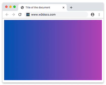
Add the to right keyword to rotate the line so the first color sits on the left edge and the last on the right.
Example of a linear gradient from left to right
<!DOCTYPE html>
<html>
  <head>
    <title>Title of the document</title>
    <style>
      .gradient {
        height: 300px;
        background-color: blue;
        background-image: linear-gradient(to right, #0052b0 ,#b340b3);
      }
    </style>
  </head>
  <body>
    <div class="gradient"></div>
  </body>
</html>Diagonal Gradients
Combine a vertical and a horizontal keyword (for example to bottom right) to run the line diagonally across the box, corner to corner.
Example of the diagonal gradient
<!DOCTYPE html>
<html>
  <head>
    <title>Title of the document</title>
    <style>
      .gradient {
        height: 300px;
        background-color: blue;
        background-image: linear-gradient(to bottom right, #0052b0, #b340b3);
      }
    </style>
  </head>
  <body>
    <div class="gradient"></div>
  </body>
</html>Using Angles
For full control over the direction, give an angle instead of a keyword. The angle is measured clockwise from the "up" direction: 0deg points the gradient line straight up (colors flow bottom to top), 90deg points it right (left to right), 180deg points down. Negative angles rotate counterclockwise.
Example of a linear gradient with a specified angle
<!DOCTYPE html>
<html>
  <head>
    <title>Title of the document</title>
    <style>
      .gradient {
        height: 300px;
        background-color: blue;
        background-image: linear-gradient(70deg, #0052b0, #b340b3);
      }
    </style>
  </head>
  <body>
    <div class="gradient"></div>
  </body>
</html>Multiple Colors
A gradient accepts any number of colors. They are spaced evenly by default, with each color blending smoothly into the next.
Example of a linear gradient with multiple colors
<!DOCTYPE html>
<html>
  <head>
    <title>Title of the document</title>
    <style>
      .gradient {
        height: 300px;
        background-color: blue;
        background-image: linear-gradient(#f50707, #f56e00,#f7df00, #66f507, #0052b0, #520f41, #ff0856);
      }
    </style>
  </head>
  <body>
    <div class="gradient"></div>
  </body>
</html>You can combine a direction with multiple colors, and you can pin each color to a specific position. A position is a percentage (0% is the start of the line, 100% is the end) or an absolute length. Giving two positions to one color creates a hard stripe of that color between them.
Example of a linear gradient with multiple colors from left to right
<!DOCTYPE html>
<html>
  <head>
    <title>Title of the document</title>
    <style>
      .gradient {
        height: 300px;
        background-color: blue;
        background-image: linear-gradient(to right, #f50707, #f56e00,#f7df00, #66f507, #0052b0, #520f41, #ff0856);
      }
    </style>
  </head>
  <body>
    <div class="gradient"></div>
  </body>
</html>Example of a linear gradient with multiple colors from right to left
<!DOCTYPE html>
<html>
  <head>
    <title>Title of the document</title>
    <style>
      .gradient {
        height: 300px;
        background-color: blue;
        background-image: linear-gradient(to left, #f50707, #f56e00,#f7df00, #66f507, #0052b0, #520f41, #ff0856);
      }
    </style>
  </head>
  <body>
    <div class="gradient"></div>
  </body>
</html>Transparency
Color stops can be partly or fully transparent, which is useful for fading a background into whatever sits behind it. Use rgba() (or any color with an alpha channel) and set the alpha from 0 (fully transparent) to 1 (fully opaque). This is the standard way to lay a readable overlay over a photo.
Example of a linear gradient from full color to transparent
<!DOCTYPE html>
<html>
  <head>
    <title>Title of the document</title>
    <style>
      .gradient {
        height: 200px;
        background-image: linear-gradient(to left, rgba(235, 117, 253, 0), rgba(235, 117, 253, 1));
      }
    </style>
  </head>
  <body>
    <div class="gradient"></div>
  </body>
</html>Repeating Linear Gradient
repeating-linear-gradient() tiles a gradient pattern across the box instead of stretching it once. The size of one repeat is set by the last color stop's position — here 10%, so the three-color pattern repeats every 10% of the line. This is handy for stripes and progress-bar textures.
Example of a repeated linear gradient
<!DOCTYPE html>
<html>
  <head>
    <title>Title of the document</title>
    <style>
      .gradient {
        height: 200px;
        background-color: blue;
        background-image: repeating-linear-gradient(55deg, #d5b6de, #6c008a 7%, #036ffc 10%);
      }
    </style>
  </head>
  <body>
    <div class="gradient"></div>
  </body>
</html>Radial Gradients
A radial gradient radiates out from a center point, with the first color in the middle and the last at the edge. At least two color stops are required. The gradient can be shaped as a circle or an ellipse (the default).
Radial gradient syntax
background-image: radial-gradient(shape size at position, start-color, ..., last-color);The shape size at position part is optional. When omitted, you get a farthest-corner ellipse centered in the box.
Example of a radial gradient with three colors
<!DOCTYPE html>
<html>
  <head>
    <title>Title of the document</title>
    <style>
      .gradient {
        height: 250px;
        width: 250px;
        background-color: blue;
        background-image: radial-gradient( #ff0509, #fff700, #05ff33);
      }
    </style>
  </head>
  <body>
    <div class="gradient"></div>
  </body>
</html>Positioning Radial Color Stops
As with linear gradients, you can pin each color to a percentage or absolute length to control how much of the radius it occupies.
Example of differently spaced color stops
<!DOCTYPE html>
<html>
  <head>
    <title>Title of the document</title>
    <style>
      .gradient {
        height: 250px;
        width: 250px;
        background-color: blue;
        background-image: radial-gradient( #ff0509 10%, #fff700 20%, #05ff33 80%);
      }
    </style>
  </head>
  <body>
    <div class="gradient"></div>
  </body>
</html>Positioning the Center
Use the at keyword to move the center of the gradient away from the middle of the box, using percentages or absolute lengths.
Example of a radial gradient with positioned center
<!DOCTYPE html>
<html>
  <head>
    <title>Title of the document</title>
    <style>
      .gradient {
        height: 250px;
        width: 250px;
        background-color: blue;
        background-image: radial-gradient(at 0% 30%, #ff0509 10px, #fff700 30%, #05ff33 50%);
      }
    </style>
  </head>
  <body>
    <div class="gradient"></div>
  </body>
</html>Radial Gradient Shape
The shape parameter is either circle or ellipse. An ellipse (the default) stretches to match the box's aspect ratio; a circle stays perfectly round regardless of the box's width and height.
Example of radial gradient shape
<!DOCTYPE html>
<html>
  <head>
    <title> Title of the document</title>
    <style>
      .gradient1 {
        height: 150px;
        width: 200px;
        background-color: blue;
        background-image: radial-gradient(red, yellow, green);
      }
      .gradient2 {
        height: 150px;
        width: 200px;
        background-color: blue;
        background-image: radial-gradient(circle, red, yellow, green);
      }
    </style>
  </head>
  <body>
    <h2>Ellipse:</h2>
    <div class="gradient1"></div>
    <h2>Circle:</h2>
    <div class="gradient2"></div>
  </body>
</html>Sizing Radial Gradient
The size keyword decides where the final color stop lands — that is, how far the gradient spreads before it ends. There are four keywords, measured from the gradient's center:
closest-side— ends at the nearest edge of the box.closest-corner— ends at the nearest corner.farthest-side— ends at the furthest edge.farthest-corner— ends at the furthest corner. This is the default.
Example of radial gradients with specified size
<!DOCTYPE html>
<html>
  <head>
    <title>Title of the document</title>
    <style>
      .gradient1 {
        height: 150px;
        width: 150px;
        background-color: blue;
        background-image: radial-gradient(closest-side at 60% 55%, #ff0509, #fff700, #103601);
      }
      .gradient2 {
        height: 150px;
        width: 150px;
        background-color: blue;
        background-image: radial-gradient(farthest-side at 60% 55%, #ff0509, #fff700, #103601);
      }
      .gradient3 {
        height: 150px;
        width: 150px;
        background-color: blue;
        background-image: radial-gradient(closest-corner at 60% 55%, #ff0509, #fff700, #103601);
      }
      .gradient4 {
        height: 150px;
        width: 150px;
        background-color: blue;
        background-image: radial-gradient(farthest-corner at 60% 55%, #ff0509, #fff700, #103601);
      }
    </style>
  </head>
  <body>
    <h2>closest-side:</h2>
    <div class="gradient1"></div>
    <h2>farthest-side:</h2>
    <div class="gradient2"></div>
    <h2>closest-corner:</h2>
    <div class="gradient3"></div>
    <h2>farthest-corner:</h2>
    <div class="gradient4"></div>
  </body>
</html>Repeating Radial Gradient
repeating-radial-gradient() tiles the radial pattern outward in rings from the center. As with the linear version, the last color stop's position sets the size of one ring.
Example of the repeated radial gradient
<!DOCTYPE html>
<html>
  <head>
    <style>
      .gradient {
        height: 200px;
        width: 200px;
        background-color: blue;
        background-image: repeating-radial-gradient(#f70000, #f7da00 10%, #005cfa 15%);
      }
    </style>
  </head>
  <body>
    <div class="gradient"></div>
  </body>
</html>Conic Gradients
A conic gradient rotates its colors around a center point, like the hands of a clock sweeping through the spectrum. Where a radial gradient changes color as you move outward, a conic gradient changes color as you move around. This makes it the natural tool for pie charts, color wheels, and angular accents.
Conic gradient syntax
background-image: conic-gradient(color1, color2);Color stops are positioned by angle (deg) rather than length. The gradient starts at the top (0deg) and sweeps clockwise.
Example of a basic conic gradient
<!DOCTYPE html>
<html>
  <head>
    <title>Title of the document</title>
    <style>
      .gradient {
        height: 250px;
        width: 250px;
        background-color: blue;
        background: conic-gradient(#ff0000, #fff200);
      }
    </style>
  </head>
  <body>
    <div class="gradient"></div>
  </body>
</html>Positioning Conic Center
As with radial gradients, the at keyword moves the center point of the sweep using percentages or absolute lengths.
Example of a conic gradient with positioned center
<!DOCTYPE html>
<html>
  <head>
    <title>Title of the document</title>
    <style>
      .gradient {
        height: 250px;
        width: 250px;
        background-color: blue;
        background: conic-gradient(at 0% 50%, red 10%, yellow 30%, #1eff00 60%);
      }
    </style>
  </head>
  <body>
    <div class="gradient"></div>
  </body>
</html>Changing the Angle
The from keyword rotates the whole sweep, shifting where the 0deg starting point sits.
Example of conic gradient with rotated angle
<!DOCTYPE html>
<html>
  <head>
    <title>Title of the document</title>
    <style>
      .gradient {
        height: 250px;
        width: 250px;
        background-color: blue;
        background: conic-gradient(from 35deg, #ff0000, #ffa600, #fcf000, #03ff0f, #be05fc, #ff0095);
      }
    </style>
  </head>
  <body>
    <div class="gradient"></div>
  </body>
</html>Repeating Conic Gradient
repeating-conic-gradient() repeats the angular pattern around the circle, which is the classic way to build starburst and checkerboard effects.
Example of the repeated conic gradient
<!DOCTYPE html>
<html>
  <head>
    <title>Title of the document</title>
    <style>
      .gradient {
        height: 250px;
        width: 250px;
        background-color: blue;
        background: repeating-conic-gradient(from -45deg, red 45deg, orange, yellow, green, blue 225deg);
      }
    </style>
  </head>
  <body>
    <div class="gradient"></div>
  </body>
</html>Browser Support and Tips
Linear and radial gradients are supported in every modern browser. Conic gradients are newer — they work in all current versions of Chrome, Edge, Firefox, and Safari, but if you must support very old browsers, pair the gradient with a solid background-color fallback as shown earlier.
A few practical pointers:
- Stack gradients. The
background-imageproperty accepts a comma-separated list, so you can layer several gradients (the first one listed sits on top). Combine transparent gradients with a photo to create overlays. - Use
hsl()for smoother blends. Interpolating between very different hues in hex can pass through muddy greys; choosing close hues, or usinghsl(), keeps transitions clean. - Performance. Gradients are cheap, but animating them repaints the whole box. Prefer animating
transform/opacityover the gradient itself for smooth motion.
Related Topics
background-image— the property gradients are most often applied to.background-size— control the size of a gradient layer to enable tiling.- CSS Colors and CSS color names — the color values you place inside gradients.
- CSS Transitions — for animating other properties alongside gradient backgrounds.