CSS grid-template-rows Property
Learn the CSS grid-template-rows property: track sizes, fr units, repeat(), minmax(), named lines, subgrid, and real-world examples.
The grid-template-rows property defines how many rows a CSS grid has and how tall each one is. You list the track sizes one after another, separated by spaces, and CSS creates one explicit row per value. So grid-template-rows: 100px 200px makes two rows — the first 100 px tall, the second 200 px tall.
This property only affects grid containers (elements with display: grid or display: inline-grid). It is the row-direction counterpart of grid-template-columns, and the two are often written together to lay out a full grid.
A track size can be a fixed length, a percentage, a flexible fr unit, a content-based keyword, or a function such as repeat() and minmax(). Mixing these is what makes grid layouts flexible:
- Use a length (
px,rem) when you want a row to stay an exact height. - Use
frwhen you want rows to share the leftover space proportionally. - Use
autoormin-content/max-contentwhen the row should grow to fit its content. - Use
repeat()to avoid typing the same size many times. - Use
minmax()when a row needs a floor and a ceiling (for example, "at least 100px, but grow if needed").
Rows you create here are the explicit grid. If items overflow into rows you did not define, those extra rows are sized by grid-auto-rows instead.
| Initial Value | none |
|---|---|
| Applies to | Grid containers. |
| Inherited | No. |
| Animatable | Yes. The size of the rows is animatable. |
| Version | CSS Grid Layout Module Level 1 |
| DOM Syntax | object.style.gridTemplateRows = "20px 100px" |
Syntax
grid-template-rows: none
                  | auto
                  | max-content
                  | min-content
                  | <length>
                  | <percentage>
                  | <flex>           /* e.g. 1fr */
                  | fit-content(<length-percentage>)
                  | repeat(<count>, <track-list>)
                  | minmax(<min>, <max>)
                  | subgrid
| [line-name] <track-size> [line-name];The standard keywords initial and inherit also apply, as with every CSS property.
Basic usage
Auto-sized rows
With auto, each row grows to fit its tallest cell. This is the most common starting point.
<!DOCTYPE html>
<html>
  <head>
    <title>Title of the document</title>
    <style>
      .auto-container {
        display: grid;
        grid-template-columns: auto auto auto auto;
        grid-template-rows: auto auto;
        gap: 10px;
        background-color: #ccc;
        padding: 10px;
        margin-top: 30px;
      }
      .auto-container > div {
        background-color: #eee;
        text-align: center;
        padding: 30px 0;
        font-size: 30px;
      }
    </style>
  </head>
  <body>
    <h2>grid-template-rows: auto auto</h2>
    <div class="auto-container">
      <div>1</div>
      <div>2</div>
      <div>3</div>
      <div>4</div>
      <div>5</div>
      <div>6</div>
      <div>7</div>
      <div>8</div>
    </div>
  </body>
</html>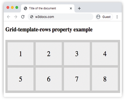
With grid-template-rows: auto auto, both rows grow to fit their content, so every cell is the same height as its tallest sibling in that row.
Fixed-height rows
Pass pixel values to pin rows to an exact height regardless of content.
<!DOCTYPE html>
<html>
  <head>
    <title>Title of the document</title>
    <style>
      .grid-container {
        display: grid;
        grid-template-columns: auto auto auto auto;
        grid-template-rows: 100px 300px;
        gap: 10px;
        background-color: #ccc;
        padding: 10px;
      }
      .grid-container > div {
        background-color: #eee;
        text-align: center;
        padding: 20px 0;
        font-size: 30px;
      }
    </style>
  </head>
  <body>
    <h2>grid-template-rows: 100px 300px</h2>
    <div class="grid-container">
      <div>1</div>
      <div>2</div>
      <div>3</div>
      <div>4</div>
      <div>5</div>
      <div>6</div>
      <div>7</div>
      <div>8</div>
    </div>
  </body>
</html>Here the rows are fixed: the first is always 100 px tall and the second always 300 px, no matter how much content the cells hold. Content that overflows those heights is clipped or scrolls depending on the overflow setting.
fr units, repeat(), and minmax()
The fr unit
fr ("fraction") represents a share of the free space left in the grid after fixed-size tracks have been placed. Free space is the grid's total size minus the space taken by tracks with absolute or content-based sizes.
/* Three equal rows */
grid-template-rows: 1fr 1fr 1fr;

/* Header takes half, body takes the other half */
grid-template-rows: 1fr 1fr;

/* Header is fixed, body gets all remaining space */
grid-template-rows: 80px 1fr;The fr unit is useful when the grid has a known height (set on the container) and you want tracks to fill it without doing any arithmetic.
repeat()
repeat(count, track-list) is shorthand for repeating one or more track sizes.
/* Same as: 1fr 1fr 1fr 1fr */
grid-template-rows: repeat(4, 1fr);

/* Alternating: 80px 1fr 80px 1fr */
grid-template-rows: repeat(2, 80px 1fr);minmax()
minmax(min, max) gives a track a minimum and a maximum size. The browser resolves the actual size somewhere in that range depending on content and available space.
/* Row is at least 80px; grows with content up to 200px */
grid-template-rows: minmax(80px, 200px);

/* Row is at least 80px; grows to fill remaining space */
grid-template-rows: minmax(80px, 1fr);Combining all three
<!DOCTYPE html>
<html>
  <head>
    <title>Title of the document</title>
    <style>
      .flex-grid {
        display: grid;
        height: 600px;
        grid-template-columns: 1fr 1fr;
        grid-template-rows: repeat(2, 1fr) minmax(80px, auto);
        gap: 10px;
        background-color: #ccc;
        padding: 10px;
      }
      .flex-grid > div {
        background-color: #eee;
        text-align: center;
        padding: 10px;
        font-size: 24px;
      }
    </style>
  </head>
  <body>
    <h2>fr, repeat() and minmax()</h2>
    <div class="flex-grid">
      <div>1</div>
      <div>2</div>
      <div>3</div>
      <div>4</div>
      <div>5</div>
      <div>6</div>
    </div>
  </body>
</html>The grid is 600 px tall. repeat(2, 1fr) creates two rows that each take an equal share of the available height. The third row uses minmax(80px, auto): it is at least 80 px tall but expands if its content grows taller than that.
Named line tracks
You can give the lines between rows a name by wrapping the name in square brackets. Named lines make it much easier to position items with grid-row without counting grid lines.
.layout {
  display: grid;
  grid-template-rows:
    [header-start] 80px [header-end body-start]
    1fr
    [body-end footer-start] 60px [footer-end];
}

/* Place an item from body-start to body-end */
.main {
  grid-row: body-start / body-end;
}A line can carry multiple names separated by spaces inside the same brackets — [header-end body-start] means the same line is the end of the header and the start of the body.
Content-based keywords
auto
auto means the track is sized by its content (equivalent to minmax(auto, auto)). The row grows to the tallest item it holds, but it will not shrink below the minimum content size. When fr tracks are also present in the same declaration, auto tracks are resolved first and the fr tracks share the remaining space.
min-content
The row is exactly tall enough to fit the smallest content in any of its cells — in practice, as tall as the longest word or smallest image.
max-content
The row is tall enough to fit the largest content without wrapping. Equivalent to giving every cell as much vertical space as it wants.
fit-content(<value>)
fit-content(200px) behaves like auto (grows with content) but caps out at the provided argument. Equivalent to min(max-content, max(auto, 200px)). Useful when you want a row to be content-sized but never grow beyond a limit.
subgrid
When a grid item is itself a grid container, subgrid on grid-template-rows tells that inner grid to use the parent grid's row tracks rather than creating its own. This lets you align content inside nested grid items with the outer grid's rhythm.
.parent {
  display: grid;
  grid-template-rows: 80px 1fr 60px;
}

.child {
  display: grid;
  /* This child spans 3 rows of the parent */
  grid-row: 1 / 4;
  /* Adopt those same 3 row tracks */
  grid-template-rows: subgrid;
}subgrid has been widely supported since late 2023 (Chrome 117+, Firefox 71+, Safari 16+).
auto-fill and auto-fit in repeat()
auto-fill and auto-fit are used inside repeat() to create as many tracks as will fit the container. They are more commonly seen with grid-template-columns, but they work identically with rows when the container has a fixed height.
/* As many rows of at least 100px as will fit */
grid-template-rows: repeat(auto-fill, minmax(100px, 1fr));auto-fill— fills the grid with as many tracks as possible, even if some are empty.auto-fit— same asauto-fill, but collapses empty tracks to zero size so items stretch to fill available space.
Values
| Value | Description |
|---|---|
none | Default. No explicit rows are defined; all rows are implicit. |
auto | The row height is determined by its content or available space. |
max-content | The row is as tall as the largest intrinsic size among its items. |
min-content | The row is as tall as the smallest intrinsic size among its items. |
minmax(min, max) | The track size is within the given range. min cannot be fr; max can be. |
<length> | A fixed height such as 100px or 2rem. |
<percentage> | A height relative to the grid container's height (must be definite). |
<flex> (fr) | A non-negative dimension that takes a share of the remaining free space. |
fit-content(<value>) | Content-sized but capped at the provided argument. |
repeat(count, tracks) | Repeats a pattern of track sizes. count can be a number, auto-fill, or auto-fit. |
subgrid | The track list is inherited from the parent grid. |
initial | Resets the property to its default (none). |
inherit | Inherits the value from the parent element. |
Common gotchas
frrequires a definite container height. If the grid container has no explicitheight, there is no free space forfrrows to share — they collapse toautosizing instead. Always set aheight(ormin-height) on the container when usingfrin rows.- Percentages require a definite container height for the same reason. If the container's height is intrinsic, percentage row sizes also resolve to
auto. - Explicit rows only. This property sizes the rows you declare. Extra rows generated by overflow items are sized by
grid-auto-rows— those implicit rows default toautoifgrid-auto-rowsis not set. minmax(0, 1fr)vs1fr. Thefrunit has an implicit minimum ofauto, so1frrows cannot shrink below their content size. Useminmax(0, 1fr)when you explicitly want rows to shrink below content — for example, inside scroll containers.
Practice
Related properties
grid-template-columns— the column-direction counterpart of this property.grid-auto-rows— sizes rows created implicitly, outside the explicit grid.grid-template-areas— names grid areas to place items by reference.grid-template— shorthand for rows, columns, and areas in one declaration.grid-row— shorthand to place or span a grid item across row tracks.grid-auto-flow— controls the direction and packing algorithm for auto-placed items.grid— the full grid shorthand and a starting point for grid layout.