CSS text-stroke Property
Use the text-stroke CSS property to specify the width and the color of the stroke. See property values and practice with examples.
The text-stroke property draws an outline (a stroke) around each character of the text, giving you control over the edge of the glyphs rather than just their fill. It is a shorthand for two longhand properties:
- text-stroke-width — how thick the outline is.
- text-stroke-color — what color the outline is.
This page covers the syntax, the accepted values, a fallback strategy for unsupported browsers, and runnable examples.
Why use text-stroke
Web fonts are usually built from vector graphics: a glyph's shape is described by mathematical curves and points, not by pixels. Because the outline is a real geometric path, the browser can paint along that path — exactly the way vector-drawing programs can add a stroke to a shape. text-stroke exposes that capability in CSS, which is handy for large display headings, logos, or "outlined" lettering where a text-shadow would not give a crisp edge.
A common pattern is an outlined-only character: set text-fill-color to transparent so the inside of each glyph is empty and only the stroke is visible.
text-stroke is non-standard. In practice you must write it with the -webkit- prefix (-webkit-text-stroke). Implementations differ slightly between browsers and the behavior may change in the future, so always provide a fallback.
Browser support and fallback
Because support is not guaranteed, never rely on the stroke alone. The text-fill-color property overrides the regular color property only in browsers that understand it, so the usual technique is:
p {
  color: #1c87c9;                    /* fallback: plain colored text everywhere */
  -webkit-text-fill-color: #f0f0f0;  /* honored only where text-stroke works */
  -webkit-text-stroke: 2px #1c87c9;
}Browsers without -webkit-text-fill-color ignore those two lines and render plain #1c87c9 text. You can pick colors from the HTML colors reference.
| Initial Value | 0 currentColor (i.e. zero width) |
|---|---|
| Applies to | All elements. |
| Inherited | No. |
| Animatable | No (the longhands text-stroke-width and text-stroke-color are). |
| Version | Compatibility Standard |
| DOM Syntax | object.style.webkitTextStroke = "1px #666"; |
Syntax
CSS text-stroke values
-webkit-text-stroke: <width> <color> | initial | inherit;The two parts are order-independent and either may be omitted. The width accepts any CSS length unit (px, pt, em, cm, …); the color accepts any CSS color value.
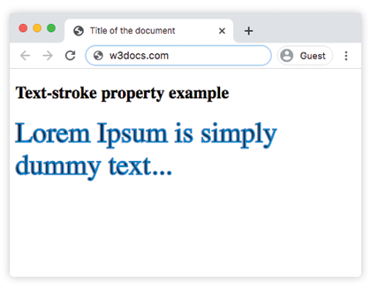
Example of the text-stroke property:
CSS text-stroke code example
<!DOCTYPE html>
<html>
  <head>
    <title>Title of the document</title>
    <style>
      p {
        font-size: 2.5em;
        margin: 0;
        -webkit-text-stroke: 2px #1c87c9;
      }
    </style>
  </head>
  <body>
    <h2>Text-stroke property example</h2>
    <p>Lorem Ipsum is simply dummy text...</p>
  </body>
</html>Result
Example of the text-stroke property with multiple values:
CSS text-stroke multiple values example
<!DOCTYPE html>
<html>
  <head>
    <title>Title of the document</title>
    <style>
      .a {
        font-size: 2.5em;
        margin: 0;
        -webkit-text-stroke: 1px #8ebf42;
      }
      .b {
        font-size: 2.5em;
        margin: 0;
        -webkit-text-stroke: 2pt #8ebf42;
      }
      .c {
        font-size: 2.5em;
        margin: 0;
        -webkit-text-stroke: 0.1cm #8ebf42;
      }
    </style>
  </head>
  <body>
    <h2>Text-stroke property example</h2>
    <p class="a">Lorem Ipsum is simply dummy text...</p>
    <p class="b">Lorem Ipsum is simply dummy text...</p>
    <p class="c">Lorem Ipsum is simply dummy text...</p>
  </body>
</html>Here 1px, 2pt, and 0.1cm are all valid width units, so the three paragraphs get progressively thicker outlines.
Values
| Value | Description |
|---|---|
| length | Specifies the thickness of the stroke. |
| color | Specifies the color of the stroke. Color names, hexadecimal color codes, rgb(), rgba(), hsl(), hsla() can be used. |
| initial | Makes the property use its default value. |
| inherit | Inherits the property from its parents element. |