CSS ::placeholder Pseudo Element
Use the ::placeholder CSS selector for selecting the element with placeholder text. Read about the pseudo-element and see examples.
The ::placeholder pseudo-element selects the placeholder text of a form field — the short hint shown inside an empty <input> or <textarea> that disappears once the user starts typing. It only matches elements that carry a placeholder attribute. By default, browsers render placeholder text in a semi-transparent or light gray color.
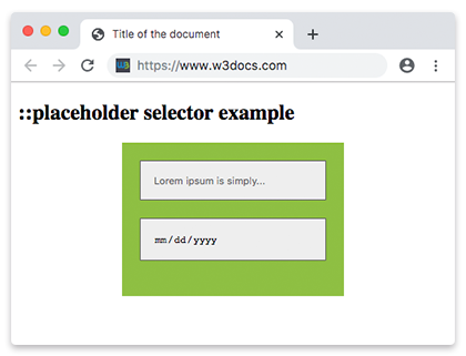
The hint itself comes from the HTML placeholder attribute, while ::placeholder lets you style how that hint looks — its color, font, and so on.
When to use it
Reach for ::placeholder when you want the hint to be readable against your form's background, or to match your brand colors. A few things worth knowing before you style it:
- Only a limited set of properties apply. Because the placeholder is "pseudo content," you can use properties that affect the text itself —
color,font-*,letter-spacing,text-decoration,opacity,background, and a handful of others. Layout properties (likemarginorwidth) have no effect. - Keep enough contrast. The default light gray often fails accessibility contrast guidelines. If you restyle the color, make sure the text stays legible.
- A placeholder is not a label. It vanishes as soon as the user types, so it should never replace a real
<label>. Use it for an example value, not the field's name.
Vendor prefixes (-webkit-, -moz-, -ms-) are legacy and unnecessary for modern browsers. The standard ::placeholder selector is supported everywhere, so you can safely write a single ::placeholder rule.
Version
Syntax
CSS ::placeholder syntax example
::placeholder {
  css declarations;
}Example of the ::placeholder selector:
CSS ::placeholder example
<!DOCTYPE html>
<html>
  <head>
    <title>Title of the document</title>
    <style>
      input::placeholder {
        color: #1c87c9;
        font-size: 1.2em;
        font-style: italic;
      }
    </style>
  </head>
  <body>
    <h2>::placeholder selector example</h2>
    <input placeholder="Type here..." />
  </body>
</html>Example of the ::placeholder selector used in form:
CSS ::placeholder code example
<!DOCTYPE html>
<html>
  <head>
    <title>Title of the document</title>
    <style>
      * {
        box-sizing: border-box;
      }
      .container {
        margin: 20px auto;
        max-width: 250px;
        background-color: #8ebf42;
        padding: 20px;
      }
      input {
        border: 1px solid #666666;
        background-color: #eeeeee;
        padding: 15px;
        margin-bottom: 20px;
        display: block;
        width: 100%;
      }
      input::-webkit-input-placeholder {
        color: #666666;
      }
      input::-moz-placeholder {
        color: #666666;
      }
      input:-ms-input-placeholder {
        color: #666666;
      }
      input::placeholder {
        color: #666666;
      }
    </style>
  </head>
  <body>
    <h2>::placeholder selector example</h2>
    <div class="container">
      <form>
        <input type="text" placeholder="Lorem ipsum is simply..." />
        <input type="date" placeholder="DD/MM/YYYY" />
      </form>
    </div>
  </body>
</html>Example of the ::placeholder selector with the HTML <input> autofocus attribute:
HTML example of placeholder
<!DOCTYPE html>
<html>
  <head>
    <title>Title of the document</title>
    <style>
      label {
        display: block;
        color: #777777;
        margin: 0 0 4px;
      }
      input {
        border: 1px solid transparent;
        padding: 15px;
        font-size: 1.2em;
        outline: 0;
      }
      input::placeholder {
        color: #8ebf42;
      }
      label,
      input {
        font-family: sans-serif;
      }
    </style>
  </head>
  <body>
    <h2>::placeholder selector example</h2>
    <form action="#">
      <div>
        <label for="name">Name:</label>
        <input id="name" name="name" type="text" placeholder="Enter your name here" autofocus />
      </div>
    </form>
  </body>
</html>Related topics
- CSS
:focusselector — style a field while the user is typing in it. - CSS
colorproperty — the property you most often combine with::placeholder. - HTML
<input>tag and HTML<textarea>tag — the elements that carry theplaceholderattribute.