HTML <textarea> Tag
The HTML <textarea> tag defines a form field where users can input a multi-line text. The HTML <textarea> tag is allowed when the form is submitted.
The <textarea> tag defines a form field where users can input a multi-line text. Unlike the <input> tag, text wrapping inside <textarea> is allowed when the form is submitted.
A text area can have an unlimited number of characters. The text within this tag is rendered in a proportional font by default.
The <textarea> is used inside the <form> tag.
Syntax
The <textarea> tag comes in pairs. The content is written between the opening (<textarea>) and closing (</textarea>) tags.
A common beginner mistake: a <textarea> does not take a value attribute. Its default value goes between the opening and closing tags, unlike a single-line <input>, which uses value="…". For example, <textarea>Hello</textarea> shows "Hello", while <input value="Hello"> shows "Hello" — but <textarea value="Hello"></textarea> shows nothing.
Example of the HTML <textarea> tag:
<!DOCTYPE html>
<html>
  <head>
    <title>Title of the document</title>
  </head>
  <body>
    <form action="/form/submit" method="post">
      <textarea name="comment" rows="12" cols="35">Send your comments to the author.</textarea><br />
      <input type="submit" name="submitInfo" value="Submit" />
    </form>
  </body>
</html>Result
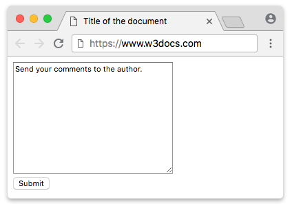
In this example we use the <textarea> to define the text field, the name attribute to assign a name to this field ("comment"), the rows attribute to set its visible height (12 lines) and the cols attribute to set its visible width (35 characters).
Associating a label with a <textarea>
Every form field should have a <label>. Connect the label to the textarea by giving the textarea an id and pointing the label's for attribute at that same value. This lets screen readers announce the field, and lets users click the label text to move focus into the textarea — both improvements for accessibility and usability.
<!DOCTYPE html>
<html>
  <head>
    <title>Title of the document</title>
  </head>
  <body>
    <form action="/form/submit" method="post">
      <label for="comment">Your comment:</label><br />
      <textarea id="comment" name="comment" rows="6" cols="40"></textarea><br />
      <input type="submit" value="Submit" />
    </form>
  </body>
</html>Limiting and hinting input
Use the maxlength attribute to cap how many characters a user can type, and the placeholder attribute to show a short hint inside an empty field. The placeholder disappears as soon as the user starts typing — it is not a default value, so it is never submitted with the form.
<!DOCTYPE html>
<html>
  <head>
    <title>Title of the document</title>
  </head>
  <body>
    <form action="/form/submit" method="post">
      <label for="bio">Short bio (max 100 characters):</label><br />
      <textarea id="bio" name="bio" rows="4" cols="40" maxlength="100"
                placeholder="Tell us a little about yourself..."></textarea><br />
      <input type="submit" value="Submit" />
    </form>
  </body>
</html>Styling the <textarea> element with CSS
The <textarea> tag is considered to be a replaced element, as it has some intrinsic dimensions. Styling this tag is relatively easy with regular CSS.
Its valid and invalid values can be highlighted with the :valid and :invalid pseudo-classes.
In most browsers, <textarea> is resizable due to the CSS resize property. Resizing is enabled by default. You can disable it putting the resize value to none.
Example of the HTML <textarea> tag with CSS properties:
<!DOCTYPE html>
<html>
  <head>
    <title>Title of the document</title>
    <style>
      .comment {
        width: 60%;
        height: 100px;
        padding: 10px;
        outline: 0;
        border: 3px solid #1c87c9;
        background: #d0e2bc;
        line-height: 20px;
      }
    </style>
  </head>
  <body>
    <form>
      <p>Here we use CSS styles to customize the look of the text field.</p>
      <textarea class="comment"> Send your comments to the author.</textarea>
      <br />
      <input type="submit" name="submitInfo" value="Submit" />
    </form>
  </body>
</html>In this example we use CSS styles to customize the look of the text field.
Controlling resizing with the resize property
By default most browsers add a drag handle in the corner of a <textarea> so users can resize it in both directions. You can control this with the CSS resize property:
resize: none;— disables resizing entirely.resize: vertical;— allows resizing the height only.resize: horizontal;— allows resizing the width only.resize: both;— the default, allows resizing in both directions.
<!DOCTYPE html>
<html>
  <head>
    <title>Title of the document</title>
    <style>
      textarea {
        width: 60%;
        padding: 8px;
      }
      .no-resize {
        resize: none;
      }
      .vertical-only {
        resize: vertical;
      }
      .horizontal-only {
        resize: horizontal;
      }
    </style>
  </head>
  <body>
    <p>Not resizable:</p>
    <textarea class="no-resize" rows="3"></textarea>
    <p>Resizable vertically only:</p>
    <textarea class="vertical-only" rows="3"></textarea>
    <p>Resizable horizontally only:</p>
    <textarea class="horizontal-only" rows="3"></textarea>
  </body>
</html>Attributes
| Attribute | Value | Description |
|---|---|---|
| autocomplete | on, off | Specifies whether or not a text field should have autocomplete enabled. |
| autofocus | autofocus | Defines that a text area should automatically get focus when the page loads. |
| cols | number | Defines the visible width of a text area. Default value is 20 characters. |
| dirname | dirname | Specifies the name of a hidden form control that will contain the text direction of the textarea when submitted. |
| disabled | disabled | Defines that a text area should be disabled. |
| form | form_id | Defines one or more forms the text area belongs to (via id). |
| maxlength | number | Defines the maximum number of characters allowed in the text area. |
| minlength | number | Defines the minimum number of characters allowed in the text area. |
| name | text | Defines a name for a text area. |
| placeholder | text | Defines a short hint that describes the expected value of a text area. The hint is shown when the field is empty, and disappears when it gets focus. |
| readonly | readonly | Defines that a text area is read-only. |
| required | required | Defines that a text area must be filled out before the form is sent. |
| rows | number | Defines the visible number of rows in a text area. The default is browser-dependent (typically 2). |
| spellcheck | true, false, default | Specifies whether the text in the <textarea> tag should be spell checked by the underlying browser/OS. |
| wrap | soft, hard | Defines how the text in a text area is to be wrapped when the form is submitted. soft (default): text is sent without additional line breaks. hard: browser inserts line breaks based on width (requires cols). |
The <textarea> tag also supports the Global Attributes and the Event Attributes.
Related tags
<input>— single-line and specialized form controls.<form>— the container that groups and submits form fields.<label>— labels that make form fields accessible.