HTML Layout Templates
Learn how to build modern HTML page layouts. Structure pages with semantic elements and create responsive columns using CSS Flexbox and CSS Grid.
A page layout is the way the main regions of a page — the banner, the navigation, the primary content, the sidebar, and the footer — are arranged on the screen. This chapter shows how to build a layout the modern way: mark up the regions with HTML5 semantic elements, then position them with CSS Flexbox or CSS Grid. By the end you will be able to assemble a responsive multi-column page from scratch.
The structure of a typical page
Almost every website is built from the same five building blocks:
| Region | Purpose | Element |
|---|---|---|
| Header | Logo, site title, banner | <header> |
| Navigation | Primary menu / links | <nav> |
| Main content | The unique content of the page | <main> |
| Sidebar | Related links, ads, "extra stuff" | <aside> |
| Footer | Copyright, contact, secondary links | <footer> |
Before HTML5 these regions were all written as generic <div> elements with id or class names like <div id="header">. That still renders fine, but it carries no meaning: a browser, a screen reader, or a search engine cannot tell a banner from a footer. The semantic elements above describe what each region is, which improves accessibility and SEO at no extra cost. See the full list in Semantic Elements in HTML5.
A semantic page skeleton
Start with the markup, before adding any layout CSS. Use each landmark element once where it naturally belongs:
<!DOCTYPE html>
<html lang="en">
<head>
<title>My page</title>
</head>
<body>
<header>
<h1>My Website</h1>
<nav>
<a href="#">Home</a>
<a href="#">About</a>
<a href="#">Contact</a>
</nav>
</header>
<main>
<h2>Welcome</h2>
<p>This is the primary content of the page.</p>
</main>
<aside>
<h2>Related</h2>
<p>Links, ads, or extra information go here.</p>
</aside>
<footer>
<p>© 2024 My Website</p>
</footer>
</body>
</html>A few rules worth remembering:
- There should be only one
<main>per page, and it must not be nested inside<header>,<nav>,<aside>, or<footer>. <nav>is for major navigation blocks, not every group of links.<aside>is content that is tangential to the main content — it works whether you place it inside<main>or beside it.
This skeleton has no columns yet; everything stacks vertically. Layout — turning these blocks into columns — is a job for CSS, which we add next.
A two-column layout with Flexbox
CSS Flexbox lays items out along a single axis — a row or a column — and is ideal for a content-plus-sidebar arrangement. Wrap <main> and <aside> in a flex container; display: flex puts them side by side, and flex controls how the leftover space is shared.
<!DOCTYPE html>
<html lang="en">
<head>
<title>Flexbox two-column layout</title>
<style>
body {
margin: 0;
font-family: Arial, sans-serif;
}
header, footer {
background: #2c3e50;
color: #fff;
padding: 16px;
}
.container {
display: flex;
gap: 16px;
padding: 16px;
}
main {
flex: 3; /* main takes 3 shares of the space */
background: #ecf0f1;
padding: 16px;
}
aside {
flex: 1; /* sidebar takes 1 share */
background: #dfe6e9;
padding: 16px;
}
</style>
</head>
<body>
<header><h1>My Website</h1></header>
<div class="container">
<main>
<h2>Main content</h2>
<p>This column grows to fill most of the width.</p>
</main>
<aside>
<h2>Sidebar</h2>
<p>A narrower second column.</p>
</aside>
</div>
<footer><p>© 2024 My Website</p></footer>
</body>
</html>flex: 3 and flex: 1 make the two columns split the available width in a 3-to-1 ratio. Because these are proportions, the columns stay fluid: they shrink and grow with the viewport instead of staying a fixed number of pixels. To stack them on small screens, wrap the rule in a media query:
@media (max-width: 600px) {
  .container {
    flex-direction: column;
  }
}A full layout with CSS Grid
CSS Grid lays out items in two dimensions — rows and columns at once — which makes it the better tool for a whole-page layout. With grid-template-areas you can draw the layout in plain text and assign each element to a named region:
<!DOCTYPE html>
<html lang="en">
<head>
<title>CSS Grid page layout</title>
<style>
body {
margin: 0;
font-family: Arial, sans-serif;
}
.grid {
display: grid;
grid-template-columns: 1fr 3fr; /* sidebar : content */
grid-template-areas:
"header header"
"nav main"
"footer footer";
gap: 12px;
padding: 12px;
}
header { grid-area: header; background: #2c3e50; color: #fff; }
nav { grid-area: nav; background: #dfe6e9; }
main { grid-area: main; background: #ecf0f1; }
footer { grid-area: footer; background: #2c3e50; color: #fff; }
header, nav, main, footer { padding: 16px; }
</style>
</head>
<body>
<div class="grid">
<header><h1>My Website</h1></header>
<nav>Navigation</nav>
<main>
<h2>Main content</h2>
<p>The header and footer span both columns.</p>
</main>
<footer><p>© 2024 My Website</p></footer>
</div>
</body>
</html>The fr unit means "a fraction of the free space", so 1fr 3fr makes the content column three times as wide as the sidebar — again, a fluid ratio rather than a fixed width. The visual map in grid-template-areas lets the header and footer span both columns simply by repeating their names across a row.
Flexbox or Grid — which should I use?
Both are modern, well-supported, and often interchangeable, but they have a natural division of labour:
- Reach for Flexbox when you are arranging items in one direction — a navigation bar, a toolbar, a row of cards, or a content-plus-sidebar split.
- Reach for Grid when you need rows and columns together, such as a full page layout (header / sidebar / content / footer) or an image gallery.
A common, robust pattern is to use Grid for the overall page skeleton and Flexbox for the smaller components inside each region.
Fixed-width vs. fluid layouts
The examples above are fluid (also called liquid): widths are expressed as ratios (flex: 3, 3fr) or percentages, so the layout flexes to fill any screen. This is the foundation of responsive design.
A fixed-width layout pins regions to an exact pixel value, e.g. width: 960px or flex: 0 0 240px for a sidebar. Fixed widths give you precise control but do not adapt — on a narrow phone they cause horizontal scrolling, and on a wide monitor they leave empty space. In practice most sites combine the two: a fixed-width sidebar next to a fluid content column, often capped with max-width so very wide screens stay readable.
Ready-made layout templates
If you would rather start from a finished structure, the gallery below offers downloadable HTML layouts — fixed, fluid, and hybrid, with two or three columns. They are a useful reference, but the modern techniques shown above are the recommended way to build new pages.
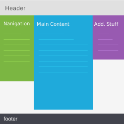 Two columns, left menu (template 01)
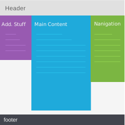 Three percentage columns (template 02)
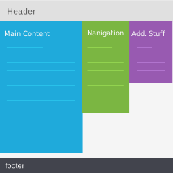 Three percentage columns (template 03)
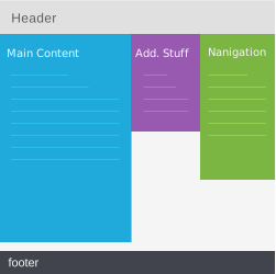 Three percentage columns (template 04)
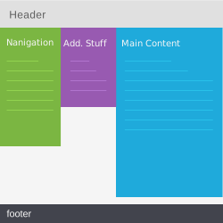 Three percentage columns (template 05)
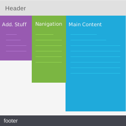 Three percentage columns (template 06)
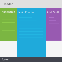 Three fixed columns (template 07)
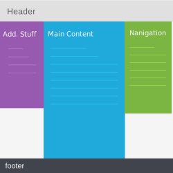 Three fixed columns (template 08)
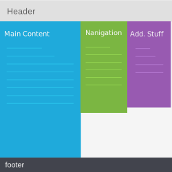 Three fixed columns (template 09)
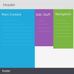 Three fixed columns (template 10)
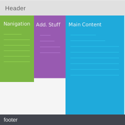 Three fixed columns (template 11)
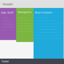 Three fixed columns (template 12)
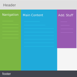 Liquid, secondary columns fixed-width (template 13)
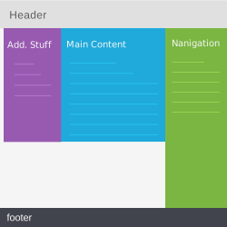 Liquid, secondary columns fixed-width (template 14)
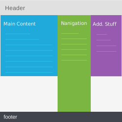 Liquid, secondary columns fixed-width (template 15)
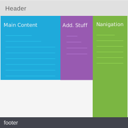 Liquid, secondary columns fixed-width (template 16)
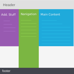 Liquid, secondary columns fixed-width (template 17)
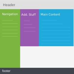 Liquid, secondary columns fixed-width (template 18)
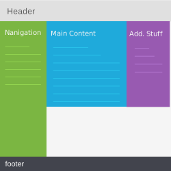 Liquid, three columns, hybrid widths (template 19)
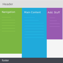 Liquid, three columns, hybrid widths (template 20)
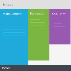 Liquid, three columns, hybrid widths (template 21)
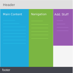 Liquid, three columns, hybrid widths (template 22)
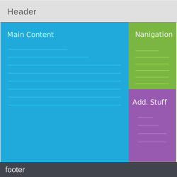 Two columns liquid, side fixed (template 23)
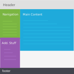 Two columns liquid, side fixed (template 24)
- Two percentage columns (template 25)
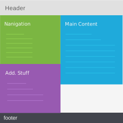 Two percentage columns (template 26)
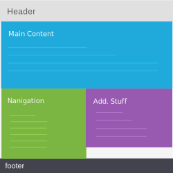 One column liquid and two halves (template 27)
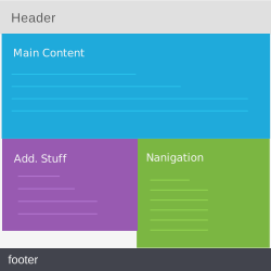 One column liquid and two halves (template 28)
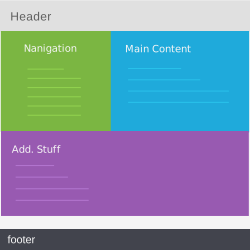 Two percentage columns and one larger (template 29)
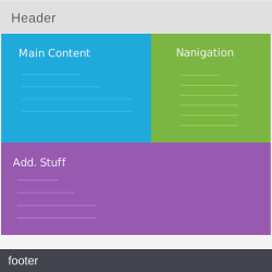 Two percentage columns and one larger (template 30)
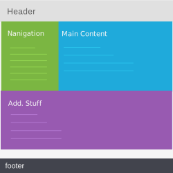 Two columns liquid, fixed side and large one (template 31)
- Two columns liquid, fixed side and large one (template 32)
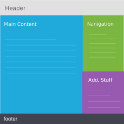 Two columns fixed (template 33)
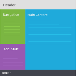 Two columns fixed (template 34)
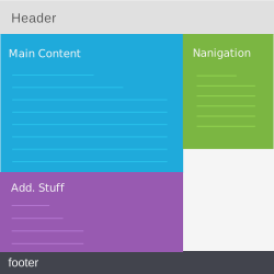 Two columns fixed (template 35)
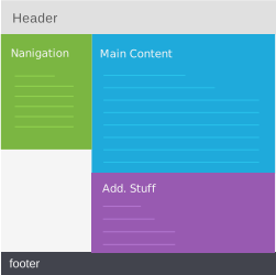 Two columns fixed (template 36)
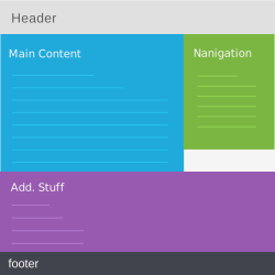 Two columns fixed (template 37)
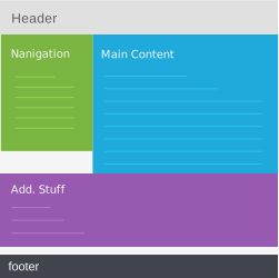 Two columns fixed (template 38)
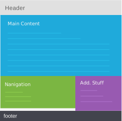 One column fixed and two halves (template 39)
- One column fixed and two halves (template 40)
These templates were built with the legacy CSS float and negative margin technique. You can study them for ideas, but rebuild the structure with the Flexbox or Grid approaches above for a result that is easier to maintain and responsive out of the box.
Customizing a template
Once you have a structure you like, here are common ways to make it yours:
- Replace the placeholder text and add your own images.
- Adjust the semantic markup to match your content.
- Deepen the markup with our HTML tutorial.
- Restyle the layout with our CSS tutorial.
- Add interactivity with our JavaScript tutorial.