HTML <details> Tag
The <details> tag contains additional information that the user can open and view. Tag attributes and examples.
The <details> tag is one of the HTML5 elements. It creates a disclosure widget: an interactive control that the user can open to reveal extra content and close again to hide it. By default the content stays hidden, and the browser draws a small triangle (the disclosure marker) that rotates to show the open or closed state.
The first child of <details> should be a <summary> element, which sets the visible label that the user clicks to toggle the widget. The <summary> is the actual control — the rest of the content inside <details> is what gets shown or hidden. If you omit <summary>, the browser supplies a default label such as "Details".
Why use <details>
The big advantage of <details> is that it gives you a fully working show/hide widget with no JavaScript at all. The browser handles the open/close behavior, keyboard support, and accessibility for you.
Common use cases:
- FAQ lists — each question is a
<summary>and the answer is revealed on click. - Progressive disclosure — hide advanced settings, long legal text, or "read more" sections so the page stays scannable.
- No-JS accordion fallback — because it works without scripting,
<details>is a robust baseline for accordions. Even if your JavaScript fails to load, the content is still reachable.
Compared with a hand-built JavaScript accordion, <details> is less code, automatically keyboard- and screen-reader-accessible, and degrades gracefully. Reach for a custom JS widget only when you need behavior the native element cannot give you (animated height transitions across the full content, for example).
Syntax
The <details> tag comes in pairs. The content is written between the opening (<details>) and closing (</details>) tags.
Example of the HTML <details> tag:
HTML <details> Tag
<!DOCTYPE html>
<html>
  <head>
    <title>Title of the document</title>
  </head>
  <body>
    <details>
      <summary>Click to see details</summary>
      <p>Detailed information is here.</p>
    </details>
  </body>
</html>Result
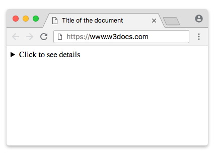
The open attribute
Add the open boolean attribute to make the widget expanded when the page loads:
<details open>
  <summary>What is HTML?</summary>
  <p>HTML is the standard markup language for documents designed to be displayed in a web browser.</p>
</details>The open attribute reflects the current state in real time. When the user toggles the widget, the browser adds or removes open on the element automatically — you do not have to manage it. You can also toggle it yourself from script:
const details = document.querySelector('details');
details.open = true;   // expand
details.open = false; // collapseReading details.open tells you whether the widget is currently open.
Example of the HTML <details> tag placed inside a <form> tag:
HTML <details> Tag
<!DOCTYPE html>
<html>
  <head>
    <title>Title of the document</title>
  </head>
  <body>
    <form action="action_form.php" method="get">
      <details>
        <summary>Departure airport:</summary>
        <input type="text" list="airports" name="airports" />
        <datalist id="airports">
          <option value="Birmingham">
          <option value="Cambridge">
          <option value="Oxford">
          <option value="Bangor">
        </datalist>
        <input type="submit" value="confirm" />
      </details>
    </form>
  </body>
</html>Attributes
| Attribute | Value | Description |
|---|---|---|
| open | open | Indicates that the information in the tag should initially be shown in expanded form. |
The <details> tag also supports the Global Attributes and the Event Attributes.
How to style an HTML <details> Tag
details {
  border: 1px solid #ccc;
  border-radius: 4px;
  padding: 0.5em;
}
summary {
  font-weight: bold;
  cursor: pointer;
}Styling the disclosure marker
Most browsers render the open/close triangle through the ::marker pseudo-element on the <summary>. To change or remove it, set list-style on the summary:
/* Remove the default triangle */
summary {
  list-style: none;
}

/* Replace it with your own characters */
summary::marker {
  content: "▶ ";
}
details[open] summary::marker {
  content: "▼ ";
}Older WebKit-based browsers (older Safari/Chrome) used a non-standard summary::-webkit-details-marker pseudo-element instead. To cover those, hide it as well:
summary::-webkit-details-marker {
  display: none;
}The toggle event
The <details> element fires a toggle event every time it opens or closes. This is the right hook for lazy-loading content, sending analytics, or syncing UI state:
const details = document.querySelector('details');

details.addEventListener('toggle', () => {
  if (details.open) {
    console.log('Opened');
  } else {
    console.log('Closed');
  }
});The event runs after the state has already changed, so details.open reflects the new value inside the handler.
Accessibility
The native <details>/<summary> pairing comes with accessibility built in. Browsers expose the <summary> with a button-like role and the <details> as a group, announce the expanded/collapsed state to screen readers, and make the summary focusable and operable with Enter and Space. This is a key reason to prefer the native element over a scripted accordion — you get correct semantics and keyboard support for free, without managing aria-expanded yourself.
Grouping with the name attribute
Modern browsers (Chrome 120+ and other recent engines) support a name attribute on <details>. When several <details> elements share the same name, they behave as an exclusive group, like an accordion: opening one automatically closes the others.
<details name="faq" open>
  <summary>Question one</summary>
  <p>Answer one.</p>
</details>
<details name="faq">
  <summary>Question two</summary>
  <p>Answer two.</p>
</details>Because this is a newer feature, browsers that do not support name simply ignore it and let each widget open independently — a safe progressive enhancement.
Related tags
<summary>— the visible label and control for a<details>widget.<dialog>— a native modal or non-modal dialog box, useful when you need an overlay rather than inline disclosure.