HTML <div> Tag
See how to use the <div> tag to group HTML elements and style them with CSS, how to apply class, id, style, and other attributes to <div> tag. Try Examples.
The <div> tag is a container used to define a division or a section. It is a block-level element that does not inherently affect the content, but is primarily used to group HTML elements to be styled with CSS or manipulated with scripts.
Because <div> is a block-level element, each one starts on a new line and stretches to fill the available width. It carries no semantic meaning of its own — it is a generic box. Use <div> to group block-level content; to group or style inline content (a few words inside a sentence), reach for the inline counterpart, the <span> tag, instead.
Positioning Blocks Defined by <div> Tag
Since <div> is a block-level element, a line break is placed before and after it.
It is possible to place any HTML element within a <div> tag, including another <div>.
Block-level elements like <div> cannot be nested inside <p> tags, as the paragraph will be broken at the point where the <div> tag is placed.
To apply styles inside a paragraph use <span> tag, which is used with inline elements.
Syntax
The <div> tag comes in pairs. The content is written between the opening (<div>) and closing (</div>) tags.
Example of the HTML <div> tag:
Example of HTML <div> tag
<!DOCTYPE html>
<html>
<head>
<title>The <div> Tag</title>
</head>
<body>
<h1> The <div> Tag </h1>
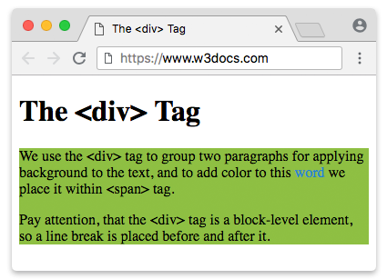
<div style="background-color:#8ebf42">
<p>We use the <div> tag to group two paragraphs for applying a background to the text, and to add color to this
<span style="color:#1c87c9">word</span> we place it within <span> tag.</p>
<p> Pay attention, that the <div> tag is a block-level element, so a line break is placed before and after
it.</p>
</div>
</body>
</html><div> vs. Semantic Elements
A <div> is the right tool when you only need a generic box to hook styles or scripts onto. But when the box represents a meaningful region of the page — navigation, a header, an article — prefer the matching HTML5 semantic element. Semantic tags describe what the content is, which helps search engines, screen readers, and other developers understand your markup.
Compare the same structure written two ways:
<!-- Before: generic divs, no meaning -->
<div class="header">...</div>
<div class="nav">...</div>
<div class="main">...</div>
<div class="footer">...</div>

<!-- After: semantic elements, self-describing -->
<header>...</header>
<nav>...</nav>
<main>...</main>
<footer>...</footer>Both render identically by default, but the second version is far more accessible and maintainable.
Beware of "div soup". Wrapping everything in nested <div> elements — <div class="nav">, <div class="header">, and so on — produces markup that is hard to read and gives assistive technology nothing to work with. Before adding a <div>, ask whether <nav>, <header>, <main>, <article>, <section>, or <footer> fits better.
<div> vs. <span>
The <div> and <span> tags are both generic, meaningless containers — the difference is the box they create:
<div>is block-level. It begins on a new line, fills the available width, and is used to group larger sections of content (paragraphs, lists, other divs).<span>is inline. It flows within a line of text and is used to style or target a small piece of content, such as a word or phrase.
<p>The word <span style="color:#1c87c9">highlighted</span> sits inside the text flow.</p>

<div style="background-color:#8ebf42">
  <p>This whole block is grouped and given a background.</p>
</div>As a rule of thumb: reach for <div> to group block-level content, and <span> to wrap inline content.
When we build layouts, we deal with multiple blocks defined by the <div> tag. The positioning of these blocks is at the heart of layout: placing elements in the correct relative positions across all screen sizes is one of the most important tasks.
Depending on the content and the goals of the page, we can use different techniques (or their combinations) to determine the place of each block. For modern layouts, the two tools you should reach for first are CSS Grid (for two-dimensional, row-and-column layouts) and Flexbox (for one-dimensional rows or columns). The older techniques below — floats, negative margins, and absolute positioning — still work but are rarely the best choice today.
CSS Grid
CSS Grid is the modern, standard way to build two-dimensional layouts — that is, layouts that arrange <div> blocks into both rows and columns at once. You define a grid on the container with display: grid and describe its tracks, then the child blocks flow into the cells.
Example of the HTML <div> tag with CSS Grid:
An example of HTML <div> tag with CSS Grid
<!DOCTYPE html>
<html>
  <head>
    <title>Title of the document</title>
    <style>
      .grid-container {
        display: grid;
        grid-template-columns: 1fr 1fr 1fr;
        gap: 10px;
        padding: 10px;
        background-color: #1faadb;
      }
      .grid-container > div {
        height: 60px;
        border-radius: 3px;
        background-color: #8ebf42;
      }
    </style>
  </head>
  <body>
    <div class="grid-container">
      <div></div>
      <div></div>
      <div></div>
      <div></div>
      <div></div>
      <div></div>
    </div>
  </body>
</html>This single grid-template-columns: 1fr 1fr 1fr creates three equal columns, and the six <div> blocks wrap automatically into two rows.
Flexbox
When you only need to lay items out along a single axis — a row or a column — Flexbox is the right tool. In modern websites float-based layouts are being replaced with Flexbox and Grid. The main idea behind Flexbox is that with it, you can control the alignment, direction, order, and size of the items inside the container.
Example of a Flexbox with HTML <div> tag:
An example of HTML <div> tag with Flexbox
<!DOCTYPE html>
<html>
  <head>
    <title>Title of the document</title>
    <style>
      .flex-container {
        display: flex;
        align-items: center; /* Use another value to see the result */
        width: 100%;
        height: 200px;
        background-color: #1faadb;
      }
      .flex-container > div {
        width: 25%;
        height: 60px;
        margin: 5px;
        border-radius: 3px;
        background-color: #8ebf42;
      }
    </style>
  </head>
  <body>
    <div class="flex-container">
      <div></div>
      <div></div>
      <div></div>
    </div>
  </body>
</html>CSS Float property
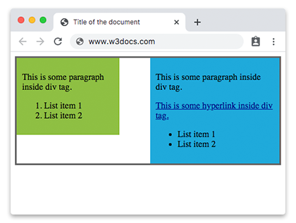
CSS float property, or "floats" allows elements to appear next to, or apart from, one another, which lets us create different types of layouts, including multi-column pages, sidebars, grids, etc.
Example of the HTML <div> tag with the CSS float property:
Example of HTML <div> tag with CSS Float property
<!DOCTYPE html>
<html>
  <head>
    <title>Title of the document</title>
    <style>
      .content {
        overflow: auto;
        border: 3px solid #666;
      }
      .content div {
        padding: 10px;
      }
      .content a {
        color: darkblue;
      }
      .blue {
        float: right;
        width: 45%;
        background-color: #1faadb;
      }
      .green {
        float: left;
        width: 35%;
        background-color: #8ebf42;
      }
    </style>
  </head>
  <body>
    <div class="content">
      <div class="blue">
        <p>This is some paragraph inside div tag.</p>
        <a href="#">This is some hyperlink inside div tag.</a>
        <ul>
          <li>List item 1</li>
          <li>List item 2</li>
        </ul>
      </div>
      <div class="green">
        <p>This is some paragraph inside div tag.</p>
        <ol>
          <li>List item 1</li>
          <li>List item 2</li>
        </ol>
      </div>
    </div>
  </body>
</html>Result
Negative Margins (legacy technique)
Negative margins can be applied to both static and floated elements to pull blocks closer together or make them overlap.
Example of negative margins:
Example of HTML <div> tag with negative margins
<!DOCTYPE html>
<html>
  <head>
    <title>Title of the document</title>
    <style>
      .content div {
        padding: 2%;
      }
      .content a {
        color: darkblue;
      }
      .main-content {
        width: 30%;
        margin-left: 32%;
      }
      .blue {
        width: 25%;
        margin-top: -10%;
        background-color: #1faadb;
      }
      .green {
        width: 20%;
        margin: -35% auto auto 70%;
        background-color: #8ebf42;
      }
    </style>
  </head>
  <body>
    <div class="content">
      <div class="main-content">
        <a href="#">This is some hyperlink inside div tag.</a>
      </div>
      <div class="blue">
        <p>This is some paragraph inside div tag.</p>
        <a href="#">This is some hyperlink inside div tag.</a>
        <ul>
          <li>List item 1</li>
          <li>List item 2</li>
        </ul>
      </div>
      <div class="green">
        <p>This is some paragraph inside div tag.</p>
        <ol>
          <li>List item 1</li>
          <li>List item 2</li>
        </ol>
      </div>
    </div>
  </body>
</html>Relative+absolute positioning
If you want to position div relative to particular element you can use a combination of position: relative and position: absolute.
Example of relative+absolute positioning of HTML <div> tag:
An example of HTML <div> tag with CSS position property
<!DOCTYPE html>
<html>
  <head>
    <title>Title of the document</title>
    <style>
      .content {
        position: relative;
        height: 400px;
        border: 1px solid #666;
      }
      .content div {
        position: absolute;
        width: 35%;
        padding: 10px;
      }
      .blue {
        right: 20px;
        bottom: 0;
        background-color: #1faadb;
      }
      .green {
        top: 10px;
        left: 15px;
        background-color: #8ebf42;
      }
    </style>
  </head>
  <body>
    <div class="content">
      <div class="blue">
        <p>This is some paragraph inside div tag.</p>
      </div>
      <div class="green">
        <p>This is some paragraph inside div tag.</p>
      </div>
    </div>
  </body>
</html>position: relative does not affect the positioning of elements in normal flow unless you add offsets.
Attributes
The <div> tag has no attributes of its own. In practice it relies on the Global attributes — most often id, class, style, data-*, and aria-* — to be styled, scripted, or made accessible. It also supports the Event Attributes.
| Attribute | Value | Description |
|---|---|---|
| align | left right center justify | Deprecated. Was used to align the content inside a <div> tag. It is not supported in HTML5 — use the CSS text-align property instead. |