HTML <nav> Tag
The HTML <nav> tag is used to define a block of navigation links, either within the current document or to other documents. Learn how to use <nav> tag.
The <nav> tag is one of the HTML5 elements. It defines a section of navigation links, either within the current document or to other documents. Typical navigation blocks are a site's main menu, a table of contents, a breadcrumb trail, or an index. Marking these up with <nav> improves both the document's structure and its semantics, helping browsers, screen readers, and search engines understand the page.
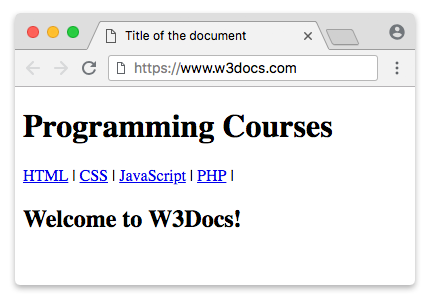
One HTML document may contain several <nav> elements — for example, one for site-wide navigation and one for intra-page (in-page) navigation.
When to use <nav> (and when not to)
<nav> is meant for major blocks of navigation links, not for every group of links on the page. Reserve it for the primary, recognizable navigation areas a user would look for.
You do not need to wrap every list of links in a <nav>:
- Footer utility links (privacy policy, terms, copyright) are usually a judgment call. A short set of legal/utility links can simply live in the
<footer>element without an extra<nav>. Reserve<nav>in the footer for a genuine secondary menu. - Pagination (previous/next, page numbers) is also a judgment call — it is navigation, so a
<nav>is acceptable, but a small "next article" link does not need one. - In-content links inside a paragraph or article body do not belong in a
<nav>.
A good rule of thumb: if removing the block would make it harder to get around the site or document, it is probably <nav>. The <nav> element commonly sits alongside the <header>, <main>, and <aside> elements that structure an HTML5 page.
The <nav> tag cannot be nested in the <address> element.
Accessibility: the navigation landmark
A <nav> element automatically exposes a navigation landmark to assistive technologies, so screen-reader users can jump straight to it. Because of this you should not add role="navigation" yourself — the element already implies it.
When a page contains more than one <nav>, give each a unique accessible name so users can tell them apart. Use aria-label (for a short literal label) or aria-labelledby (to point at a visible heading):
<!-- Primary site navigation -->
<nav aria-label="Primary">
  <a href="/">Home</a>
  <a href="/products">Products</a>
  <a href="/contact">Contact</a>
</nav>

<!-- Breadcrumb navigation on the same page -->
<nav aria-label="Breadcrumb">
  <a href="/">Home</a>
  <a href="/products">Products</a>
  <span aria-current="page">Laptops</span>
</nav>Do not include the word "navigation" in the label (for example aria-label="Main navigation") — assistive technologies already announce it as a navigation landmark, so that would be read twice. Use aria-current="page" to mark the link for the current page.
Syntax
The <nav> tag comes in pairs. The content is written between the opening (<nav>) and closing (</nav>) tags.
Example of using the HTML <nav> tag:
Example of HTML nav tag
<!DOCTYPE html>
<html>
  <head>
    <title>Title of the document</title>
  </head>
  <body>
    <header>
      <h1>Programming Courses</h1>
    </header>
    <nav>
      <a href="/learn-html.html">HTML</a> |
      <a href="/learn-css.html">CSS</a> |
      <a href="/learn-javascript.html">JavaScript</a> |
      <a href="/learn-php.html">PHP</a>
    </nav>
    <h2>Welcome to W3Docs!</h2>
  </body>
</html>Example of the <nav> tag:
Example of HTML nav tag
<!DOCTYPE html>
<html>
  <head>
    <style>
      nav {
        display: flex;
        flex-wrap: wrap;
      }
      nav a {
        text-decoration: none;
        display: block;
        padding: 15px 25px;
        text-align: center;
        background-color: rgb(189, 185, 185);
        color: #464141;
        margin: 0;
        font-family: sans-serif;
      }
      nav a:hover {
        background-color: #777777;
        color: #ffffff;
      }
    </style>
  </head>
  <body>
    <h1>Example of the HTML nav tag:</h1>
    <nav aria-label="Primary">
      <a href="/">Home</a>
      <a href="/quiz">Quizzes</a>
      <a href="/snippets">Snippets</a>
      <a href="/tools">Tools</a>
      <a href="/string-functions">String Functions</a>
    </nav>
  </body>
</html>Example of creating a dropdown menu using the HTML <nav> tag:
The example below builds a dropdown menu with pure CSS by revealing a nested <ul> on :hover.
This CSS-only dropdown is shown to illustrate <nav> structure, not as production-ready code. Because the submenus open only on mouse :hover, they are unreachable by keyboard and most screen-reader users, which fails WCAG. A real dropdown also needs to respond to keyboard focus (:focus-within) and expose state with attributes such as aria-expanded and aria-haspopup — usually with a small amount of JavaScript.
Example of the nav tag, when creating dropdown menu
<!DOCTYPE html>
<html>
  <head>
    <style>
      nav ul ul {
        display: none;
      }
      nav ul li:hover > ul {
        display: block;
      }
      nav ul:after {
        content: "";
        clear: both;
        display: block;
      }
      nav ul li {
        float: left;
        position: relative;
        list-style-type: none;
      }
      nav ul li:hover {
        background: rgba(19, 20, 123, 0.67);
      }
      nav ul li:hover a {
        color: #fff;
      }
      nav ul li a {
        display: block;
        padding: 20px 30px;
        color: #ffffff;
        text-decoration: none;
        background-color: rgba(35, 17, 134, 0.8);
        font-family: sans-serif;
      }
      nav ul ul {
        background: #5f6975;
        padding: 0;
        position: absolute;
        top: 100%;
      }
      nav ul ul li {
        float: none;
        position: relative;
      }
      nav ul ul li a {
        padding: 15px 10px;
        color: #ffffff;
        text-transform: uppercase;
      }
      nav ul ul li a:hover {
        background: rgba(19, 20, 123, 0.67);
      }
    </style>
  </head>
  <body>
    <h1>Dropdown menu with the HTML nav tag:</h1>
    <nav aria-label="Primary">
      <ul>
        <li>
          <a href="/">Home</a>
        </li>
        <li>
          <a href="/quiz">Quizzes</a>
          <ul>
            <li>
              <a href="/quiz/html-basic">HTML Basics</a>
            </li>
            <li>
              <a href="/quiz/css-basic">CSS Basics</a>
            </li>
            <li>
              <a href="/quiz/javascript-basic">JavaScript Basics</a>
            </li>
            <li>
              <a href="/quiz/php-basic">PHP Basics</a>
            </li>
            <li>
              <a href="/quiz/es6-basic">ES6 Basics</a>
            </li>
          </ul>
        </li>
        <li>
          <a href="/snippets">Snippets</a>
          <ul>
            <li>
              <a href="/snippets/angularjs">Angular JS</a>
            </li>
            <li>
              <a href="/snippets/apache">Apache</a>
            </li>
            <li>
              <a href="/snippets/git">Git</a>
            </li>
            <li>
              <a href="/snippets/linux">Linux</a>
            </li>
            <li>
              <a href="/snippets/nodejs">Node.Js</a>
            </li>
            <li>
              <a href="/snippets/symfony">Symfony</a>
            </li>
          </ul>
        </li>
        <li>
          <a href="/tools">Tools</a>
          <ul>
            <li>
              <a href="/tools/html-encoder">HTML ENCODER/DECODER</a>
            </li>
            <li>
              <a href="/tools/css-maker">CSS MAKER</a>
            </li>
            <li>
              <a href="/tools/password-generator">PASSWORD GENERATOR</a>
            </li>
            <li>
              <a href="/tools/image-base64">Base 64</a>
            </li>
            <li>
              <a href="/tools/code-diff">CODE DIFF</a>
            </li>
          </ul>
        </li>
        <li>
          <a href="/string-functions">String Functions</a>
          <ul>
            <li>
              <a href="/tools/string-reverse">STRING REVERSE</a>
            </li>
            <li>
              <a href="/tools/string-word-count">STRING WORD COUNT</a>
            </li>
            <li>
              <a href="/tools/string-remove-empty-lines">EMPTY LINES REMOVER</a>
            </li>
          </ul>
        </li>
      </ul>
    </nav>
  </body>
</html>Attributes
The <nav> tag supports the Global Attributes and the Event Attributes.. Note that global attributes apply to all HTML elements.
How to style an HTML <nav> tag
<nav> is a semantic container with no default appearance of its own, so styling is done with CSS. A common pattern is to give the bar a background and lay the links out horizontally, removing the default link underline and spacing them apart:
nav {
  background-color: #333;
  padding: 10px;
}
nav a {
  color: white;
  text-decoration: none;
  margin-right: 15px;
}For laying the links out in a row, Flexbox (display: flex on the <nav>) is the modern approach, as shown in the second example above.