CSS align-content Property
Align-content property sets how the browser distributes space between lines. See and try example with all six values.
The CSS align-content property controls how a flex container distributes the extra space between and around its lines along the cross-axis. This page explains when the property applies, walks through every value with a runnable example, and shows how it differs from the related alignment properties.
In a row-direction flex container the main axis runs horizontally, so the cross-axis is vertical. align-content therefore moves whole rows of items up, down, or spreads them apart vertically — it never touches items individually.
When does align-content take effect?
Two conditions must both be true, otherwise the property does nothing:
- The container must allow wrapping — set
flex-wrap: wrap(or use theflex-flowshorthand). The defaultnowrapkeeps everything on one line. - There must be more than one line, plus free space on the cross-axis for the lines to move into.
If you want to align the items within a single line, use align-items instead. align-content is for the lines as a group; align-items is for items inside each line. The align-content property is one of the CSS3 properties.
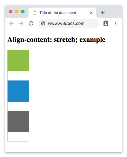
The value stretch is this property's default value.
The align-content property accepts the following values:
- flex-start
- flex-end
- center
- space-between
- space-around
- space-evenly
- stretch
| Initial Value | stretch |
|---|---|
| Applies to | Multi-line flex containers. |
| Inherited | No. |
| Animatable | No. |
| Version | CSS3 |
| DOM Syntax | object.style.alignContent = "flex-end"; |
Syntax
Syntax of CSS align-content Property
align-content: flex-start | flex-end | center | space-between | space-around | space-evenly | stretch | initial | inherit;Example of the align-content property with the stretch value:
<!DOCTYPE html>
<html>
  <head>
    <title>Title of the document</title>
    <style>
      #example {
        width: 70px;
        height: 300px;
        padding: 0;
        border: 1px solid #c3c3c3;
        display: flex;
        flex-flow: row wrap;
        align-content: stretch;
      }
      #example li {
        width: 70px;
        height: 70px;
        list-style: none;
      }
    </style>
  </head>
  <body>
    <h2>Align-content: stretch; example</h2>
    <ul id="example">
      <li style="background-color:#8ebf42;"></li>
      <li style="background-color:#1c87c9;"></li>
      <li style="background-color:#666;"></li>
    </ul>
  </body>
</html>Result
Example of the align-content property with the "center" value:
<!DOCTYPE html>
<html>
  <head>
    <style>
      #example {
        width: 70px;
        height: 300px;
        padding: 0;
        border: 1px solid #c3c3c3;
        display: flex;
        flex-flow: row wrap;
        align-content: center;
      }
      #example li {
        width: 70px;
        height: 70px;
        list-style: none;
      }
    </style>
  </head>
  <body>
    <h2>Align-content: center; example</h2>
    <ul id="example">
      <li style="background-color:#8ebf42;"></li>
      <li style="background-color:#1c87c9;"></li>
      <li style="background-color:#666;"></li>
    </ul>
  </body>
</html>Example of the align-content property with the "flex-start" value:
<!DOCTYPE html>
<html>
  <head>
    <style>
      #example {
        width: 70px;
        height: 300px;
        padding: 0;
        border: 1px solid #c3c3c3;
        display: flex;
        flex-flow: row wrap;
        align-content: flex-start;
      }
      #example li {
        width: 70px;
        height: 70px;
        list-style: none;
      }
    </style>
  </head>
  <body>
    <h2>Align-content: flex-start; example</h2>
    <ul id="example">
      <li style="background-color:#8ebf42;"></li>
      <li style="background-color:#1c87c9;"></li>
      <li style="background-color:#666;"></li>
    </ul>
  </body>
</html>Example of the align-content property with the "flex-end" value:
<!DOCTYPE html>
<html>
  <head>
    <style>
      #example {
        width: 70px;
        height: 300px;
        padding: 0;
        border: 1px solid #c3c3c3;
        display: flex;
        flex-flow: row wrap;
        align-content: flex-end;
      }
      #example li {
        width: 70px;
        height: 70px;
        list-style: none;
      }
    </style>
  </head>
  <body>
    <h2>Align-content: flex-end; example</h2>
    <ul id="example">
      <li style="background-color:#8ebf42;"></li>
      <li style="background-color:#1c87c9;"></li>
      <li style="background-color:#666;"></li>
    </ul>
  </body>
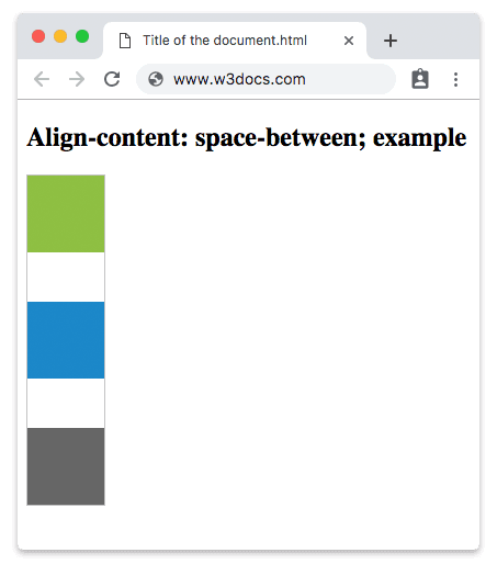
</html>In the following example, space is distributed evenly between the flex lines.
Example of the align-content property with the "space-between" value:
<!DOCTYPE html>
<html>
  <head>
    <style>
      #example {
        width: 70px;
        height: 300px;
        padding: 0;
        border: 1px solid #c3c3c3;
        display: flex;
        flex-flow: row wrap;
        align-content: space-between;
      }
      #example li {
        width: 70px;
        height: 70px;
        list-style: none;
      }
    </style>
  </head>
  <body>
    <h2>Align-content: space-between; example</h2>
    <ul id="example">
      <li style="background-color:#8ebf42;"></li>
      <li style="background-color:#1c87c9;"></li>
      <li style="background-color:#666;"></li>
    </ul>
  </body>
</html>Result
Another example with the "space-around" value. There is equal space between the flex lines.
Example of the align-content property with the "space-around" value:
<!DOCTYPE html>
<html>
  <head>
    <style>
      #example {
        width: 70px;
        height: 300px;
        padding: 0;
        border: 1px solid #c3c3c3;
        display: flex;
        flex-flow: row wrap;
        align-content: space-around;
      }
      #example li {
        width: 70px;
        height: 70px;
        list-style: none;
      }
    </style>
  </head>
  <body>
    <h2>Align-content: space-around; example</h2>
    <ul id="example">
      <li style="background-color:#8ebf42;"></li>
      <li style="background-color:#1c87c9;"></li>
      <li style="background-color:#666;"></li>
    </ul>
  </body>
</html>With space-evenly, the gaps before the first line, between every line, and after the last line are all identical — unlike space-around, where the outer gaps are half the size of the inner ones.
Example of the align-content property with the "space-evenly" value:
<!DOCTYPE html>
<html>
  <head>
    <style>
      #example {
        width: 70px;
        height: 300px;
        padding: 0;
        border: 1px solid #c3c3c3;
        display: flex;
        flex-flow: row wrap;
        align-content: space-evenly;
      }
      #example li {
        width: 70px;
        height: 70px;
        list-style: none;
      }
    </style>
  </head>
  <body>
    <h2>Align-content: space-evenly; example</h2>
    <ul id="example">
      <li style="background-color:#8ebf42;"></li>
      <li style="background-color:#1c87c9;"></li>
      <li style="background-color:#666;"></li>
    </ul>
  </body>
</html>align-content vs. align-items vs. justify-content
These three properties are easy to confuse because they all align flex children:
align-content— aligns the lines as a group on the cross-axis. Needs wrapping and multiple lines.align-items— aligns items within a single line on the cross-axis. Works even with one line.justify-content— aligns items along the main axis (the direction items flow in).
For a deeper tour of how these fit together, see The Ultimate Guide to Flexbox.
Browser support
align-content is supported in all modern browsers — Chrome, Firefox, Safari, Edge, and Opera. It is part of the stable Flexbox specification, so no vendor prefixes are needed for current versions.
Values
| Value | Description | Play it |
|---|---|---|
| stretch | Makes items stretch to fit the container. This is the default value for this property. | Play it » |
| center | Items are placed at the center of the container. | Play it » |
| flex-start | Items are placed at the beginning of the container. | Play it » |
| flex-end | Items are placed at the end of the container. | Play it » |
| space-between | Distributes space evenly between flex lines. | Play it » |
| space-around | Items are distributed with equal space between them. | Play it » |
| space-evenly | Distributes items with equal space between them, as well as before the first and after the last item. | Play it » |
| initial | Makes the property use its default value. | Play it » |
| inherit | Inherits the property from its parent element. |