CSS object-position Property
Use the object-position CSS property to define the position of the element inside its container. See property values and try examples.
The CSS object-position property sets how a replaced element — such as an <img> or <video> — is positioned inside its own box. A replaced element is one whose content comes from an external source rather than from CSS, so the browser decides how to fit that content into the space the box provides.
On its own, object-position does nothing visible unless the element's intrinsic size differs from its box size. That mismatch is created by the object-fit property: once object-fit scales or crops the content (for example with cover or contain), object-position decides which part of the content stays in view. Think of the box as a window and the image as a larger picture behind it — object-position slides the picture so a different region shows through.
You write the value as one or two coordinates: the first controls the x-axis (horizontal) and the second the y-axis (vertical). If you give only one value, the second defaults to center.
/* keyword pairs */
object-position: left top;
object-position: right bottom;

/* lengths and percentages */
object-position: 10px 20%;
object-position: 50% 50%; /* the default — centered */Each coordinate can be a keyword (left, right, top, bottom, center), a length (px, em, …), or a percentage. A percentage of 0% aligns that edge of the content with the same edge of the box; 100% aligns the opposite edges.
Negative values are valid — object-position: -20px 0; pushes the content past the left edge of the box, hiding that strip.
| Initial Value | 50% 50% |
|---|---|
| Applies to | Replaced elements. |
| Inherited | No. |
| Animatable | Yes. The image is animatable. |
| Version | CSS3 |
| DOM Syntax | object.style.objectPosition = "20% 0%"; |
Syntax
object-position: <position> | initial | inherit;Examples
Example with the default position (50% 50%)
The default value centers the content. Because object-fit: cover crops the image to fill the box, centering keeps the middle of the picture visible.
<!DOCTYPE html>
<html>
  <head>
    <title>Title of the document</title>
    <style>
      img.tree {
        width: 200px;
        height: 400px;
        border: 2px solid #8ebf42;
        object-fit: cover;
        object-position: 50% 50%;
      }
    </style>
  </head>
  <body>
    <h2>Object-position property example</h2>
    <h3>Original image:</h3>
    <img src="/uploads/media/default/0001/01/b408569013c0bb32b2afb0f0d45e93e982347951.jpeg" alt="Tree" width="300" height="200" />
    <h3>Object-position: 50% 50%</h3>
    <img class="tree" src="/uploads/media/default/0001/01/b408569013c0bb32b2afb0f0d45e93e982347951.jpeg" alt="Tree" width="300" height="200" />
  </body>
</html>Result
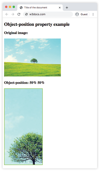
Example with the keyword left
With left, the horizontal axis snaps to the left edge of the box (and the vertical axis defaults to center), so the left side of the cropped image stays in view.
<!DOCTYPE html>
<html>
  <head>
    <title>Title of the document</title>
    <style>
      img.tree {
        width: 200px;
        height: 400px;
        border: 2px solid #8ebf42;
        object-fit: cover;
        object-position: left;
      }
    </style>
  </head>
  <body>
    <h2>Object-position property example</h2>
    <h3>Original image:</h3>
    <img src="/uploads/media/default/0001/01/b408569013c0bb32b2afb0f0d45e93e982347951.jpeg" alt="Tree" width="300" height="200" />
    <h3>Object-position: left</h3>
    <img class="tree" src="/uploads/media/default/0001/01/b408569013c0bb32b2afb0f0d45e93e982347951.jpeg" alt="Tree" width="300" height="200" />
  </body>
</html>Example with a length and a percentage (10px 20%)
You can mix units between the two axes. Here the content is offset 10px from the left and positioned 20% down the box.
<!DOCTYPE html>
<html>
  <head>
    <title>Title of the document</title>
    <style>
      img.tree {
        width: 200px;
        height: 400px;
        border: 2px solid #8ebf42;
        object-fit: cover;
        object-position: 10px 20%;
      }
    </style>
  </head>
  <body>
    <h2>Object-position property example</h2>
    <h3>Original image:</h3>
    <img src="/uploads/media/default/0001/01/b408569013c0bb32b2afb0f0d45e93e982347951.jpeg" alt="Tree" width="300" height="200" />
    <h3>Object-position: 10px 20%</h3>
    <img class="tree" src="/uploads/media/default/0001/01/b408569013c0bb32b2afb0f0d45e93e982347951.jpeg" alt="Tree" width="300" height="200" />
  </body>
</html>Values
| Value | Description |
|---|---|
<position> | Specifies the position of the replaced element inside its box. Can be a keyword (top, bottom, left, right, center) or a combination of keywords, percentages, or lengths. |
initial | Sets the property to its default value. |
inherit | Inherits the property from its parent element. |
When to use it
object-position is most useful for responsive image cropping. When a photo must fill a fixed-size container (a card thumbnail, a hero banner, an avatar) with object-fit: cover, the browser crops whatever doesn't fit. By default it crops evenly from the center, which can cut off the important part of a photo — a person's face near the top, say. Setting object-position: center top keeps that region in view instead.
A few things worth remembering:
- It only affects replaced elements (
<img>,<video>,<input type="image">, sometimes<object>). It has no effect on a<div>. - It pairs with object-fit:
object-fitdecides how the content is scaled or cropped, andobject-positiondecides where the visible window sits. - The syntax mirrors the background-position property, so the same keyword and percentage rules apply.