CSS align-items Property
The align-items property specifies the alignment for items in the container. Learn about values and try examples with each of them.
The CSS align-items property sets the default alignment for flex items (and grid items) along the cross axis of their container. It is the cross-axis counterpart of justify-content, which aligns items along the main axis.
This page explains what the cross axis is, walks through every value with a runnable example, and shows how align-items relates to align-self and align-content.
Understanding the cross axis
In a flex container, the main axis is the direction items flow in, set by flex-direction. The cross axis runs perpendicular to it:
flex-direction: row(the default) → main axis is horizontal, so the cross axis is vertical, andalign-itemscontrols vertical alignment.flex-direction: column→ main axis is vertical, so the cross axis is horizontal, andalign-itemscontrols horizontal alignment.
Because the axis depends on flex-direction, names like flex-start and flex-end are used instead of top/bottom — they always mean "start of the cross axis" and "end of the cross axis" regardless of direction.
Note:
align-itemsonly applies to flex and grid containers — it has no effect on an element with the defaultdisplay: block. Setdisplay: flex(ordisplay: grid) on the parent first.
When to use it
The classic use case is vertical centering: display: flex; align-items: center centers children vertically without margins or absolute positioning. Combine it with justify-content: center to center an item on both axes — the long-standing "center a div" problem solved in two lines.
align-items vs. align-self vs. align-content
align-itemsis set on the container and controls the default cross-axis alignment of all items.align-selfis set on an individual item to override the container'salign-itemsfor just that item.align-contentaligns the rows as a group when the flex container has multiple lines (flex-wrap: wrap). With a single line it has no effect — that is when you reach foralign-items.
This property is one of the CSS3 properties.
The align-items property accepts the following values:
stretchflex-startcenterflex-endbaseline
| Initial Value | stretch |
|---|---|
| Applies to | Flex and grid containers. |
| Inherited | No. |
| Animatable | No. |
| Version | CSS3 |
| DOM Syntax | object.style.alignItems = "center"; |
Syntax
align-items: stretch | center | flex-start | flex-end | baseline | initial | inherit;Examples
stretch (default)
With stretch, items grow to fill the container's full cross-axis size (here, the full height), as long as they have no fixed height of their own.
<!DOCTYPE html>
<html>
  <head>
    <title>Title of the document</title>
    <style>
      #example {
        width: 220px;
        height: 300px;
        padding: 0;
        border: 1px solid #000;
        display: flex;
        align-items: stretch;
      }
      #example li {
        flex: 1;
        list-style: none;
      }
    </style>
  </head>
  <body>
    <h2>Align-items: stretch; example</h2>
    <ul id="example">
      <li style="background-color:#8ebf42;">Green</li>
      <li style="background-color:#1c87c9;">Blue</li>
      <li style="background-color:#ccc;">Gray</li>
    </ul>
  </body>
</html>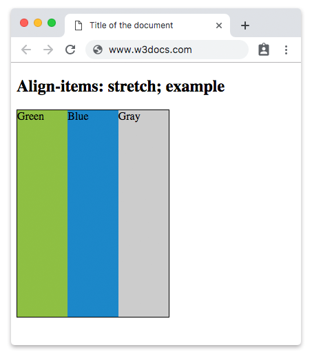
center
The items are positioned at the center of the cross axis (vertically centered here).
Example of CSS align-items Property with center value
<!DOCTYPE html>
<html>
  <head>
    <title>The title of the document</title>
    <style>
      #example {
        width: 220px;
        height: 300px;
        padding: 0;
        border: 1px solid #000;
        display: flex;
        align-items: center;
      }
      #example li {
        flex: 1;
        list-style: none;
      }
    </style>
  </head>
  <body>
    <h2>Align-items: center; example</h2>
    <ul id="example">
      <li style="background-color:#8ebf42;">Green</li>
      <li style="background-color:#1c87c9;">Blue</li>
      <li style="background-color:#ccc;">Gray</li>
    </ul>
  </body>
</html>flex-start
The items are placed at the start of the cross axis (the top, with the default flex-direction: row).
Example of CSS align-items Property with flex-start value
<!DOCTYPE html>
<html>
  <head>
    <title>The title of the document</title>
    <style>
      #example {
        width: 220px;
        height: 300px;
        padding: 0;
        border: 1px solid #000;
        display: flex;
        align-items: flex-start;
      }
      #example li {
        flex: 1;
        list-style: none;
      }
    </style>
  </head>
  <body>
    <h2>Align-items: flex-start; example</h2>
    <ul id="example">
      <li style="background-color:#8ebf42;">Green</li>
      <li style="background-color:#1c87c9;">Blue</li>
      <li style="background-color:#ccc;">Gray</li>
    </ul>
  </body>
</html>flex-end
The items are placed at the end of the cross axis (the bottom, with the default flex-direction: row).
Example of CSS align-items Property with flex-end value
<!DOCTYPE html>
<html>
  <head>
    <title>The title of the document</title>
    <style>
      #example {
        width: 220px;
        height: 300px;
        padding: 0;
        border: 1px solid #000;
        display: flex;
        align-items: flex-end;
      }
      #example li {
        flex: 1;
        list-style: none;
      }
    </style>
  </head>
  <body>
    <h2>Align-items: flex-end; example</h2>
    <ul id="example">
      <li style="background-color:#8ebf42;">Green</li>
      <li style="background-color:#1c87c9;">Blue</li>
      <li style="background-color:#ccc;">Gray</li>
    </ul>
  </body>
</html>baseline
The items are aligned so that their text baselines line up. This is useful when items contain text of different font sizes and you want the letters to sit on a common line.
Example of CSS align-items Property with baseline value
<!DOCTYPE html>
<html>
  <head>
    <title>The title of the document</title>
    <style>
      #example {
        width: 220px;
        height: 300px;
        padding: 0;
        border: 1px solid #000;
        display: flex;
        align-items: baseline;
      }
      #example li {
        flex: 1;
        list-style: none;
      }
    </style>
  </head>
  <body>
    <h2>Align-items: baseline; example</h2>
    <ul id="example">
      <li style="background-color:#8ebf42;">Green</li>
      <li style="background-color:#1c87c9;">Blue</li>
      <li style="background-color:#ccc;">Gray</li>
    </ul>
  </body>
</html>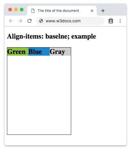
Values
| Value | Description | Play it |
|---|---|---|
| stretch | Makes items stretch to fit the container. This is the default value for this property. | Play it » |
| center | Items are placed at the center of the container. | Play it » |
| flex-start | Items are placed at the beginning of the container. | Play it » |
| flex-end | Items are placed at the end of the container. | Play it » |
| baseline | Items are positioned at the baseline of the container. | Play it » |
| initial | It makes the property use its default value. | Play it » |
| inherit | It inherits the property from its parent element. |
Common pitfalls
stretchdoes nothing if items have a fixed cross-axis size. If an item already has aheight(in a row container),stretchcannot grow it. Remove the fixed size to let it stretch.- Nothing happens without a flex/grid container.
align-itemsis ignored unless the parent hasdisplay: flexordisplay: grid. - The axis flips with
flex-direction: column. Thenalign-itemscontrols horizontal alignment, not vertical. - To align just one item, use
align-selfon that item instead of changing the whole container.
Related properties
- justify-content — alignment along the main axis.
- align-self — override
align-itemsfor a single item. - align-content — align wrapped lines as a group.
- flex-direction — choose which axis is the main one.