CSS column-width Property
The column-width CSS property defines the width of the columns. Find examples here and try them for yourself.
The CSS column-width property sets the ideal width of each column in a multi-column layout. Instead of telling the browser how many columns to create, you tell it how wide each column should be, and the browser works out how many columns fit in the available space.
This is the opposite approach to column-count, where you fix the number of columns and let their width vary. column-width is what makes multi-column text responsive by default: as the container gets wider, more columns appear; as it gets narrower, columns drop away until a single column remains.
The column-width property is one of the CSS3 properties.
How column-width works
The value is best understood as a minimum desired width, not a strict one. The browser packs in as many columns of (at least) that width as will fit, then stretches them to fill the remaining space.
- If the container can hold several columns of the given width, you get several columns.
- If the container is narrower than the specified value, you get a single column that is as wide as the container — the width never overflows the box.
- When
column-countis also set,column-widthbecomes a maximum width: the browser uses whichever of the two constraints produces fewer columns. The shorthand for setting both at once iscolumns.
A rough way to predict the result: number of columns ≈ floor(container width / (column-width + column-gap)). The default column-gap is 1em.
When to use it
Reach for column-width when you want readable line lengths that adapt to the viewport — for example flowing a long article or a list of short items into newspaper-style columns without writing media queries. Because the column count adjusts automatically, the same rule works on a phone (one column) and a wide desktop (three or four columns).
Modern browsers support column-width without vendor prefixes. The default value auto means the column width is decided by other properties such as column-count, or falls back to a single column if nothing else constrains it.
| Initial Value | auto |
|---|---|
| Applies to | Block containers except table wrapper boxes. |
| Inherited | No. |
| Animatable | Yes. |
| Version | CSS3 |
| DOM Syntax | object.style.columnWidth = "5px"; |
Syntax
Syntax of CSS column-width Property
column-width: auto | length | initial | inherit;Example of the column-width property:
Example of CSS column-width Property with length property
<!DOCTYPE html>
<html>
<head>
<title>Title of the document</title>
<style>
div {
column-width: 80px;
}
</style>
</head>
<body>
<h1>Column-width property example</h1>
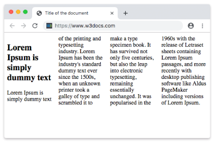
<p>Here the width of the column is set to 80px.</p>
<div>
Lorem Ipsum is dummy text of the printing and typesetting industry. Lorem Ipsum has been the industry's standard dummy text ever since the 1500s when an unknown printer took a galley of type and scrambled it to make a type specimen book. It has survived not only five centuries, but also the leap into electronic typesetting, remaining essentially unchanged. It was popularised in the 1960s with the release of Letraset sheets containing Lorem Ipsum passages, and more recently with desktop publishing software like Aldus PageMaker including versions of Lorem Ipsum.
</div>
</body>
</html>Result

Example of the column-width property with the "auto" value:
With auto, the browser does not impose a target width. Combined with column-count, it lets the count rule decide the layout; on its own it falls back to a single column.
<!DOCTYPE html>
<html>
  <head>
    <title>Title of the document</title>
    <style>
      div {
        column-width: auto;
      }
    </style>
  </head>
  <body>
    <h1>Column-width property example</h1>
    <p>Here the width of the column is set to auto.</p>
    <div>
      Lorem Ipsum is dummy text of the printing and typesetting industry. Lorem Ipsum has been the industry's standard dummy text ever since the 1500s when an unknown printer took a galley of type and scrambled it to make a type specimen book. It has survived not only five centuries, but also the leap into electronic typesetting, remaining essentially unchanged. It was popularised in the 1960s with the release of Letraset sheets containing Lorem Ipsum passages, and more recently with desktop publishing software like Aldus PageMaker including versions of Lorem Ipsum.
    </div>
  </body>

</html>Responsive columns without media queries
Because the browser derives the column count from the available width, a single column-width rule produces a layout that reflows on its own. Here we also add a column-gap and a column-rule for separation. Resize the preview to watch columns appear and disappear.
<!DOCTYPE html>
<html>
  <head>
    <title>Responsive columns</title>
    <style>
      .news {
        column-width: 14em;
        column-gap: 2em;
        column-rule: 1px solid #ccc;
      }
    </style>
  </head>
  <body>
    <div class="news">
      Lorem Ipsum is dummy text of the printing and typesetting industry. Lorem Ipsum has been the industry's standard dummy text ever since the 1500s, when an unknown printer took a galley of type and scrambled it to make a type specimen book. It has survived not only five centuries, but also the leap into electronic typesetting, remaining essentially unchanged.
    </div>
  </body>
</html>Common gotchas
- It is a target, not a guarantee. The actual rendered column width is rarely exactly the value you set — the browser stretches columns to fill the row. Use it to control roughly how many columns appear, not their pixel-perfect width.
column-widthpluscolumn-countinteract. When both are present, the browser treatscolumn-widthas a maximum and never exceedscolumn-count. Set only one unless you intentionally want a cap on both axes.- Tall content can break columns unevenly. Use
column-fillto control how content is balanced across columns. - Percentages are not allowed. Unlike many width properties,
column-widthaccepts only a length (px,em,ch, …) orauto— not%.
Values
| Value | Description | Play it |
|---|---|---|
| auto | The width of the column is specified by the browser. This is default value. | |
| length | The width of columns is specified by length. | |
| initial | Sets the property to its default value. | |
| inherit | Inherits the property from its parent element. |
Related properties
column-count— fix the number of columns instead of their width.columns— shorthand forcolumn-widthandcolumn-count.column-gap— space between columns.column-rule— a line drawn between columns.column-span— let an element span across all columns.