CSS flex-wrap Property
The flex-wrap CSS property defines whether the items should wrap or not. See some examples with different values.
The flex-wrap property controls whether the items in a flex container are forced onto a single line or are allowed to break onto multiple lines. By default, a flex container tries to fit all of its items on one line, even if that means shrinking them or letting them overflow. Setting flex-wrap: wrap tells the items they may flow onto new lines when there isn't enough room.
This is the property you reach for whenever a row of cards, tags, or navigation links should reflow gracefully on narrow screens instead of overflowing or being squashed.
flex-wrap only affects elements that are flex items, so it has no effect unless the parent has display: flex (or display: inline-flex). If a flex container has no items, the property does nothing.
The flex-wrap property is one of the CSS3 properties, and it pairs closely with flex-direction: together they are commonly written as the flex-flow shorthand.
This chapter explains each flex-wrap value, how wrapping interacts with the main axis, and the gotchas to watch for.
| Initial Value | nowrap |
|---|---|
| Applies to | Flex containers. |
| Inherited | No. |
| Animatable | No. |
| Version | CSS3 |
| DOM Syntax | object.style.flexWrap = "wrap-reverse"; |
How wrapping works
Wrapping happens along the cross axis, perpendicular to the main axis set by flex-direction:
- With the default
flex-direction: row, items lay out left to right. Whenflex-wrap: wrapis on and the items run out of horizontal space, the next item starts a new row below. - With
flex-direction: column, items stack top to bottom, and wrapping pushes overflow items into a new column beside the first.
A key consequence: when flex-wrap is nowrap (the default), flex items shrink to fit the container (their flex-shrink kicks in) or overflow it. Only once wrapping is allowed do items keep their preferred size and move to a new line instead.
When items wrap onto several lines, the space between those lines is controlled by align-content, while alignment of items within a single line is controlled by align-items. On a single, non-wrapped line, align-content has no effect.
Syntax
Syntax of CSS flex-wrap Property
flex-wrap: nowrap | wrap | wrap-reverse | initial | inherit;Example of the flex-wrap property with the "wrap" value:
The container below is 200px wide and holds six 50px-wide boxes (300px of content). With flex-wrap: wrap, the boxes that don't fit on the first row drop onto a second row instead of shrinking:
Example of CSS flex-wrap Property with wrap value
<!DOCTYPE html>
<html>
  <head>
    <title>Title of the document</title>
    <style>
      .wrap {
        width: 200px;
        height: 200px;
        border: 1px solid #cccccc;
        display: flex;
        flex-wrap: wrap;
      }
      .wrap div {
        width: 50px;
        height: 50px;
      }
    </style>
  </head>
  <body>
    <h2>The flex-wrap Property</h2>
    <div class="wrap">
      <div style="background-color:coral;">A</div>
      <div style="background-color:lightblue;">B</div>
      <div style="background-color:khaki;">C</div>
      <div style="background-color:pink;">D</div>
      <div style="background-color:lightgrey;">E</div>
      <div style="background-color:lightgreen;">F</div>
    </div>
  </body>
</html>Example of the flex-wrap property with the "nowrap" value:
With the default nowrap value the same six boxes are forced onto a single row. Because they can't all fit, they are squeezed narrower than their declared 50px width:
Example of CSS flex-wrap Property with nowrap value
<!DOCTYPE html>
<html>
  <head>
    <title>Title of the document</title>
    <style>
      .example {
        width: 200px;
        height: 200px;
        border: 1px solid #c3c3c3;
        display: flex;
        flex-wrap: nowrap;
      }
      .example div {
        width: 50px;
        height: 50px;
      }
    </style>
  </head>
  <body>
    <h2>Flex-wrap property example</h2>
    <div class="example">
      <div style="background-color: #8ebf42;">A</div>
      <div style="background-color: #1c87c9;">B</div>
      <div style="background-color: #cccccc;">C</div>
      <div style="background-color: #666666;">D</div>
      <div style="background-color: #4c4a4a;">E</div>
      <div style="background-color: #c6c4c4;">F</div>
    </div>
  </body>
</html>Result
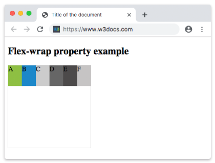
Example of the flex-wrap property with the "wrap-reverse" value:
wrap-reverse also lets items flow onto multiple lines, but it reverses the cross-axis direction: the lines stack upward instead of downward, so the first row appears at the bottom:
Example of CSS flex-wrap Property with wrap-reverse value
<!DOCTYPE html>
<html>
  <head>
    <title>Title of the document</title>
    <style>
      .example {
        width: 200px;
        height: 200px;
        border: 1px solid #c3c3c3;
        display: flex;
        flex-wrap: wrap-reverse;
      }
      .example div {
        width: 50px;
        height: 50px;
      }
    </style>
  </head>
  <body>
    <h2>Flex-wrap property example</h2>
    <div class="example">
      <div style="background-color: #8ebf42;">A</div>
      <div style="background-color: #1c87c9;">B</div>
      <div style="background-color: #cccccc;">C</div>
      <div style="background-color: #666666;">D</div>
      <div style="background-color: #4c4a4a;">E</div>
      <div style="background-color: #c6c4c4;">F</div>
    </div>
  </body>
</html>Values
| Value | Description | Play it |
|---|---|---|
| nowrap | Defines that flexible items won't wrap. This is the default value of this property. | Play it » |
| wrap | Defines that flexible items will wrap when necessary. | Play it » |
| wrap-reverse | Defines that flexible items will wrap in reverse order when necessary. | Play it » |
| initial | Makes the property use its default value. | Play it » |
| inherit | Inherits the property from its parents element. |
flex-flow shorthand
Because flex-wrap is almost always set alongside flex-direction, CSS provides the flex-flow shorthand for both at once:
/* flex-direction  flex-wrap */
flex-flow: row wrap;This is equivalent to writing flex-direction: row; and flex-wrap: wrap; separately.
Related properties
display— setdisplay: flexon the parent to create the flex container thatflex-wrapacts on.flex-direction— sets the main axis (row or column) that wrapping reflows around.align-content— distributes space between wrapped lines (only matters when items wrap).justify-content— aligns items along the main axis.flex— controls how individual items grow and shrink to fill each line.