CSS font-size Property
The font-size property sets the size of the font. It is also used to compute the size of em, ex, and other relatives <length> units.
The CSS font-size property defines the size of the text. It is one of the most-used typography properties, and because units like em, ex, and % are calculated relative to it, the value you choose also affects the size of other elements that depend on it.
This page covers every way you can specify a font size — keywords, lengths, and percentages — explains how the relative units (em, rem, ex, vw/vh) are computed, and shows which approach to reach for when.
Ways to set the font size
You can set font-size in four broad ways:
- absolute-size — a fixed keyword from a built-in scale.
- relative-size — a keyword that adjusts the inherited size up or down.
- length — an explicit number plus a unit.
- percentage — a value relative to the parent element's font size.
The absolute-size keywords map to a fixed scale defined by the browser:
xx-smallx-smallsmallmedium(the initial value)largex-largexx-large
The relative-size keywords adjust the size up or down from the inherited value:
smallerlarger
Lengths can be relative (em, ex, rem, ch, vw, vh, px) or absolute (in, cm, mm, pt, pc). A percentage sets the font size relative to the parent element's font size — 150% is one-and-a-half times the parent's size.
Which one should I use?
- Reach for
remfor most text. It scales with the user's browser font-size setting (good for accessibility) while staying predictable, since it is always relative to the root element rather than the parent. - Use
emwhen you want a component's spacing or child text to scale together with the component's own font size. - Avoid pixel (
px) values for body text if accessibility matters: fixed pixels ignore the reader's preferred default size.
| Initial Value | medium |
|---|---|
| Applies to | All elements. It also applies to ::first-letter and ::first-line. |
| Inherited | Yes. |
| Animatable | Yes. |
| Version | CSS1 |
| DOM Syntax | object.style.fontSize = "15px"; |
Syntax
Syntax of CSS font-size Property
font-size: medium | xx-small | x-small | small | large | x-large | xx-large | smaller | larger | length | initial | inherit;Example of the font-size property:
Example of CSS font-size Property with px,em,pt,x-small and %(percentage) values
<!DOCTYPE html>
<html>
  <head>
    <title>Title of the document</title>
    <style>
      h1 {
        font-size: 24pt;
      }
      h3 {
        font-size: 26px;
      }
      p {
        font-size: 1em;
      }
      a {
        font-size: 100%;
      }
      span {
        font-size: x-small;
      }
    </style>
  </head>
  <body>
    <span>This span is written with x-small value.</span>
    <p>This paragraph is written with 1em font-size.</p>
    <a href="https://www.w3docs.com/">This hyperlink is written with 100% font-size.</a>
    <h3>We used x-small font size for this heading.</h3>
    <h1>We set the font size 24pt  for this heading.</h1>
  </body>
</html>Result
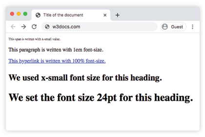
Usage of percentage values
Percentage values are relative to the font-size of the parent element. In the example below the heading is 125%, so it renders at one-and-a-quarter times the inherited body font size:
Example of the font-size property specified in percentage:
<!DOCTYPE html>
<html>
  <head>
    <title>Title of the document</title>
    <style>
      h3 {
        font-size: 125%;
      }
    </style>
  </head>
  <body>
    <h3>This heading is 125% of the body font size.</h3>
    <span>This span uses the default (inherited) size.</span>
    <p>This paragraph uses the default (inherited) size.</p>
  </body>
</html>Usage of the em unit
The em unit is considered to be a relative unit. It is based on the calculated value of its parent element’s font size. In the code below, the paragraph will be 32px, because 2x16=32, and the heading will have a font-size of 48px because 3x16=48px. This method is very useful because we can be sure that all the child elements will always be relative to each other.
Example of the font-size property with the "em" value:
<!DOCTYPE html>
<html>
  <head>
    <title>Title of the document</title>
    <style>
      .container {
        font-size: 16px;
      }
      p {
        font-size: 2em;
      }
      h2 {
        font-size: 3em;
      }
    </style>
  </head>
  <body>
    <div class="container">
      <h2>Here is the heading</h2>
      <p>Here is the text.</p>
    </div>
  </body>
</html>Usage of the rem unit
With the rem unit, the font-size is always relative to the root <html> element, no matter how deeply nested the element is. In the example below the root is 16px, so the heading is 1.5rem = 1.5 × 16 = 24px. Because every rem points at the same root value, you avoid the compounding problem that em units can cause inside nested elements.
Example of the font-size property with the "rem" value:
<!DOCTYPE html>
<html>
  <head>
    <title>Title of the document</title>
    <style>
      html {
        font-size: 16px;
      }
      h2 {
        font-size: 1.5rem;
      }
    </style>
  </head>
  <body>
    <div class="container">
      <h2>Here is the heading</h2>
      <p>Here is the text.</p>
    </div>
  </body>
</html>Usage of the ex unit
With the ex unit, 1ex equals the x-height — the height of the lowercase letter "x" — of the element's current font. Because the x-height varies from font to font, an ex-based size depends on which font is in use, which makes it less predictable than em or rem. In the example below the text is sized to 15 times the x-height.
CSS font-size Property
.exunit {
  font-size: 15ex;
}Usage of viewport units
Viewport units (vw and vh) are used for setting the font-size of an element, which is relative to the size of the viewport.
- 1vw = 1% of viewport width
- 1vh = 1% of viewport height
CSS font-size Property
.viewport {
  font-size: 120vh;
}Example of the font-size property with the "length" value:
<!DOCTYPE html>
<html>
  <head>
    <title>Title of the document</title>
    <style>
      span {
        color: green;
        font-size: 2vh;
      }
      p {
        color: red;
        font-size: 1em;
      }
      .length {
        color: orange;
        font-size: 30px;
      }
      h3 {
        color: lightblue;
        font-size: 3ex;
      }
      h1 {
        color: purple;
        font-size: 24pt;
      }
      a {
        color: blue;
        font-size: 120%;
      }
    </style>
  </head>
  <body>
    <h2>Font-size property</h2>
    <span>This text is written with 2vh font-size.</span>
    <p>This paragraph is written with 1em font-size.</p>
    <div class="length">Example with 30px font-size length </div>
    <h3>Example with 3ex font-size length.</h3>
    <h1>We set the font size 24pt  for this heading.</h1>
    <a href="https://www.w3docs.com/">This hyperlink is written with 100% font-size.</a>
  </body>
</html>Example of the font-size property with the absolute-size values:
Example of the font-size property (absolute-size):
<!DOCTYPE html>
<html>
  <head>
    <title>Title of the document</title>
    <style>
      .font-xxsmall {
        color: grey;
        font-size: xx-small;
      }
      .font-xsmall {
        color: grey;
        font-size: x-small;
      }
      .font-small {
        color: grey;
        font-size: small;
      }
      .font-medium {
        color: grey;
        font-size: medium;
      }
      .font-large {
        color: grey;
        font-size: large;
      }
      .font-xlarge {
        color: grey;
        font-size: x-large;
      }
      .font-xxlarge {
        color: grey;
        font-size: xx-large;
      }
    </style>
  </head>
  <body>
    <h1>Font-size property</h1>
    <div class="font-xxsmall">Example with font-size xx-small property</div>
    <div class="font-xsmall">Example with font-size x-small property</div>
    <div class="font-small">Example with font-size small property</div>
    <div class="font-medium">Example with font-size medium property</div>
    <div class="font-large">Example with font-size large property</div>
    <div class="font-xlarge">Example with font-size x-large property</div>
    <div class="font-xxlarge">Example with font-size xx-large property</div>
  </body>
</html>Example of the font-size property with "smaller" and "larger" values:
Example of the font-size property with "smaller" and "larger" values:
<!DOCTYPE html>
<html>
  <head>
    <title>Title of the document</title>
    <style>
      .smaller {
        color: red;
        font-size: smaller;
      }
      .larger {
        color: red;
        font-size: larger;
      }
    </style>
  </head>
  <body>
    <h1>font-size property</h1>
    <div class="smaller">Example with font-size smaller property</div>
    <div class="larger">Example with font-size larger property</div>
  </body>
</html>Values
| Value | Description | Play it |
|---|---|---|
| medium | Sets the font-size to medium. This is the default value of this property. | Play it » |
| xx-small | Sets the font-size to xx-small. | Play it » |
| x-small | Sets the font-size to x-small. | Play it » |
| small | Sets the font-size to small. | Play it » |
| large | Sets the font-size to large. | Play it » |
| x-large | Sets the font-size to x-large. | Play it » |
| xx-large | Sets the font-size to xx-large. | Play it » |
| smaller | Makes the font-size smaller. | Play it » |
| larger | Makes the font-size larger. | Play it » |
| length | Specifies the font-size by px, em etc. | Play it » |
| % | Sets the font-size to a percent of the parent element's font size. | Play it » |
| initial | Makes the property use its default value. | Play it » |
| inherit | Inherits the property from its parents element. |
Related properties
To control the rest of an element's typography, combine font-size with these properties:
- font-family — choose the typeface.
- font-weight — set how bold the text is.
- font-style — apply italic or oblique styling.
- line-height — control the vertical spacing between lines.
- font — the shorthand that sets several of these at once.