CSS object-fit Property
Use the object-fit CSS property to define how an element fits in its container. See property values with examples.
The CSS object-fit property controls how a replaced element — such as an <img> or <video> — is resized to fill its content box. It is the image-and-video counterpart of background-size: instead of stretching or distorting media, you decide whether it should fill, fit, crop, or stay untouched inside the box you gave it.
This page covers what object-fit does, when to reach for it, each of its values with a runnable example, and the related properties that fine-tune the result.
Why use object-fit
When you set a fixed width and height on an image whose aspect ratio differs from that box, the browser stretches the image by default — faces get squashed, logos warp. object-fit solves this. It lets you keep the box dimensions (important for predictable layouts and grids) while telling the browser how to reconcile the image's natural aspect ratio with that box:
- Use
coverfor hero images, thumbnails, and avatars — fill the box, crop the overflow, never distort. This is the value you reach for most often. - Use
containwhen the whole image must stay visible (logos, product shots) even if that leaves empty space. - Use
fill(the default) only when you genuinely want the image stretched to the exact box.
By default the image is centered inside its box. To control which part is kept when cropping with cover, pair object-fit with object-position.
| Initial Value | fill |
|---|---|
| Applies to | Replaced elements (<img>, <video>, <object>, etc.). |
| Inherited | No. |
| Animatable | No. |
| Version | CSS3 |
| DOM Syntax | object.style.objectFit = "cover"; |
Syntax
CSS object-fit syntax
object-fit: fill | contain | cover | scale-down | none | initial | inherit;In every example below the box is 200px wide and 400px tall — a tall, narrow box — while the source image is landscape. That mismatch is what makes each value's behavior visible.
Example of the object-fit property with the "fill" value
fill (the default) ignores the aspect ratio and stretches the image to exactly match the box, so the tree looks squashed.
<!DOCTYPE html>
<html>
  <head>
    <title>Title of the document</title>
    <style>
      img.tree {
        width: 200px;
        height: 400px;
        object-fit: fill;
      }
    </style>
  </head>
  <body>
    <h2>Object-fit property example</h2>
    <h3>Original image:</h3>
    <img src="/uploads/media/default/0001/01/b408569013c0bb32b2afb0f0d45e93e982347951.jpeg" alt="Tree" width="300" height="200" />
    <h3>Fill value:</h3>
    <img class="tree" src="/uploads/media/default/0001/01/b408569013c0bb32b2afb0f0d45e93e982347951.jpeg" alt="Tree" width="300" height="200" />
  </body>
</html>Result
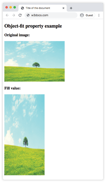
The image is stretched to fit the box, distorting it. The next value, cover, fixes that by cropping instead of stretching.
Example of the object-fit property with the "cover" value
cover scales the image to fill the entire box while preserving its aspect ratio, then clips whatever overflows. Nothing is distorted, but the edges may be cut off. This is the ideal choice for thumbnails and hero banners.
<!DOCTYPE html>
<html>
  <head>
    <title>Title of the document</title>
    <style>
      img.tree {
        width: 200px;
        height: 400px;
        object-fit: cover;
      }
    </style>
  </head>
  <body>
    <h2>Object-fit property example</h2>
    <h3>Original image:</h3>
    <img src="/uploads/media/default/0001/01/b408569013c0bb32b2afb0f0d45e93e982347951.jpeg" alt="Tree" width="300" height="200" />
    <h3>Cover value:</h3>
    <img class="tree" src="/uploads/media/default/0001/01/b408569013c0bb32b2afb0f0d45e93e982347951.jpeg" alt="Tree" width="300" height="200" />
  </body>
</html>Example of the object-fit property with the "contain" value
contain scales the image to fit inside the box while preserving its aspect ratio, so the whole image stays visible. Because the box is taller than the image is wide, this leaves empty bands above and below it (often called letterboxing).
<!DOCTYPE html>
<html>
  <head>
    <title>Title of the document</title>
    <style>
      img.tree {
        width: 200px;
        height: 400px;
        object-fit: contain;
      }
    </style>
  </head>
  <body>
    <h2>Object-fit property example</h2>
    <h3>Original image:</h3>
    <img src="/uploads/media/default/0001/01/b408569013c0bb32b2afb0f0d45e93e982347951.jpeg" alt="Tree" width="300" height="200" />
    <h3>Contain value:</h3>
    <img class="tree" src="/uploads/media/default/0001/01/b408569013c0bb32b2afb0f0d45e93e982347951.jpeg" alt="Tree" width="300" height="200" />
  </body>
</html>Example of the object-fit property with the "none" value
none keeps the image at its intrinsic (natural) size and ignores the box dimensions entirely. The image is centered, and any part that exceeds the box is clipped. Use it when you must preserve the original pixel size.
<!DOCTYPE html>
<html>
  <head>
    <title>Title of the document</title>
    <style>
      img.tree {
        width: 200px;
        height: 400px;
        object-fit: none;
      }
    </style>
  </head>
  <body>
    <h2>Object-fit property example</h2>
    <h3>Original image:</h3>
    <img src="/uploads/media/default/0001/01/b408569013c0bb32b2afb0f0d45e93e982347951.jpeg" alt="Tree" width="300" height="200" />
    <h3>None value:</h3>
    <img class="tree" src="/uploads/media/default/0001/01/b408569013c0bb32b2afb0f0d45e93e982347951.jpeg" alt="Tree" width="300" height="200" />
  </body>
</html>Example of the object-fit property with the "scale-down" value
scale-down compares none and contain and uses whichever produces the smaller rendered image. In practice it behaves like contain for images larger than the box, and like none for images smaller than it — a safe way to shrink oversized media without ever scaling small images up.
<!DOCTYPE html>
<html>
  <head>
    <title>Title of the document</title>
    <style>
      img.tree {
        width: 200px;
        height: 400px;
        object-fit: scale-down;
      }
    </style>
  </head>
  <body>
    <h2>Object-fit property example</h2>
    <h3>Original image:</h3>
    <img src="/uploads/media/default/0001/01/b408569013c0bb32b2afb0f0d45e93e982347951.jpeg" alt="Tree" width="300" height="200" />
    <h3>Scale-down value:</h3>
    <img class="tree" src="/uploads/media/default/0001/01/b408569013c0bb32b2afb0f0d45e93e982347951.jpeg" alt="Tree" width="300" height="200" />
  </body>
</html>Values
| Value | Description |
|---|---|
| fill | Default. Stretches the content to fill the content box exactly, ignoring its aspect ratio (the image may be distorted). |
| contain | Scales the content to fit inside the box while preserving its aspect ratio; empty space may appear (letterboxing). |
| cover | Scales the content to fill the box while preserving its aspect ratio; overflowing edges are clipped. |
| none | Keeps the content at its intrinsic size, ignoring the box; centered and clipped if it overflows. |
| scale-down | Renders the content as the smaller of none and contain — never scales the image up. |
| initial | Makes the property use its default value (fill). |
| inherit | Inherits the property from its parent element. |
Browser support and tips
object-fit is supported in all modern browsers. Keep these points in mind:
- It only affects replaced elements (
<img>,<video>,<object>, embedded SVG). It does nothing on a<div>— usebackground-sizethere instead. - The element still occupies the
width/heightyou set;object-fitonly changes how the content is painted inside that box. - Pair it with
object-positionto choose which part of the image stays visible when usingcoverornone. - If the cropped overflow should stay hidden, the box already clips it; learn more in CSS overflow.