CSS align-self Property
The align-self property sets the alignment of the selected items in the container. Try some examples with its values.
The CSS align-self property aligns a single flex or grid item along the cross axis of its container, overriding the align-items value set on the container.
Where align-items aligns every item in the container at once, align-self lets you single out one item and align it differently. This is the property you reach for when one element needs to break ranks — for example, pinning a logo to the top of a header row while the rest of the items stay vertically centered.
align-self only does something when the item lives inside a flex container, a grid container, or is absolutely positioned. On a plain block-level element it has no effect, which is why a value like stretch does nothing until you also set display: flex (or grid) on the parent. It is one of the CSS3 properties.
How it relates to align-items
The relationship is "container vs. item":
align-itemsis set on the container and aligns all items along the cross axis.align-selfis set on an individual item and overrides whatever the container'salign-itemssays for that one item.
Because align-self accepts the same values as align-items, you only need to learn the value set once. The default auto simply means "use the container's align-items value", so an item with no align-self follows the crowd.
align-self is ignored when the flex item has an auto vertical margin (the auto margin wins and absorbs the free space). It also has no effect on table cells or on standalone block-level boxes that are not flex/grid items.
| Initial Value | auto |
|---|---|
| Applies to | Flex items, grid items, and absolutely-positioned boxes. |
| Inherited | No. |
| Animatable | No. |
| Version | CSS3 |
| DOM Syntax | object.style.alignSelf = "auto"; |
Syntax
Syntax of CSS align-self Property
align-self: auto | stretch | center | flex-start | flex-end | baseline | initial | inherit;Example of the align-self property:
Example of CSS align-self Property with flex-start value
<!DOCTYPE html>
<html>
  <head>
    <title>The title of the document</title>
    <style>
      section {
        display: flex;
        align-items: center;
        height: 120px;
        padding: 10px;
        background: #99caff;
      }
      div {
        height: 60px;
        background: #1c87c9;
        margin: 5px;
      }
      div:nth-child(1) {
        align-self: flex-start;
        background: #8ebf42;
      }
    </style>
  </head>
  <body>
    <h2>Align-self property example</h2>
    <p>Here the align-self for the first box is set to "flex-start".</p>
    <section>
      <div>Box #1</div>
      <div>Box #2</div>
      <div>Box #3</div>
    </section>
  </body>
</html>Result
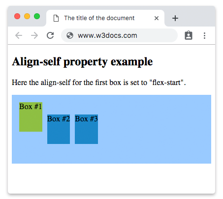
The container's align-items: center keeps boxes #2 and #3 vertically centered, while box #1 — with align-self: flex-start — jumps to the top, overriding the container value just for itself.
Here is an example where three boxes are used and the second is specified by "flex-end" value.
Example of the align-self property with the "flex-end" value:
Example of CSS align-self Property with flex-end value
<!DOCTYPE html>
<html>
  <head>
    <title>The title of the document</title>
    <style>
      section {
        display: flex;
        align-items: center;
        height: 120px;
        padding: 10px;
        background: #99caff;
      }
      div {
        height: 60px;
        background: #1c87c9;
        margin: 5px;
      }
      div:nth-child(2) {
        align-self: flex-end;
        background: #8ebf42;
      }
    </style>
  </head>
  <body>
    <h2>Align-self property example</h2>
    <p>Here the align-self for the second box is set to "flex-end".</p>
    <section>
      <div>Box #1</div>
      <div>Box #2</div>
      <div>Box #3</div>
    </section>
  </body>
</html>Example with the "stretch" value:
By default a flex item only takes the height its content needs. Setting align-self: stretch on one item makes that single item grow to fill the container's full cross size, while the others keep their natural height. To see stretch work you must leave the item's height unset (or auto).
<!DOCTYPE html>
<html>
  <head>
    <title>The title of the document</title>
    <style>
      section {
        display: flex;
        align-items: center;
        height: 120px;
        padding: 10px;
        background: #99caff;
      }
      div {
        height: 60px;
        background: #1c87c9;
        margin: 5px;
      }
      div:nth-child(2) {
        align-self: stretch;
        height: auto;
        background: #8ebf42;
      }
    </style>
  </head>
  <body>
    <h2>Align-self property example</h2>
    <p>Here the align-self for the second box is set to "stretch".</p>
    <section>
      <div>Box #1</div>
      <div>Box #2</div>
      <div>Box #3</div>
    </section>
  </body>
</html>align-self in CSS Grid
align-self is not flex-only — it works the same way inside a grid container, aligning a grid item along the block (column) axis of its grid area:
.grid {
  display: grid;
  grid-template-columns: repeat(3, 1fr);
  align-items: center; /* default for every item */
}
.grid .featured {
  align-self: start; /* this one item hugs the top of its cell */
}In grid the keywords start and end are used instead of flex-start and flex-end, but the concept is identical: the container sets a default with align-items, and align-self overrides it per item.
When to use align-self
- One odd item out. Most items should align one way, but a single element (an icon, a badge, a call-to-action) needs a different position.
- Top- or bottom-pinning in a centered row. A navbar that vertically centers its links but pins a logo to the top.
- Letting one card stretch. In a row of equal-height cards, force just one to fill the height with
align-self: stretch.
If every item needs the same alignment, set align-items on the container instead — that is cleaner than repeating align-self on each child.
Values
| Value | Description | Play it |
|---|---|---|
| auto | The item inherits its parent container's align-items property. This is the default value. | Play it » |
| stretch | Makes items stretch to fit the container. | Play it » |
| center | Items are placed at the center of the container. | Play it » |
| flex-start | Items are placed at the beginning of the container. | Play it » |
| flex-end | Items are placed at the end of the container. | Play it » |
| baseline | Items are positioned at the baseline of the container. | Play it » |
| initial | It makes the property use its default value. | Play it » |
| inherit | It inherits the property from its parents element. |
Practice
Related properties
align-items— the container-level version of this property.align-content— aligns the rows of a multi-line flex container.justify-content— aligns items along the main axis.flex-direction— sets which axis is the main axis (and therefore which onealign-selfcontrols).- The Ultimate Guide to Flexbox — how all the flex alignment properties fit together.