CSS grid-auto-columns Property
Use the grid-auto-columns CSS property to set the sizing of columns. Read about the values and try examples.
The grid-auto-columns property sets the size of implicitly created grid columns — that is, columns the browser generates automatically when grid items are placed outside the columns you explicitly defined with grid-template-columns.
Why this matters: When you build a grid, you usually declare a fixed number of tracks. But if an item lands in a column that doesn't exist yet (for example, you place an item at grid-column: 5 in a 3-column grid), CSS Grid creates that extra column on the fly. By default those auto-generated columns are auto-sized, which often collapses them to fit content. grid-auto-columns lets you control how wide they should be.
Note: This property only affects implicitly created columns, not explicitly defined ones. To size the columns you declare up front, use
grid-template-columnsinstead. The row equivalent isgrid-auto-rows.
When are implicit columns created?
Implicit columns appear in two common situations:
- An item is positioned past the last explicit column line (e.g.
grid-column-start: 4when only 3 columns are defined). - The grid uses
grid-auto-flow: column, so new items flow into freshly created columns instead of rows.
In both cases the new columns inherit their width from grid-auto-columns.
| Initial Value | auto |
|---|---|
| Applies to | Grid containers. |
| Inherited | No. |
| Animatable | Yes. The size of the columns is animatable. |
| Version | CSS Grid Layout Module Level 1 |
| DOM Syntax | object.style.gridAutoColumns = "100px"; |
Syntax
Syntax of CSS grid-auto-columns Property
grid-auto-columns: auto | max-content | min-content | length | % | minmax(min, max);Example of the grid-auto-columns:
Example of CSS grid-auto-columns Property with auto and length values
<!DOCTYPE html>
<html>
  <head>
    <title>Title of the document</title>
    <style>
      .grid-container {
        display: grid;
        grid-auto-columns: 50px;
        gap: 10px;
        background-color: #555;
        padding: 10px;
      }
      .grid-container > div {
        background-color: #ccc;
        text-align: center;
        padding: 20px 0;
        font-size: 30px;
      }
      .black-container {
        display: grid;
        grid-auto-columns: 100px;
        gap: 10px;
        background-color: #000;
        padding: 10px;
      }
      .black-container > div {
        background-color: #ccc;
        text-align: center;
        padding: 20px 0;
        font-size: 30px;
      }
      .auto-container {
        display: grid;
        grid-auto-columns: auto;
        gap: 10px;
        background-color: #ccc;
        padding: 10px;
      }
      .auto-container > div {
        background-color: #999;
        text-align: center;
        padding: 20px 0;
        font-size: 30px;
      }
    </style>
  </head>
  <body>
    <h2>Grid-auto-columns property example</h2>
    <h3>50 pixels</h3>
    <div class="grid-container">
      <div>1</div>
      <div>2</div>
      <div>3</div>
      <div>4</div>
      <div>5</div>
      <div>6</div>
    </div>
    <h3>100 pixels</h3>
    <div class="black-container">
      <div>1</div>
      <div>2</div>
      <div>3</div>
      <div>4</div>
      <div>5</div>
      <div>6</div>
    </div>
    <h3>auto</h3>
    <div class="auto-container">
      <div>1</div>
      <div>2</div>
      <div>3</div>
      <div>4</div>
      <div>5</div>
      <div>6</div>
    </div>
  </body>
</html>Result
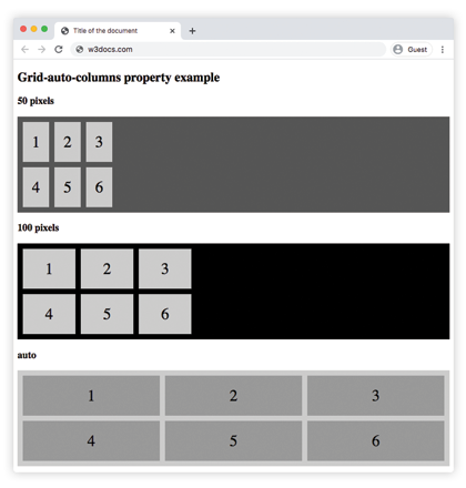
In the following example, the grid-auto-columns property is used to set a default size (width) for all columns.
Example of the grid-auto-columns with all the values:
Example of CSS grid-auto-columns Property with max-content, min-content, auto and length values
<!DOCTYPE html>
<html>
  <head>
    <title>Title of the document</title>
    <style>
      .grid-container {
        display: grid;
        grid-auto-columns: 50px;
        gap: 10px;
        background-color: #555;
        padding: 10px;
      }
      .grid-container > div {
        background-color: #ccc;
        text-align: center;
        padding: 20px 0;
        font-size: 30px;
      }
      .black-container {
        display: grid;
        grid-auto-columns: 100px;
        gap: 10px;
        background-color: #000;
        padding: 10px;
      }
      .black-container > div {
        background-color: #ccc;
        text-align: center;
        padding: 20px 0;
        font-size: 30px;
      }
      .grey-container {
        display: grid;
        grid-auto-columns: max-content;
        gap: 10px;
        background-color: #ccc;
        padding: 10px;
      }
      .grey-container > div {
        background-color: #555;
        text-align: center;
        padding: 20px 0;
        font-size: 30px;
      }
      .white-container {
        display: grid;
        grid-auto-columns: min-content;
        gap: 10px;
        background-color: #ccc;
        padding: 10px;
      }
      .white-container > div {
        background-color: #fff;
        text-align: center;
        padding: 20px 0;
        font-size: 30px;
      }
      .auto-container {
        display: grid;
        grid-auto-columns: auto;
        gap: 10px;
        background-color: #ccc;
        padding: 10px;
      }
      .auto-container > div {
        background-color: #999;
        text-align: center;
        padding: 20px 0;
        font-size: 30px;
      }
      .minmax-container {
        display: grid;
        grid-auto-columns: minmax(50px, 1fr);
        gap: 10px;
        background-color: #eee;
        padding: 10px;
      }
      .minmax-container > div {
        background-color: #777;
        text-align: center;
        padding: 20px 0;
        font-size: 30px;
      }
    </style>
  </head>
  <body>
    <h2>Grid-auto-columns property example</h2>
    <p>Use the grid-auto-columns property to set a default size (width) for all columns.</p>
    <h3>50 pixels</h3>
    <div class="grid-container">
      <div>1</div>
      <div>2</div>
      <div>3</div>
      <div>4</div>
      <div>5</div>
      <div>6</div>
    </div>
    <h3>100 pixels</h3>
    <div class="black-container">
      <div>1</div>
      <div>2</div>
      <div>3</div>
      <div>4</div>
      <div>5</div>
      <div>6</div>
    </div>
    <h3>max-content</h3>
    <div class="grey-container">
      <div>1</div>
      <div>2</div>
      <div>3</div>
      <div>4</div>
      <div>5</div>
      <div>6</div>
    </div>
    <h3>min-content</h3>
    <div class="white-container">
      <div>1</div>
      <div>2</div>
      <div>3</div>
      <div>4</div>
      <div>5</div>
      <div>6</div>
    </div>
    <h3>auto</h3>
    <div class="auto-container">
      <div>1</div>
      <div>2</div>
      <div>3</div>
      <div>4</div>
      <div>5</div>
      <div>6</div>
    </div>
    <h3>minmax(50px, 1fr)</h3>
    <div class="minmax-container">
      <div>1</div>
      <div>2</div>
      <div>3</div>
      <div>4</div>
      <div>5</div>
      <div>6</div>
    </div>
  </body>
</html>Values
| Value | Description |
|---|---|
| auto | The size of the columns is determined by the content or available space. This is the default value of the property. |
| max-content | The size of each column is determined by the largest min-content contribution of its items. |
| min-content | The size of each column is determined by the smallest min-content contribution of its items. |
| minmax(min, max) | The size range is greater than or equal to "min" and less than or equal to "max". |
| length | The size of the columns is specified by length value. |
| % | The size of the columns is specified by percentages. |
You can also pass a space-separated list of sizes (for example grid-auto-columns: 100px 200px). The list repeats in order for each new implicit column.
Related properties
grid-auto-rows— the same idea for implicitly created rows.grid-auto-flow— controls whether auto-placed items create new rows or columns.grid-template-columns— defines the explicit columns.grid— the shorthand that ties the grid layout properties together.