CSS column-rule Property
The column-rule shorthand property sets the style, width, color of the rule between columns. See examples and learn about this property.
The column-rule shorthand property defines the style, width, and color of the line drawn between the columns of a multi-column layout. It works like the border shorthand, but instead of drawing a box around an element, it draws a single vertical rule in each column gap.
The rule is a purely decorative line: it is painted inside the gap and takes up no space of its own. Widening the rule does not push the columns apart — only column-gap changes the spacing. This is why a thick rule can visually overlap the text on either side if the gap is too small.
column-rule is a shorthand for these three longhand properties:
- column-rule-width — the thickness of the line.
- column-rule-style — the line style (
solid,dotted,dashed, etc.). - column-rule-color — the line color.
Like every shorthand, any longhand you omit is reset to its initial value. So column-rule: 5px solid; sets width and style explicitly, while the color falls back to currentColor (the element's text color), and the width back to medium if you omit it.
When to use column-rule
Reach for column-rule whenever you split flowing text into multiple columns and want a visible separator — newspaper-style article layouts, lists of links, footer link groups, or a glossary. A subtle 1px solid #ddd rule helps the eye track where one column ends and the next begins without adding any extra markup.
The rule only renders when the element actually establishes a multi-column layout — that is, when column-count or the columns shorthand creates more than one column. On a single-column element there are no gaps, so nothing is drawn.
column-rule is one of the CSS3 properties.
| Initial Value | medium (width), none (style), currentColor (color) |
|---|---|
| Applies to | Block containers that establish a multi-column layout. It also applies to ::first-letter. |
| Inherited | No. |
| Animatable | Yes. The color and the width of the column-rule are animatable. |
| Version | CSS3 |
| DOM Syntax | object.style.columnRule = "5px outset #ccc"; |
Syntax
column-rule: column-rule-width column-rule-style column-rule-color | initial | inherit;The order of the three values is flexible — the browser tells them apart by type, so column-rule: dotted 5px #ccc is just as valid as column-rule: 5px dotted #ccc. As with border, a value of none (or omitting the style) means no rule is drawn at all, because column-rule-style defaults to none.
Example of the column-rule property:
Example with width, style, and color values
<!DOCTYPE html>
<html>
  <head>
    <title>Title of the document</title>
    <style>
      div {
        column-count: 3;
        column-gap: 30px;
        column-rule: 5px dotted #ccc;
      }
    </style>
  </head>
  <body>
    <h1>Column-rule example</h1>
    <p>Here the column-rule is set to 5px dotted gray.</p>
    <div>
      Lorem Ipsum is dummy text of the printing and typesetting industry. Lorem Ipsum has been the industry's standard dummy text ever since the 1500s when an unknown printer took a galley of type and scrambled it to make a type specimen book. It has survived not only five centuries, but also the leap into electronic typesetting, remaining essentially unchanged. It was popularised in the 1960s with the release of Letraset sheets containing Lorem Ipsum passages, and more recently with desktop publishing software like Aldus PageMaker including versions of Lorem Ipsum.
    </div>
  </body>
</html>Result
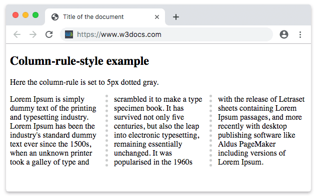
If a single value is provided, it is interpreted as the column-rule-style (the other two longhands keep their initial values).
Example of the column-rule property with one value:
Example with a single value
<!DOCTYPE html>
<html>
  <head>
    <title>Title of the document</title>
    <style>
      div {
        column-count: 3;
        column-gap: 30px;
        column-rule: dashed;
      }
    </style>
  </head>
  <body>
    <h2>Column-rule example</h2>
    <p>Here the column-rule is set to only "dashed".</p>
    <div>
      Lorem Ipsum is dummy text of the printing and typesetting industry. Lorem Ipsum has been the industry's standard dummy text ever since the 1500s, when an unknown printer took a galley of type and scrambled it to make a type specimen book. It has survived not only five centuries, but also the leap into electronic typesetting, remaining essentially unchanged. It was popularised in the 1960s with the release of Letraset sheets containing Lorem Ipsum passages, and more recently with desktop publishing software like Aldus PageMaker including versions of Lorem Ipsum.
    </div>
  </body>
</html>Example of the column-rule property with specified width, style and color:
Example with all values specified
<!DOCTYPE html>
<html>
  <head>
    <title>Title of the document</title>
    <style>
      div {
        column-count: 4;
        column-gap: 30px;
        column-rule: 10px groove #ccc;
      }
    </style>
  </head>
  <body>
    <h2>Column-rule example</h2>
    <p>Here the column-rule is set to 10px groove gray.</p>
    <div>
      Lorem Ipsum is dummy text of the printing and typesetting industry. Lorem Ipsum has been the industry's standard dummy text ever since the 1500s, when an unknown printer took a galley of type and scrambled it to make a type specimen book. It has survived not only five centuries, but also the leap into electronic typesetting, remaining essentially unchanged. It was popularised in the 1960s with the release of Letraset sheets containing Lorem Ipsum passages, and more recently with desktop publishing software like Aldus PageMaker including versions of Lorem Ipsum.
    </div>
  </body>
</html>Values
| Value | Description |
|---|---|
| column-rule-width | Defines the width of the rule between columns. Default value is "medium". |
| column-rule-style | Defines the style of the rule between columns. Default value is "none". |
| column-rule-color | Sets the color of the rule. Default value is the current color of the element. |
| initial | Sets the property to its default value. |
| inherit | Inherits the property from its parent element. |
Things to watch out for
- The rule needs a multi-column context. Set column-count (or the columns shorthand) on the same element, otherwise the rule never appears.
- A missing style means no rule. Because
column-rule-styledefaults tonone,column-rule: 5px #ccc;draws nothing. Always include a style keyword such assolidordotted. - The rule does not change layout. Its width is taken from the existing gap, not added to it. If a thick rule overlaps the text, increase column-gap — the rule centers itself within that gap.
- No rule before the first or after the last column. A line is only drawn between adjacent columns, never on the outer edges.
Browser support
column-rule is widely supported in all modern browsers (Chrome, Edge, Firefox, Safari, and Opera). Older WebKit and Gecko builds required the -webkit- and -moz- prefixes, but unprefixed column-rule is safe to use today.