CSS column-count Property
The column-count CSS property specifies the number of columns an element will be divided into. See values and try some examples.
The column-count property specifies the number of columns into which the content of an element will be divided. It is part of the CSS multi-column layout module, which lets a single block of content flow across several columns automatically — much like a newspaper or magazine — without you having to split the markup by hand.
This page covers what column-count does, its syntax and accepted values, runnable examples, how it works together with the other column properties, and the gotchas to watch for.
What column-count does
column-count accepts a positive integer or the auto keyword. auto is the default value.
- When set to a numeric value (for example
3), the browser tries to divide the content into exactly that many equal-width columns. - When set to
auto, the number of columns is determined by other properties — most importantlycolumn-width. If neithercolumn-countnorcolumn-widthis set, the content is rendered as a single column.
If you set both column-count and column-width, column-count acts as a maximum: the browser fits as many columns of at least column-width as it can, but never more than column-count. This pairing is the recommended responsive pattern, and the columns shorthand sets both at once.
When would I use it?
Multi-column layout shines for long passages of continuous, reading-order text — articles, terms-of-service pages, lists of links — where you want the content to fill the available width in balanced columns. It is not a general-purpose grid: for two-dimensional page layouts use CSS Grid or Flexbox instead.
| Initial Value | auto |
|---|---|
| Applies to | Block containers except table wrapper boxes. |
| Inherited | No. |
| Animatable | Yes. The number of columns is animatable. |
| Version | CSS3 |
| DOM Syntax | object.style.columnCount = "4"; |
Syntax
Syntax of the column-count property
column-count: <integer> | auto | initial | inherit;Example of the column-count property:
Example of CSS column-count Property with auto value
<!DOCTYPE html>
<html>
  <head>
    <title>Title of the document</title>
    <style>
      div {
        column-count: auto;
      }
    </style>
  </head>
  <body>
    <h2>Column-count property example</h2>
    <div>
      Lorem Ipsum is dummy text of the printing and typesetting industry. Lorem Ipsum has been the industry's standard dummy text ever since the 1500s, when an unknown printer took a galley of type and scrambled it to make a type specimen book. It has survived not only five centuries, but also the leap into electronic typesetting, remaining essentially unchanged. It was popularised in the 1960s with the release of Letraset sheets containing Lorem Ipsum passages, and more recently with desktop publishing software like Aldus PageMaker including versions of Lorem Ipsum.
    </div>
  </body>
</html>Result
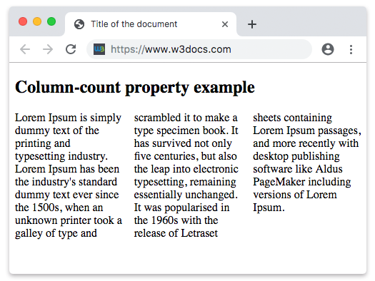
Example of the column-count property with a numeric value:
Example of CSS column-count Property with a number value
<!DOCTYPE html>
<html>
  <head>
    <title>Title of the document</title>
    <style>
      div {
        column-count: 7;
      }
    </style>
  </head>
  <body>
    <h2>Column-count property example</h2>
    <div>
      Lorem Ipsum is dummy text of the printing and typesetting industry. Lorem Ipsum has been the industry's standard dummy text ever since the 1500s when an unknown printer took a galley of type and scrambled it to make a type specimen book. It has survived not only five centuries, but also the leap into electronic typesetting, remaining essentially unchanged. It was popularised in the 1960s with the release of Letraset sheets containing Lorem Ipsum passages, and more recently with desktop publishing software like Aldus PageMaker including versions of Lorem Ipsum. It is a great fact that a reader will be distracted by the readable content of a page when looking at its layout.
    </div>
  </body>
</html>With column-count: 7, the browser splits the same paragraph into seven columns. If the container is too narrow to give each column a usable width, the columns end up very thin — which is exactly why combining column-count with column-width (or the columns shorthand) is usually a better choice than a fixed number.
Working with the other column properties
column-count rarely travels alone. These companion properties shape the resulting columns:
| Property | What it controls |
|---|---|
column-width | The ideal width of each column. Combined with column-count, it caps the column count to a maximum. |
column-gap | The space between columns. |
column-rule | A line drawn between columns (like a border, but in the gap). |
columns | Shorthand for setting column-width and column-count together. |
column-span | Lets an element (such as a heading) span across all columns. |
column-fill | Whether content is balanced evenly across columns or fills each column in turn. |
A common, robust recipe is to set a target width and a maximum number of columns at the same time:
.article {
  column-width: 14rem;   /* aim for ~14rem-wide columns */
  column-count: 3;       /* but never more than 3 */
  column-gap: 2rem;
}Gotchas
- Whole numbers only.
column-countdoes not accept fractions or units —2.5and200pxare invalid. Usecolumn-widthwhen you want to think in widths. - It's a maximum, not a guarantee. When
column-widthis also set, the browser may render fewer columns thancolumn-countif there isn't room. - Content can be cut between columns. Use the
break-insideproperty (break-inside: avoid) to keep elements like figures or list items from being split across a column boundary. - Animatable but rarely animated. The value can be transitioned, but reflowing text into a different number of columns is visually jarring, so it's seldom used in animations.
The
column-countproperty is supported in all modern browsers. Internet Explorer 10–11 and older versions of Safari required the-ms-/-webkit-prefixes; today the unprefixed property is safe to use.
Values
| Value | Description | Play it |
|---|---|---|
| auto | The number of columns is determined by other properties. This is the default value of this property. | Play it » |
<integer> | Specifies the exact number of columns into which the content should be flowed. | Play it » |
| initial | Sets the property to its default value. | Play it » |
| inherit | Inherits the property from its parent element. |