CSS stroke-dasharray Property
How to use the stroke-dasharray CSS property to create dashed lines or the element. Read about the property and see the values with examples.
The stroke-dasharray property controls the pattern of dashes and gaps used to paint the outline (stroke) of an SVG shape. Instead of one solid line, the stroke is broken into alternating dashes and gaps, letting you draw dashed and dotted borders, separators, and the lines used in stroke-drawing animations.
This page covers how the value list is interpreted, the odd-count repetition rule that trips most people up, common use cases, and how stroke-dasharray interacts with related properties.
How the value list works
stroke-dasharray takes either none or a <dasharray> — a list of lengths or percentages separated by commas and/or whitespace. The numbers are read in order as dash, gap, dash, gap…, and the whole list repeats along the path:
- One value —
4draws a dash of 4, then a gap of 4, repeating. Equal dashes and gaps. - Two values —
8 2draws an 8-unit dash, a 2-unit gap, then repeats. This is the most common form. - Several values —
4 1 2 1cycles through dash 4, gap 1, dash 2, gap 1, then starts over.
The key gotcha: if you give an odd number of values, the list is duplicated to make it even. So 5 3 2 behaves as 5 3 2 5 3 2, which means dash 5, gap 3, dash 2, dash 5, gap 3, dash 2 — the roles of each number flip on the second pass. Use an even count whenever you want a predictable, repeating pattern.
A value of 0 for a dash produces a dot when combined with stroke-linecap: round, which is how rounded dotted lines are made.
Common use cases
- Dashed and dotted borders or separators on icons and illustrations, where a CSS
bordercannot follow a curved or diagonal path. - Line-drawing ("self-drawing") animations, where
stroke-dasharrayis set to the path length and stroke-dashoffset is animated from that length down to0, making the stroke appear to draw itself. - Progress rings and loaders, where animating the dash and offset reveals a circular stroke.
CSS inline styles override SVG presentation attributes. For example, an inline style stroke-dasharray: 4; takes precedence over the presentation attribute stroke-dasharray="4".
The stroke-dasharray property can be used as both a CSS property and an SVG presentation attribute. It can be applied to any element, but it only affects the following elements: <altGlyph>, <circle>, <ellipse>, <path>, <line>, <polygon>, <polyline>, <rect>, <text>, <textPath>, <tref>, and <tspan>.
| Initial Value | none |
|---|---|
| Applies to | Shapes and text content elements. |
| Inherited | Yes. |
| Animatable | No. |
| Version | SVG 1.1 Specification |
| DOM Syntax | Object.strokeDasharray = "none"; |
Syntax
CSS stroke-dasharray syntax
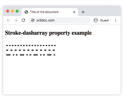
stroke-dasharray: none | <dasharray> | initial | inherit;Example of the stroke-dasharray property:
CSS stroke-dasharray code example
<!DOCTYPE html>
<html>
  <head>
    <title>Title of the document</title>
  </head>
  <body>
    <h2>Stroke-dasharray property example</h2>
    <svg height="80" width="300">
      <g fill="none" stroke="black" stroke-width="4">
        <path stroke-dasharray="6,6" d="M5 20 l215 0" />
        <path stroke-dasharray="8,10" d="M5 40 l215 0" />
        <path stroke-dasharray="18,10,6,7,7,10" d="M5 60 l215 0" />
      </g>
    </svg>
  </body>
</html>Result
Example of the stroke-dasharray property with the <line> element:
CSS stroke-dasharray another code example
<!DOCTYPE html>
<html>
  <head>
    <title>Title of the document</title>
  </head>
  <body>
    <h2>Stroke-dasharray property example</h2>
    <svg viewBox="0 0 30 10" xmlns="http://www.w3.org/2000/svg">
      <line x1="0" y1="1" x2="30" y2="1" stroke="#1c98c9" />
      <line x1="0" y1="3" x2="30" y2="3" stroke="#8ebf42"
        stroke-dasharray="3" />
      <line x1="0" y1="5" x2="30" y2="5" stroke="#000"
        stroke-dasharray="5 1" />
      <line x1="0" y1="7" x2="30" y2="7" stroke="#ccc"
        stroke-dasharray="4 2 2" />
      <line x1="0" y1="9" x2="30" y2="9" stroke="#666"
        stroke-dasharray="4 1 3 2" />
    </svg>
  </body>
</html>In this example each <line> uses a different pattern: a solid line (no dasharray), then 3 (equal dashes and gaps), 5 1 (long dashes, tiny gaps), and the odd-count patterns 4 2 2 and 4 1 3 2, which repeat across two passes as described above.
Values
| Value | Description |
|---|---|
| none | No dash is used. |
<dasharray> | A dashing pattern is used. |
| initial | Makes the property use its default value. |
| inherit | Inherits the property from its parents element. |
Related properties
stroke-dasharray is one of several properties that style an SVG outline. You will often combine it with:
- stroke-dashoffset — shifts where the dash pattern starts; the key to line-drawing animations.
- stroke-linecap — controls the shape of dash ends (
butt,round,square); useroundto turn0-length dashes into dots. - stroke-width — sets how thick the stroke is.
- stroke — sets the stroke color.
- fill — sets the interior color of the shape.