CSS initial-letter Property
Learn how the CSS initial-letter property creates drop caps and raised caps with syntax, values, browser support, and working examples.
The CSS initial-letter property creates a drop cap: it enlarges the first letter of a block so that it spans several lines of text and aligns neatly with the surrounding paragraph. This is the oversized opening letter you often see in books, magazines, and long-form articles.
Before this property existed, drop caps were faked with float plus hand-tuned font-size and negative margins — fragile values that broke whenever the font or line height changed. initial-letter does the math for you: you state how tall the letter should be in lines, and the browser sizes and positions it automatically so its baseline and cap height align with the body text.
You apply it to the ::first-letter pseudo-element (or to the first inline child of a block container), not to the whole paragraph.
| Initial Value | normal |
|---|---|
| Applies to | ::first-letter pseudo-elements and the inline-level first child of a block container. |
| Inherited | No |
| Animatable | No |
| Version | CSS3 |
| DOM Syntax | element.style.initialLetter = "2 1"; |
Syntax
initial-letter: normal | <integer> | <integer> <integer>;The property accepts the normal keyword or one to two space-separated positive integers.
How it works
- The first value (
size) controls how many lines tall the letter is.3means the glyph occupies the same height as three lines of text — the browser adjustsfont-sizeto achieve this automatically. - The second value (
sink) is optional and controls how many lines the letter descends below the first text baseline. If omitted, the sink defaults to the size, producing a classic dropped cap. A sink of1keeps the letter at the top of the first line and produces a raised cap.
/* 3 lines tall, sunk 3 lines (classic dropped cap — sink defaults to size) */
initial-letter: 3;

/* 3 lines tall, sunk only 1 line — letter rises above the paragraph */
initial-letter: 3 1;

/* Reset to no effect */
initial-letter: normal;Both integers must be positive — zero and negative values are invalid. The sink value must not exceed the size value.
Values
| Value | Description |
|---|---|
normal | No initial-letter effect. This is the default. |
<integer> | A single positive integer sets the size in lines; the sink defaults to the same value, giving a dropped cap. |
<integer> <integer> | First value is the size (height in lines). Second is the sink (lines the letter descends). Use 1 for the sink to get a raised cap. |
initial | Resets the property to its default value (normal). |
inherit | Inherits the computed value from the parent element. |
Initial letter example
This example sizes the first letter to two lines tall with a sink of 1 (the letter stands at the top of the first line, part raised, part sunk). The margin-right keeps the following text from crowding the cap.
<!DOCTYPE html>
<html>
  <head>
    <title>Title of the document</title>
    <style>
      body {
        display: flex;
        align-items: center;
        justify-content: center;
        font-family: 'Slabo 27px';
        font-size: 1.5em;
        line-height: 1.5;
        padding: 40px 0;
      }
      article {
        width: 80%;
      }
      .example::first-letter {
        -webkit-initial-letter: 2 1;
        initial-letter: 2 1;
        color: #8ebf42;
        font-weight: bold;
        margin-right: .60em;
      }
    </style>
  </head>
  <body>
    <article class="example">
      Lorem Ipsum is dummy text of the printing and typesetting industry. Lorem Ipsum has been the industry's standard dummy text ever since the 1500s, when an unknown printer took a galley of type and scrambled it to make a type specimen book. It has survived not only five centuries, but also the leap into electronic typesetting, remaining essentially unchanged.
    </article>
  </body>
</html>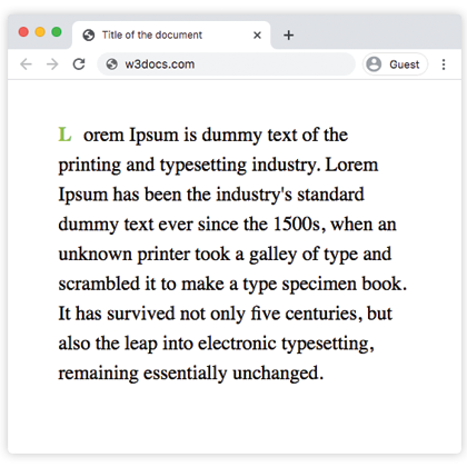
Raised cap example
Set the sink (second value) to 1 so the enlarged letter sits at the top of the first line and rises above the paragraph rather than dropping into it:
.example::first-letter {
  -webkit-initial-letter: 3 1;
  initial-letter: 3 1;
  color: #8ebf42;
  font-weight: bold;
  margin-right: 0.1em;
}A sink of 1 with a size of 3 means the letter is three lines tall but only its bottom edge descends to the first baseline — the rest towers above the opening line.
Styling the initial letter
You can apply any property that also works on ::first-letter to dress up the cap. Common approaches include:
color— use a brand or accent color to make the cap stand out.font-size— avoid setting this on the same rule;initial-lettertakes over font sizing.font-family— pair a decorative display font with the cap while the body uses a different typeface.font-weight— bold caps are traditional in editorial typography.margin-right— add a small gap (0.1–0.6 em) between the cap and the following text.padding— add space between the glyph and anybackground-colororborder.color— set a contrasting ink color.
p::first-letter {
  -webkit-initial-letter: 3;
  initial-letter: 3;
  font-family: Georgia, serif;
  color: #b5451b;
  font-weight: bold;
  margin-right: 0.15em;
  padding: 0.05em 0.1em;
  background-color: #fdf3ee;
}Browser support and fallback
initial-letter has broad support in Safari and Chrome/Edge (Blink), but Firefox does not yet implement it. Always provide a fallback so the page still looks reasonable in unsupported browsers.
Use the -webkit-initial-letter prefix alongside the unprefixed property to cover older WebKit/Blink versions.
Progressive-enhancement fallback
The @supports rule lets you apply the modern property only where it works, and a simpler float-based layout everywhere else:
/* Fallback for Firefox and older browsers */
p::first-letter {
  font-size: 3.5em;
  font-weight: bold;
  float: left;
  line-height: 0.65;
  margin: 0.05em 0.1em 0 0;
}

/* Override with the proper property where supported */
@supports (initial-letter: 2) or (-webkit-initial-letter: 2) {
  p::first-letter {
    font-size: unset;
    float: unset;
    line-height: unset;
    margin: unset;
    -webkit-initial-letter: 3;
    initial-letter: 3;
  }
}The float approach requires hand-tuning line-height and margin to make the letter align visually — which is exactly the brittle setup that initial-letter replaces. The @supports block cleanly resets those manual values and applies the standard property.
When to use initial-letter
Use initial-letter when:
- You want editorial drop caps that stay aligned even if the reader changes their browser font size.
- You are producing magazine-style layouts, long-form articles, or book-chapter pages.
- You can tolerate the Firefox gap with a float fallback.
Avoid it when:
- The first "letter" is actually a number, emoji, or punctuation mark — visual alignment may be unexpected.
- You need pixel-perfect control over position in all browsers today without a float fallback.
Related properties
::first-letter— the pseudo-elementinitial-lettertargets.::first-line— style the opening line of a block.float— the classic (pre-CSS3) way to fake a drop cap.font-size— size text manually wheninitial-letteris not supported.line-height— determines the line grid the cap snaps to.text-indent— another first-line typographic tool, often used alongside drop caps.