CSS border-image-width Property
The CSS border-image-width property defines the width of the border image. See examples and practice yourself.
The CSS border-image-width property defines the width of an element's border image — that is, how thick the image-based border is drawn around the box. It is one of the CSS3 properties.
When to use it
You only need border-image-width when an element already has a border image set with border-image-source (and usually border-image-slice). On its own it does nothing.
A key gotcha: border-image-width is not the same as the regular border-width. The plain border-width reserves space in the box model and affects layout, while border-image-width only controls how wide the image is painted in that border region. If you make the image wider than the actual border, it can overflow inward over the element's padding/content without pushing other content around. That is why most examples set a transparent border first and then size the image with border-image-width.
Accepted value types
The width of each side can be expressed in several ways:
<length>— a fixed size such as20px.<number>— a multiplier of the correspondingborder-width.border-image-width: 2means "twice the border width". This is the type used by the initial value1.<percentage>— relative to the size of the border-image area (horizontal percentages use its width, vertical ones its height).auto— uses the intrinsic width/height of the matching border-image-slice, or the correspondingborder-widthif no intrinsic size exists.
How many values to use
border-image-width accepts one to four values, following the standard CSS clockwise shorthand:
- One value — applies to all four sides.
- Two values — first is top/bottom, second is left/right.
- Three values — first is top, second is left/right, third is bottom.
- Four values — top, right, bottom, left (clockwise from the top).
When a value is omitted, it mirrors the opposite side: an omitted fourth value copies the second (left = right), an omitted third copies the first (bottom = top), and an omitted second copies the first (so one value fills everything).
| Initial Value | 1 |
|---|---|
| Applies to | All elements, except internal table elements when border-collapse is collapse. It also applies to ::first-letter. |
| Inherited | No. |
| Animatable | No. |
| Version | CSS3 |
| DOM Syntax | object.style.borderImageWidth = "20px"; |
Syntax
Syntax of CSS border-image-width Property
border-image-width: number | % | auto | initial | inherit;Example of the border-image-width property:
Example of CSS border-image-width Property with px value
<!DOCTYPE html>
<html>
  <head>
    <style>
      .border {
        border: 10px solid transparent;
        padding: 20px;
        border-image: url("/uploads/media/default/0001/01/812bf6a749522b8185c1beee20dd99dd6c6c87da.jpeg") round;
        border-image-slice: 20;
        border-image-repeat: round;
        border-image-width: 20px;
      }
    </style>
  </head>
  <body>
    <h1>Border-image-width Example</h1>
    <p class="border">Here the border-image-width is set to 20px.</p>
  </body>
</html>Result
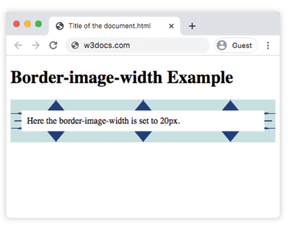
Here is another example where you can see what will be changed if one, two, three or four values are used.
Example of the border-image-width property with different values:
Example of CSS border-image-width Property with two, three and four values
<!DOCTYPE html>
<html>
  <head>
    <style>
      .border1 {
        border: 10px solid transparent;
        padding: 20px;
        border-image: url("/uploads/media/default/0001/01/812bf6a749522b8185c1beee20dd99dd6c6c87da.jpeg");
        border-image-slice: 10%;
        border-image-repeat: round;
        border-image-width: 20px;
      }
      .border2 {
        border: 10px solid transparent;
        padding: 20px;
        border-image: url("/uploads/media/default/0001/01/812bf6a749522b8185c1beee20dd99dd6c6c87da.jpeg");
        border-image-slice: 10%;
        border-image-repeat: round;
        border-image-width: 20px 10px;
      }
      .border3 {
        border: 10px solid transparent;
        padding: 40px;
        border-image: url("/uploads/media/default/0001/01/812bf6a749522b8185c1beee20dd99dd6c6c87da.jpeg");
        border-image-slice: 10%;
        border-image-repeat: round;
        border-image-width: 20px 10px 40px;
      }
      .border4 {
        border: 10px solid transparent;
        padding: 55px;
        border-image: url("/uploads/media/default/0001/01/812bf6a749522b8185c1beee20dd99dd6c6c87da.jpeg");
        border-image-slice: 10%;
        border-image-repeat: round;
        border-image-width: 20px 10px 40px 55px;
      }
    </style>
  </head>
  <body>
    <h1>The border-image-width Example</h1>
    <p class="border1">Here the border-image-width is set to 20px.</p>
    <p class="border2">Here the border-image-width is set to 20px and 10px.</p>
    <p class="border3">Here the border-image-width is set to 20px, 10px and 40px.</p>
    <p class="border4">Here the border-image-width is set to 20px, 10px, 40px and 55px.</p>
  </body>
</html>In the example above, .border1 uses a single value for all sides, while .border4 gives each side a different width — notice how the thicker sides paint more of the image inward.
Related properties
- border-image-source — sets which image is used for the border.
- border-image-slice — cuts the source image into the nine regions that form the border.
- border-image-outset — pushes the border image beyond the border box.
- border-width — the regular border width that
border-image-widthmultiplies when a<number>is used.
Values
| Value | Description | Play it |
|---|---|---|
| length | A length unit (px) that defines the size of the border-width. | Play it » |
| number | The border width is defined as a multiple of the corresponding border-width. It must not be negative, and default value is 1. | Play it » |
| percentage | Is calculated in relation to the width of border image area for horizontal offsets and the height of the border image area for vertical offsets. | Play it » |
| auto | Border width is made equal to the intrinsic width or height of the corresponding border-image-slice. | Play it » |
| initial | Sets the property to its default value. | Play it » |
| inherit | Inherits the property from its parent element. |